So I have this friend. He’s a Librarian. And he’s super awesome, and he does neat super-supportive things for me, and I love him very much. And I was in the store, and I found this thing:
I’m busy on my facebook page, showing all the stuff I got to burn and he’s like, “CONTAINERS! I LOVE CONTAINERS!” Apparently, he says, he has an unnatural attraction to containers. And like I said, he’s a librarian.
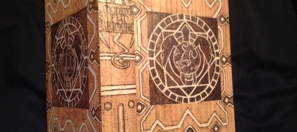
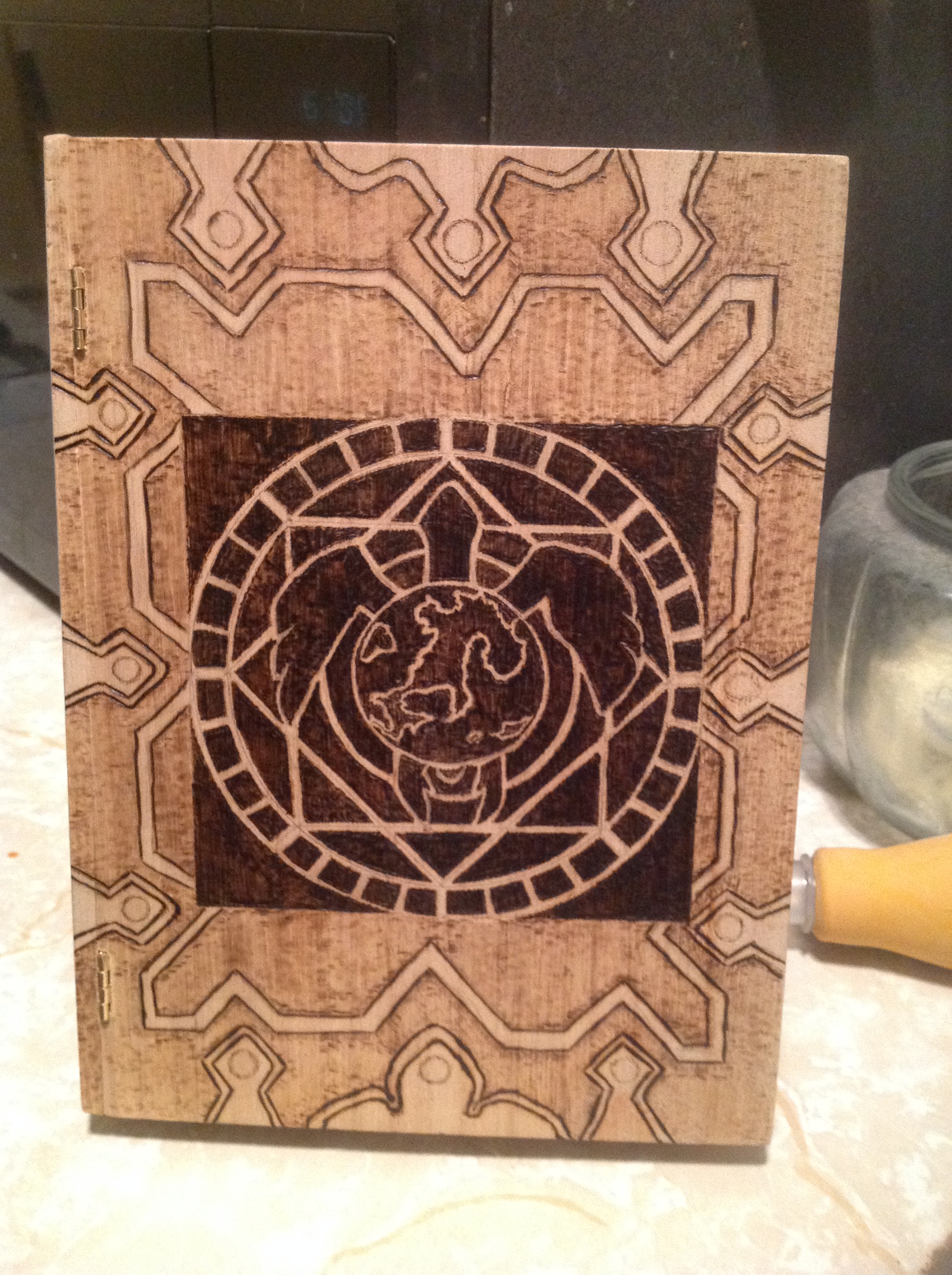
I wanted to make him a present. (That’s his wife’s mom’s awesome quilt making skillz in the background btw. She does neat stuff.) So we were discussing (his wife and I) what to make the book look like. I mean…books can be ANYTHING. It could be his life story…it could be the book he always wanted to read…it could be his favorite book, or we could make up a book. Tough call. And then, he posted this image on facebook as his profile picture.
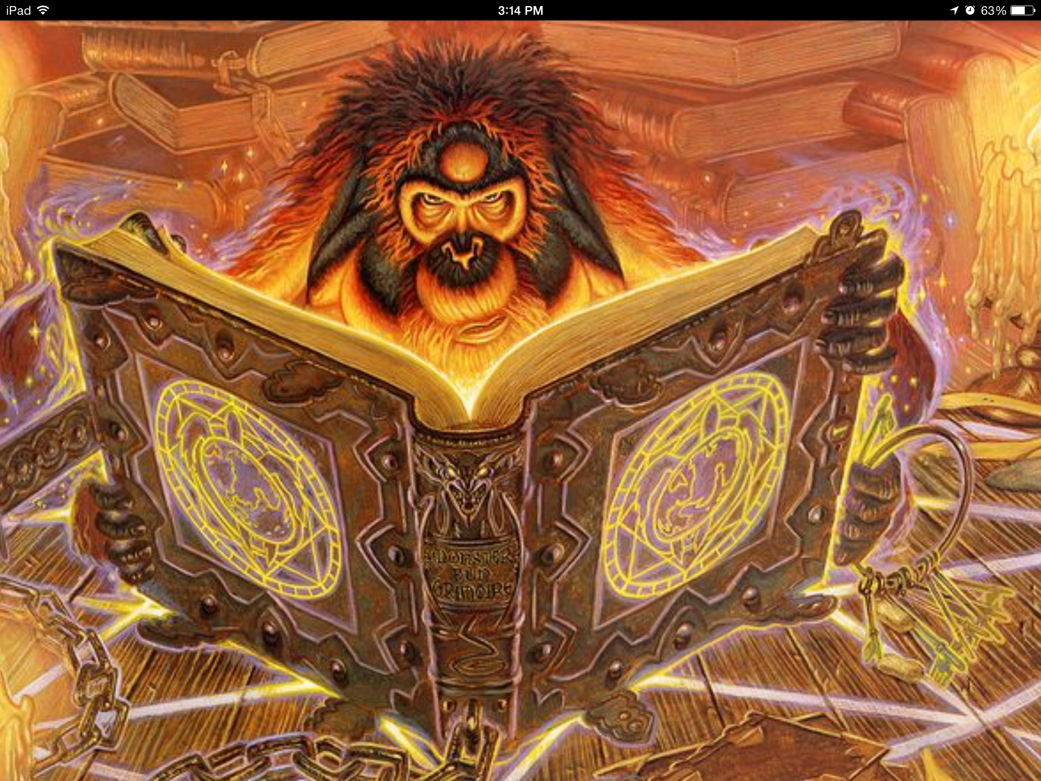
I was like, “I could make THAT book!” “Really?” “Yes! Totally I could do that book!”
I had no idea I had just signed myself up for hours and hours and hours of work, but also that I’d be producing the thing I would be the most proud of to date. (Currently, it’s April 4th, of 2015, and I have a lifetime of burning ahead of me…but right now, I love this friggin book.)
So a couple of things were going on.
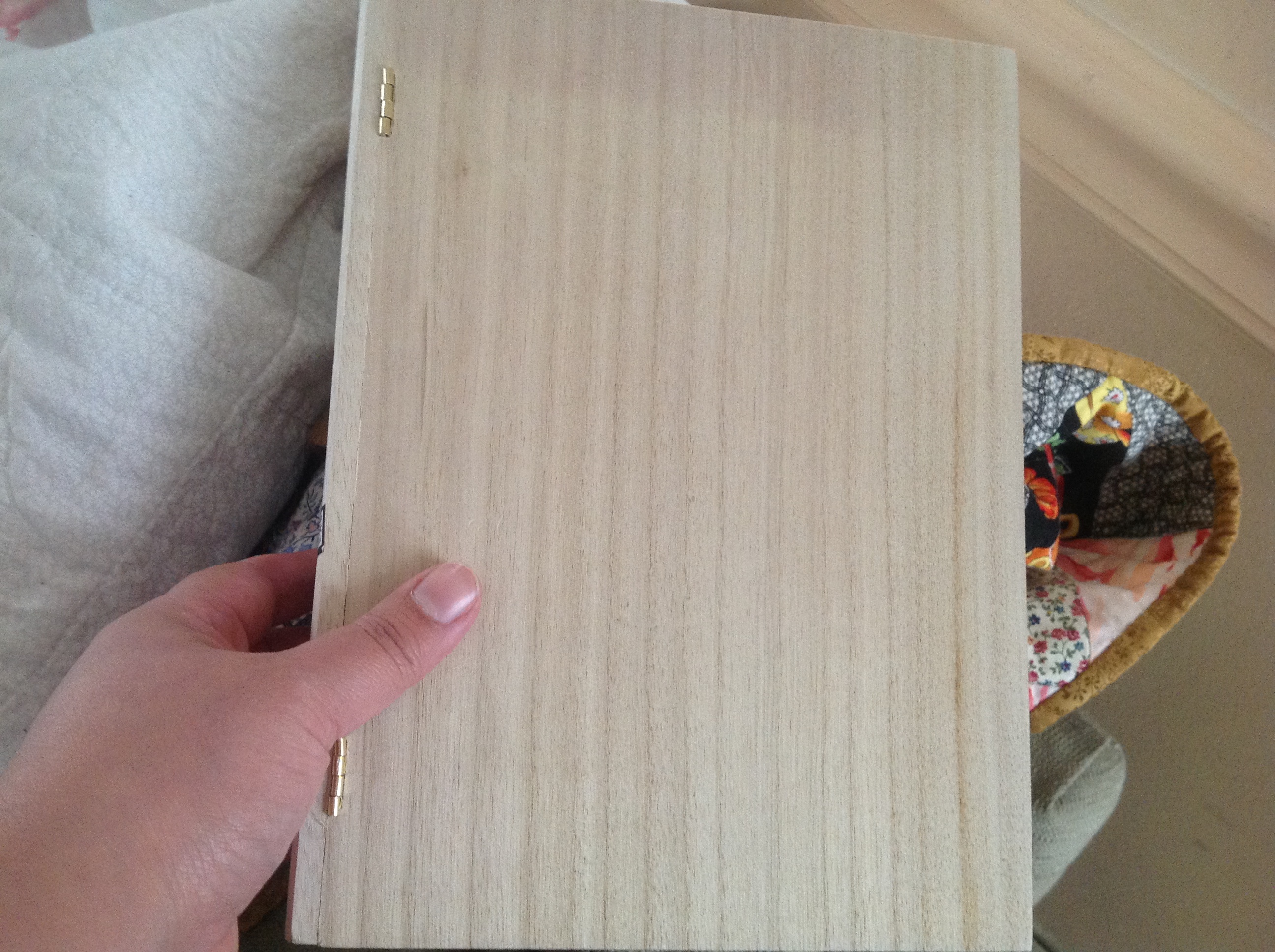
1-I still didn’t own a variable temperature burner. Just on and off.
2 – I still didn’t own a compass. Just a ruler
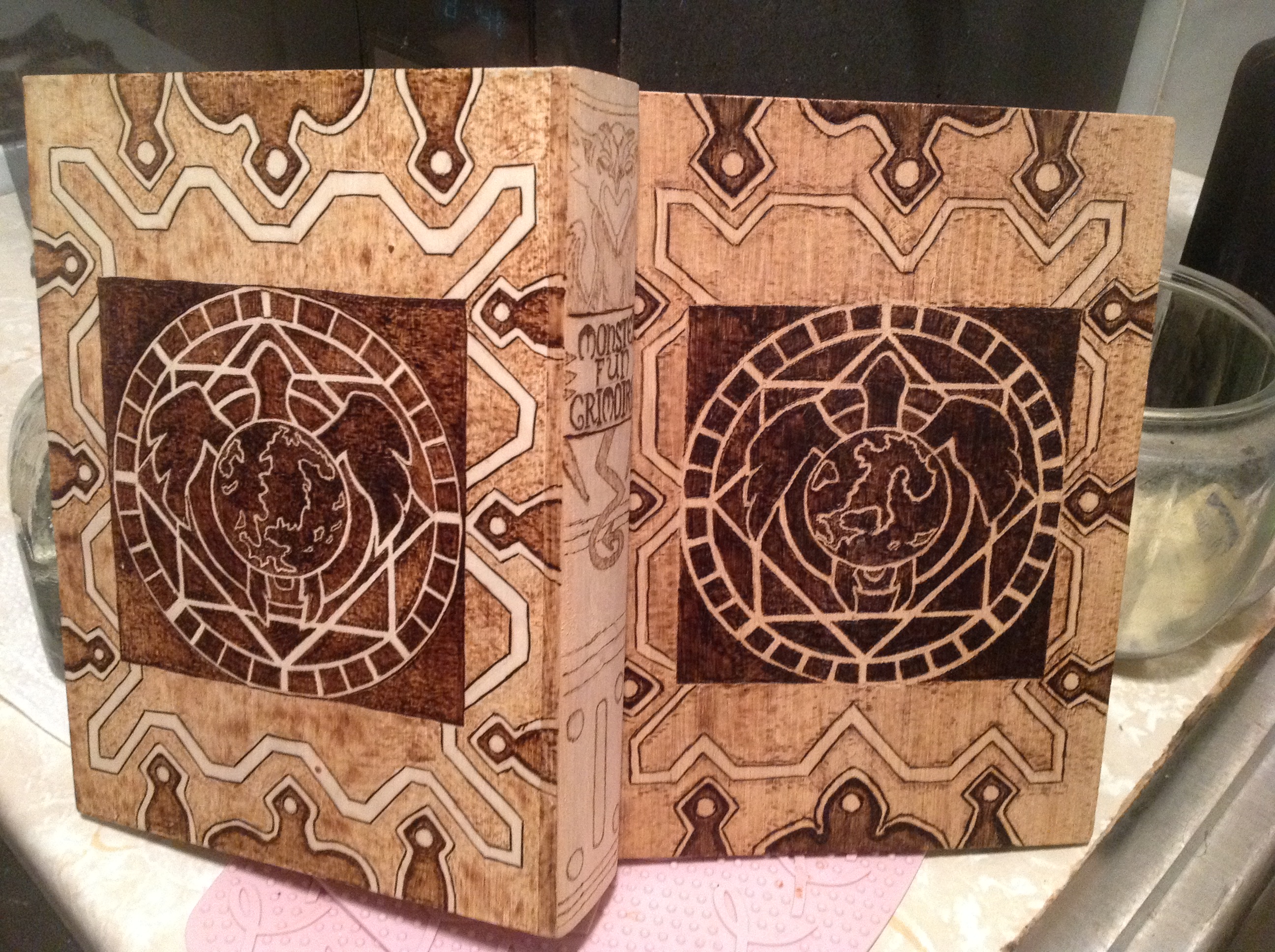
3 – the box I bought was more rectangular than the book in the picture, which meant fudging the image a bit. But I didn’t know that. I didn’t even notice it. I was so enamored of the project, I just dived right in.
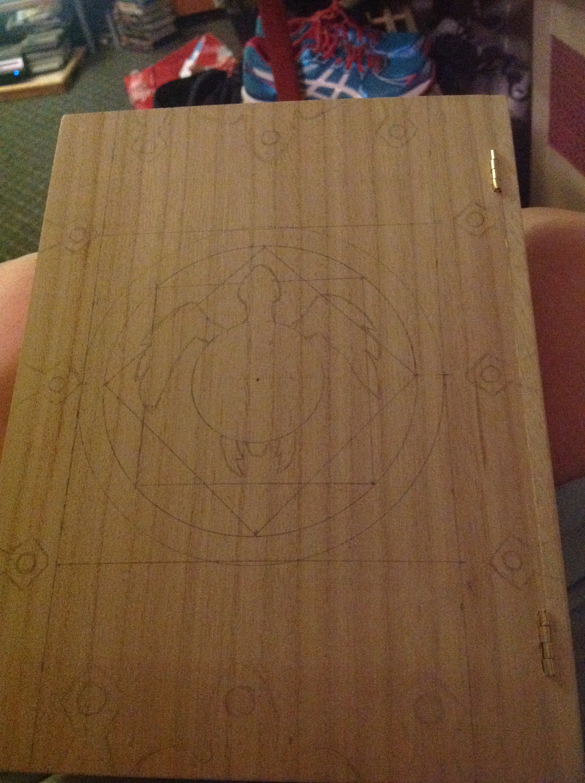
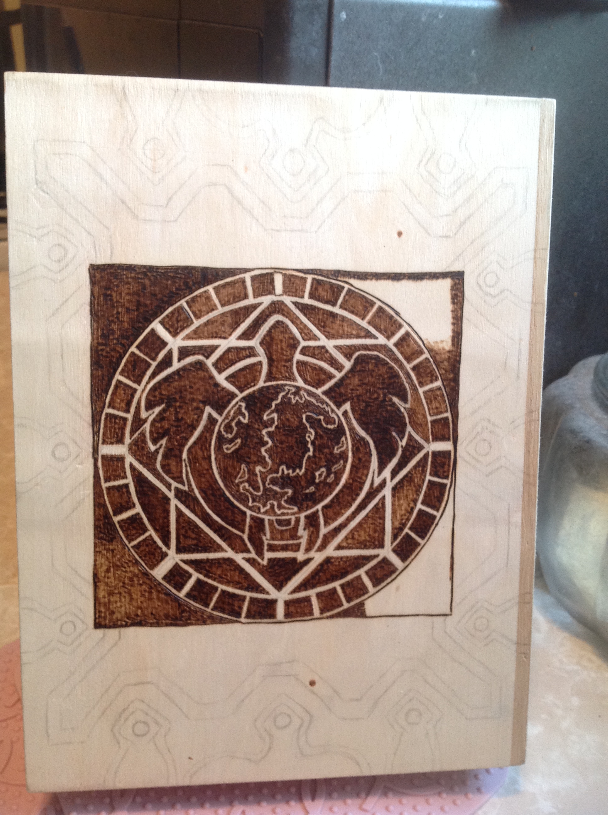
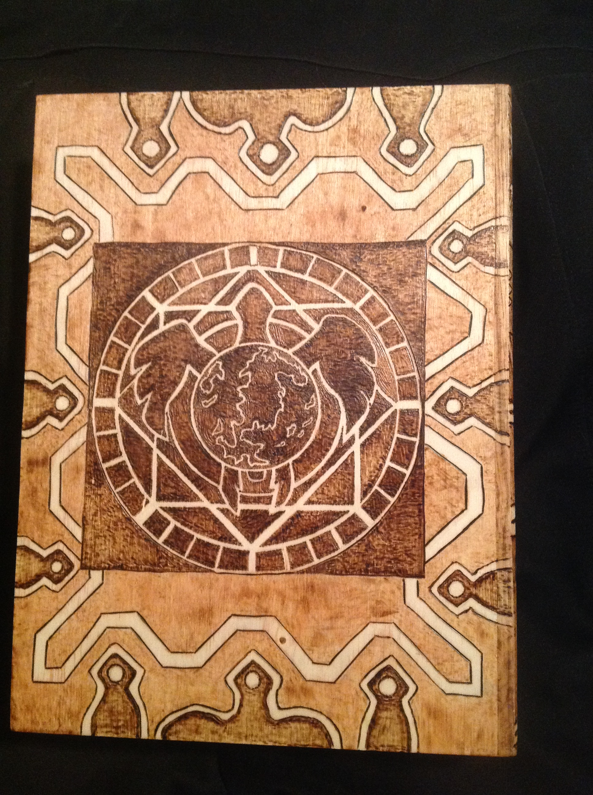
If I had been thinking, I would have done the back cover first, so I had practice before I did the front. But of course, I wasn’t thinking, I was flying through the project. So I was up to that picture above before I realized I had drawn the turtle completely upside down. All that work on the flippers had gone to waste. Thank the Gods I hadn’t drawn the continents yet.
So I erased, sanded, and redrew it.
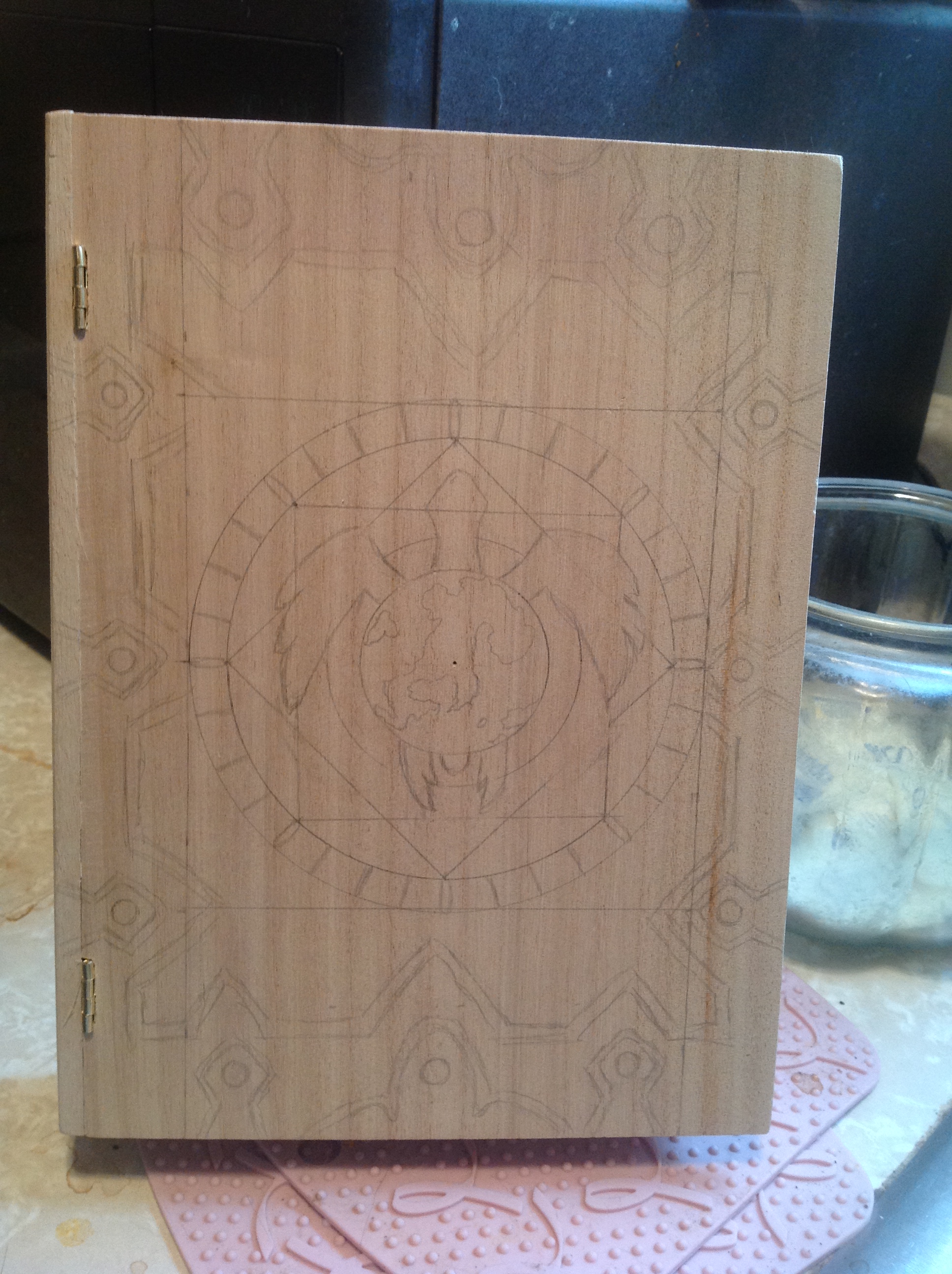
Then I realized something else. If I wanted the image to glow like the picture, I would have to burn in the negative space. This is kind of a tough thing for me…because I have to draw the image, and then pointedly NOT burn the image, and burn everyplace else. And a mistake could be a big problem.
So I started.
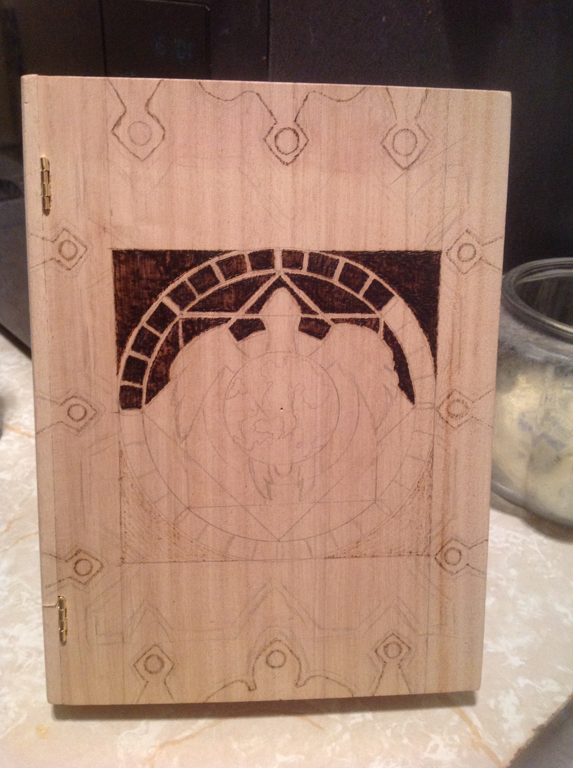
Then I had to really focus, every time I burned, to make sure that I wasn’t breaking any lines I wasn’t supposed to. For instance, the topmost part of the image is the world, then the turtle. So I couldn’t break any of the lines on the turtle, I had to break the squares beneath it. Took a lot of concentration. I also did a very light burn on all the buckles of the book. See, if you handle a piece of wood that has pencil images on it for too long, the pencils smudge, and I couldn’t risk that happening once I got things where I wanted them.
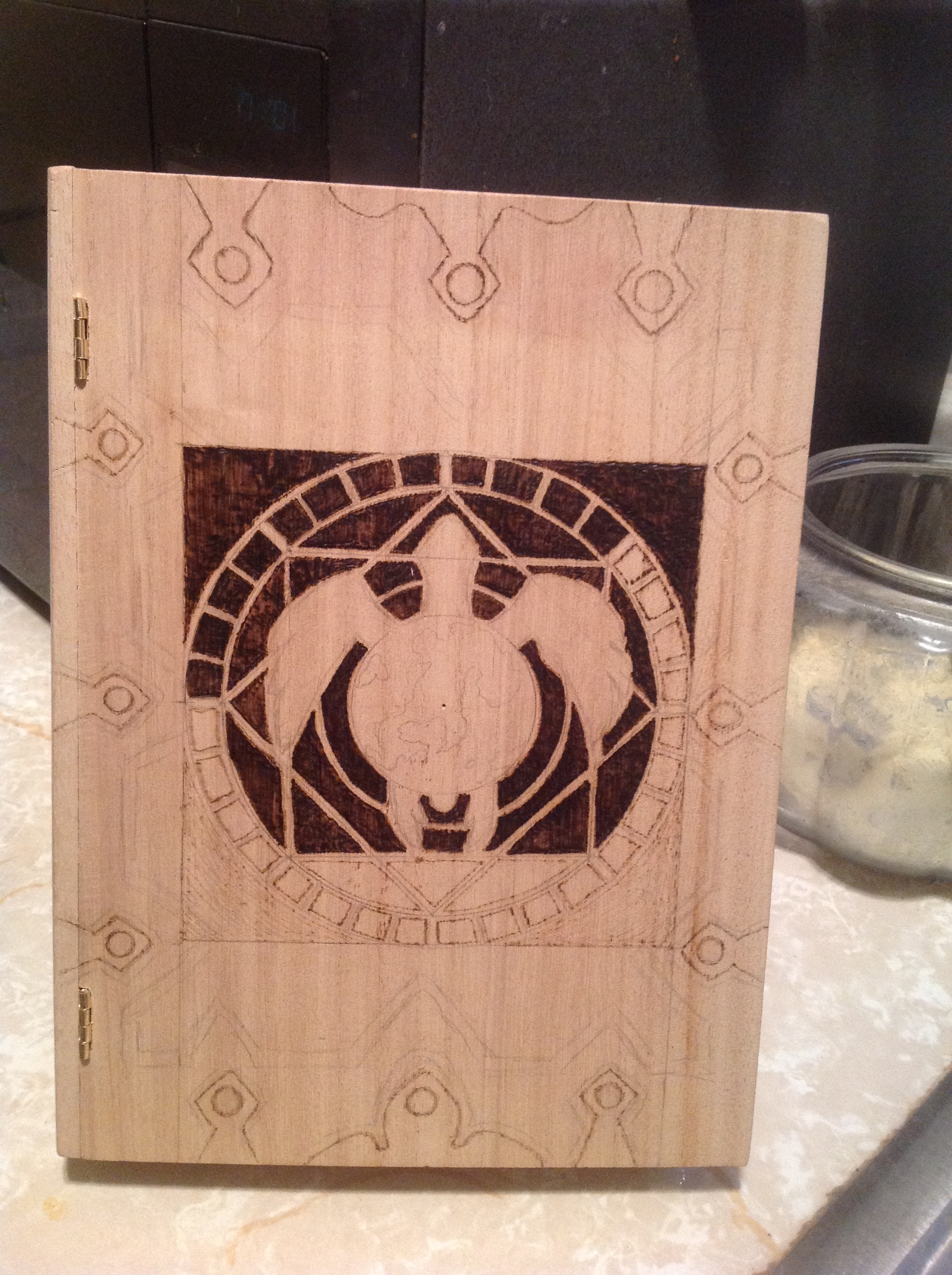
The next thing was the continents. Had to do them.
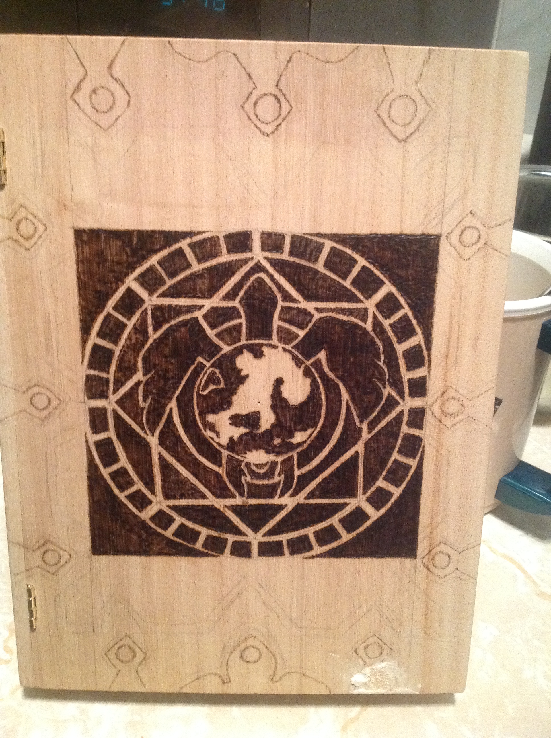
Scary thing, because the lines on them were SO THIN that I was afraid to make a mistake. However, it turns out it’s easier to burn a thin line in negative space than in positive space. A super thin line in positive space has to be drawn one dot at a time. Super thin line in negative space means you just get closer and closer until you want to stop. So I did.
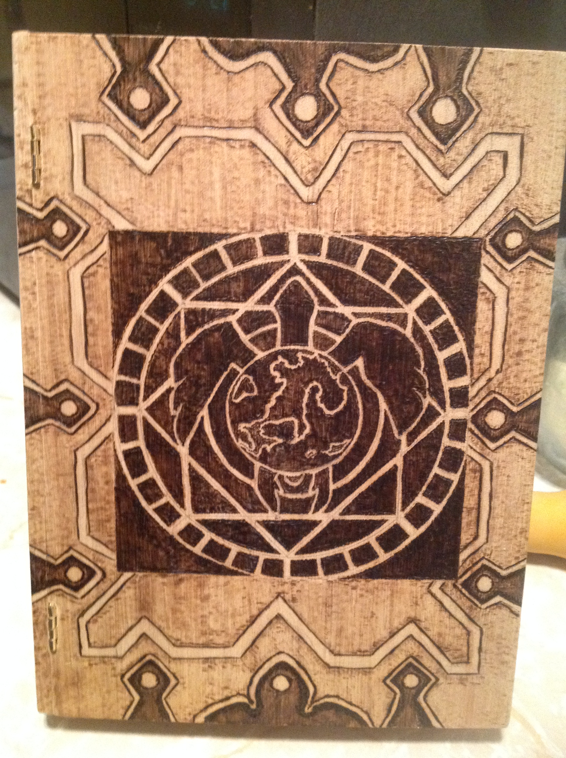
But then, in order to make the other zigzag line in the background pop, that meant I had to shade the background. With no variable temperature burner, this was a problem. So there are a lot of little dots from the burner, but it didn’t look bad because it lent it a kind of leathery feel.
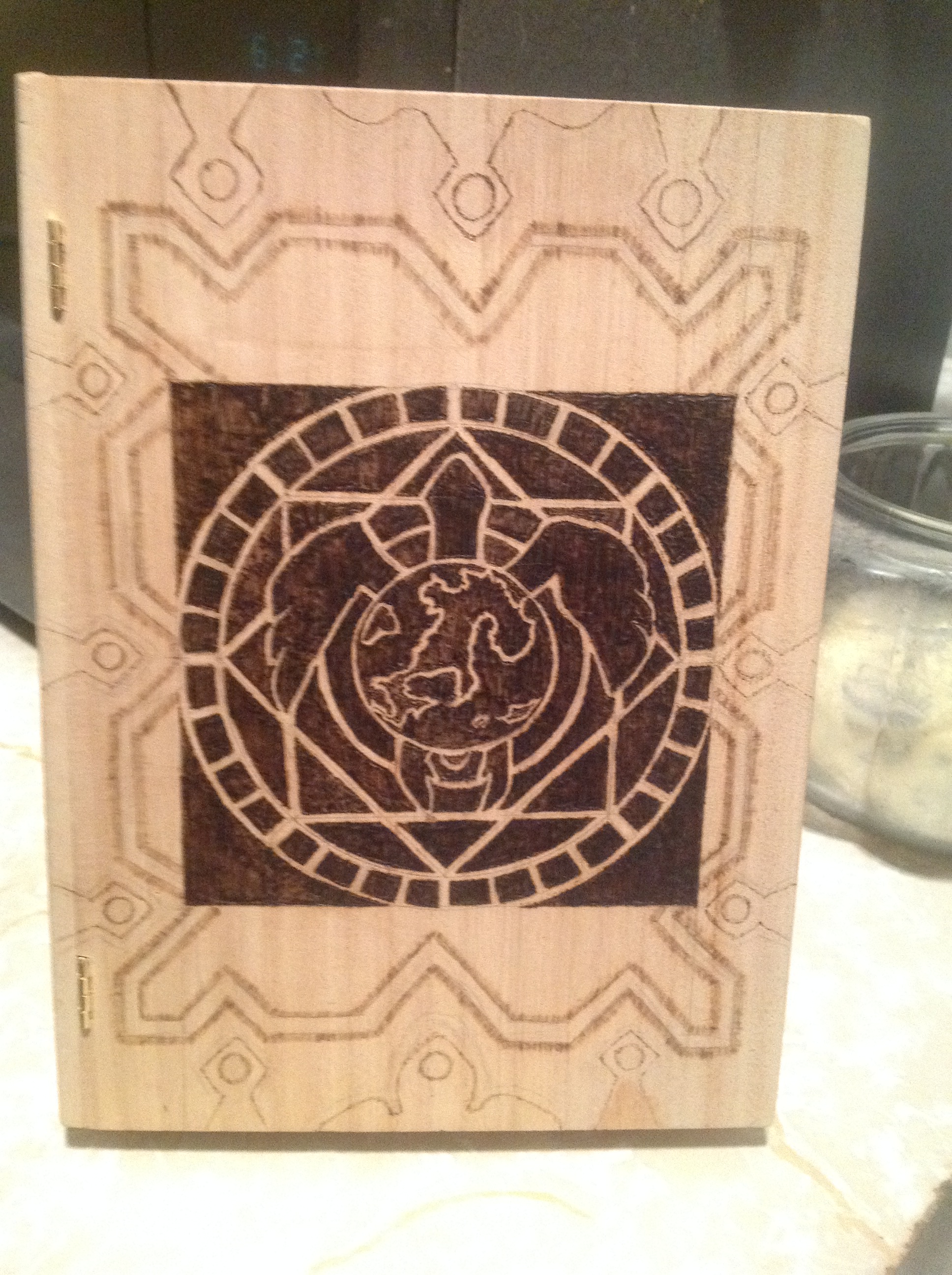
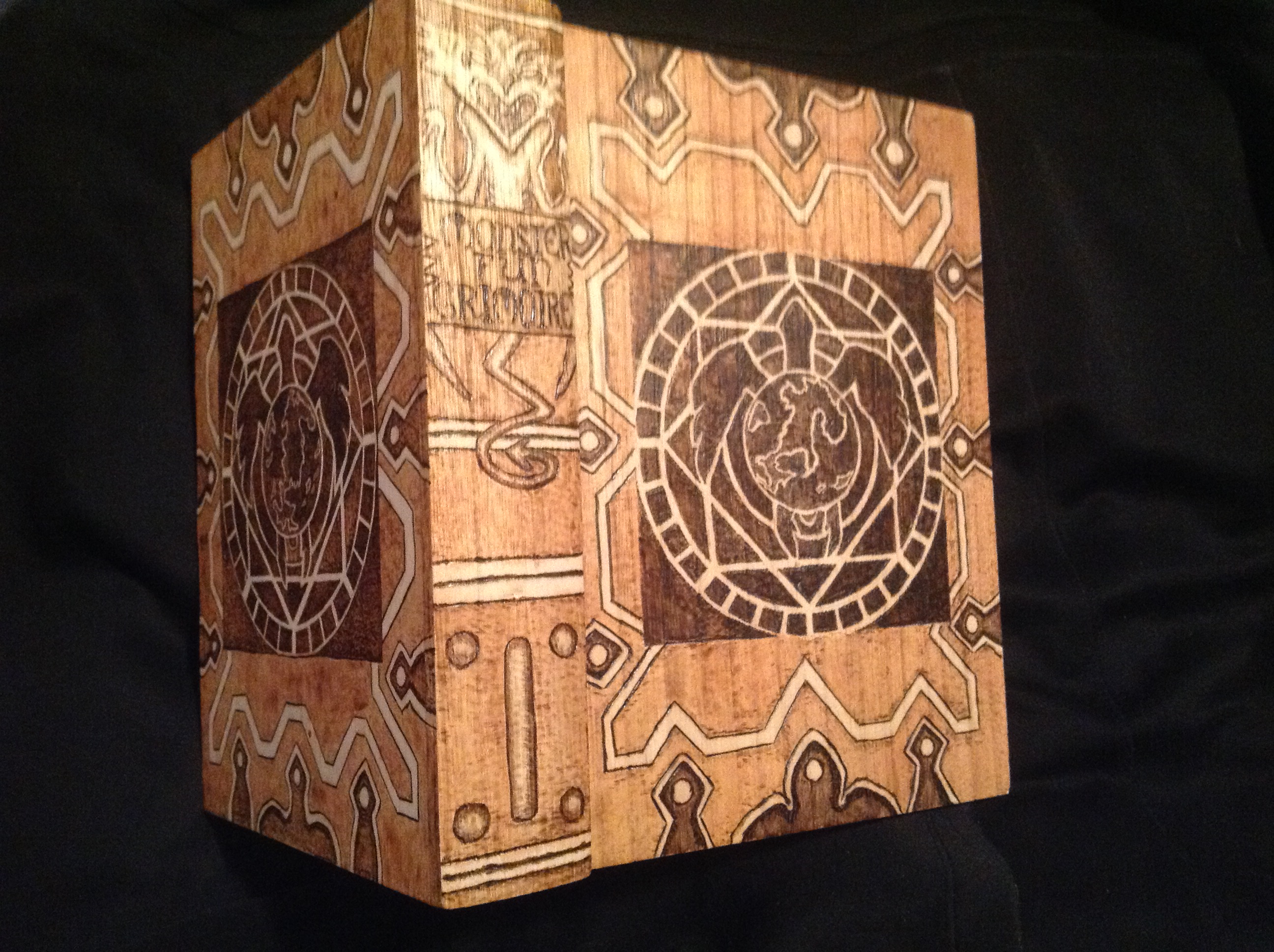
But no way was I going to go through this on the back cover. I went out and bought a variable temperature burner right away. And a bunch of gourmet heads to play with, too.
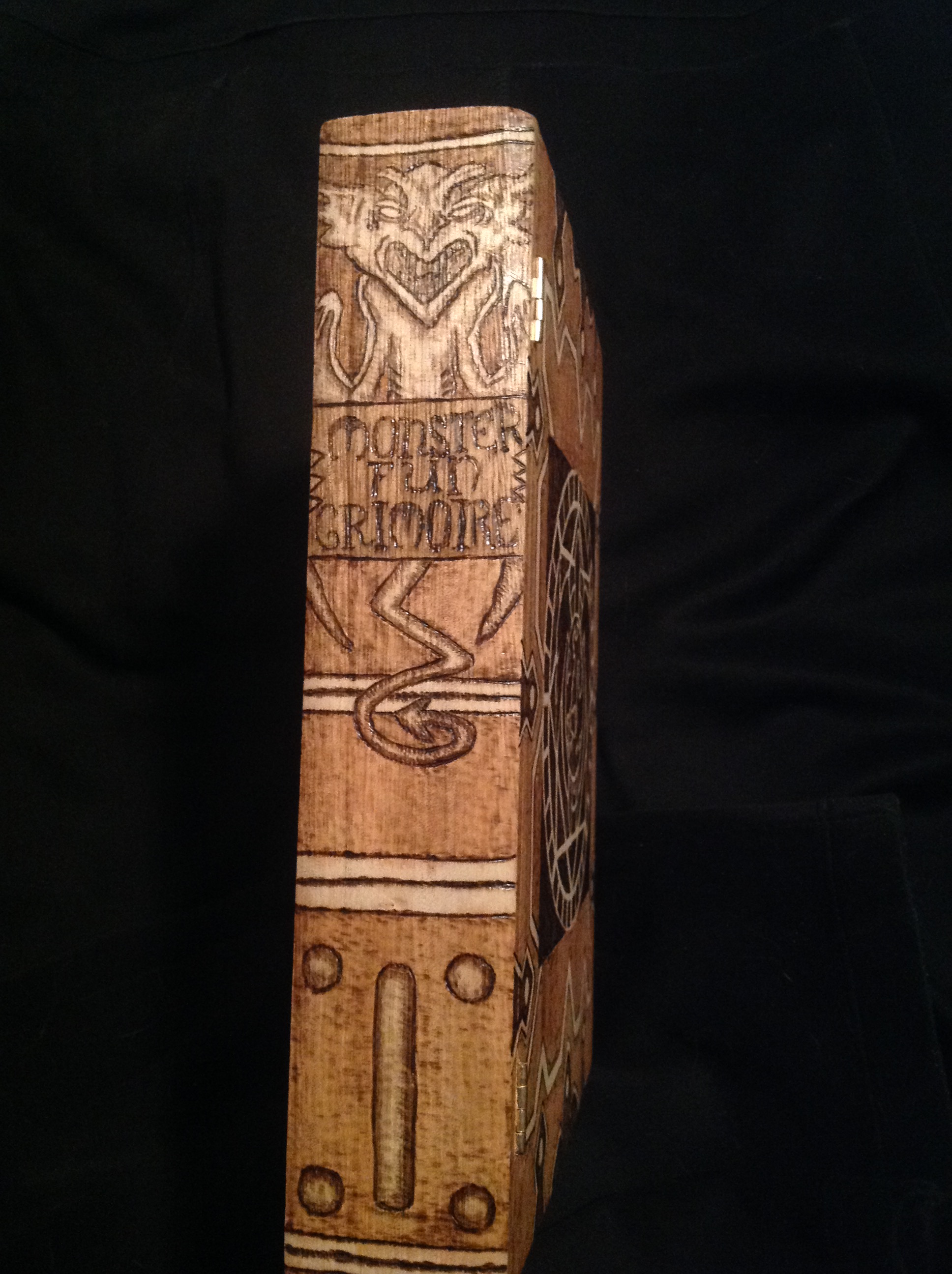
Right. Awesome. I can do this again on the back cover, no sweat…but what about the spine of the book? There’s that gargoyle thing on there…I better stop avoiding that.
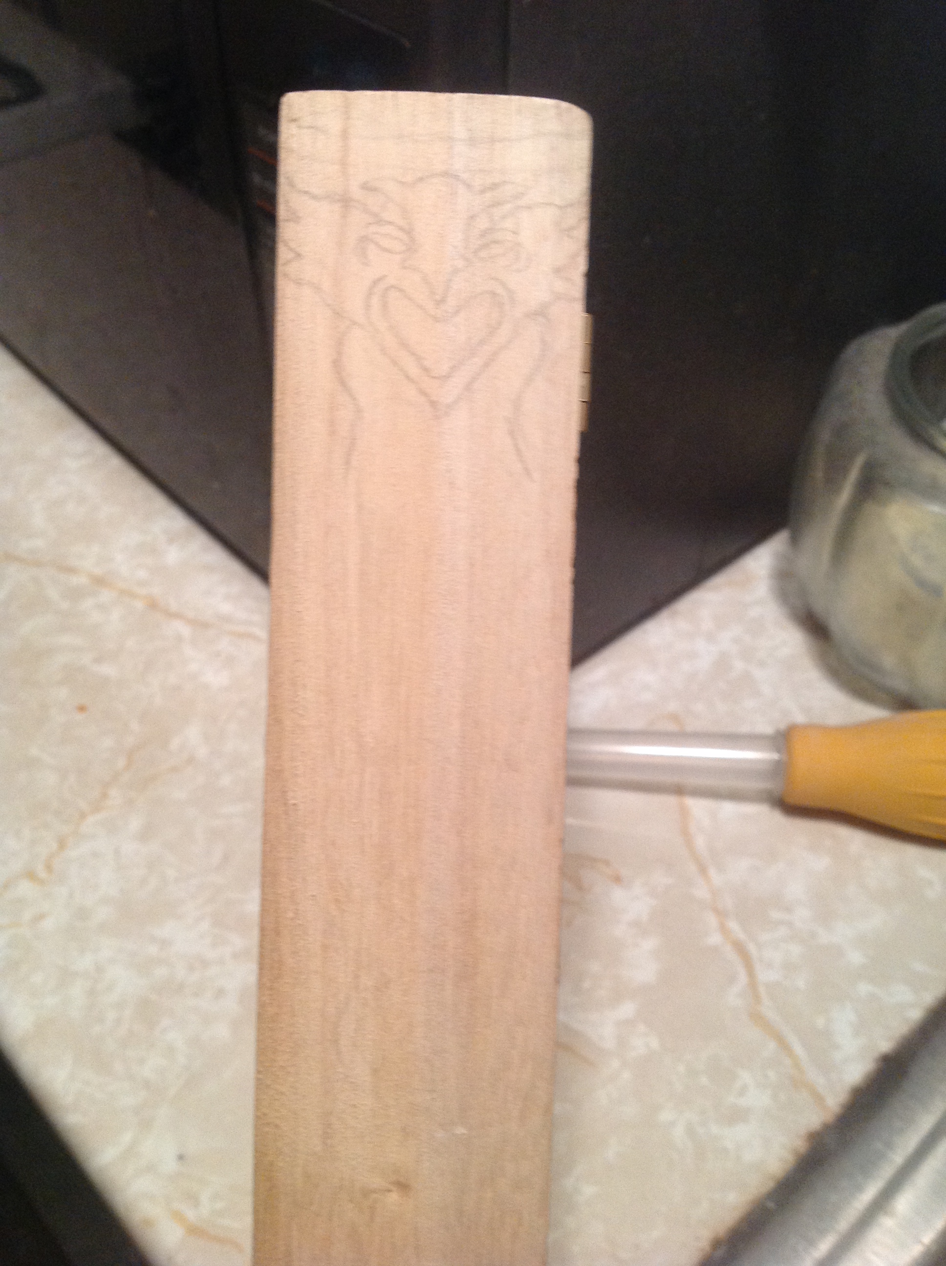
Harder than I thought. I figured I’d put it on hold again and work on the back cover.
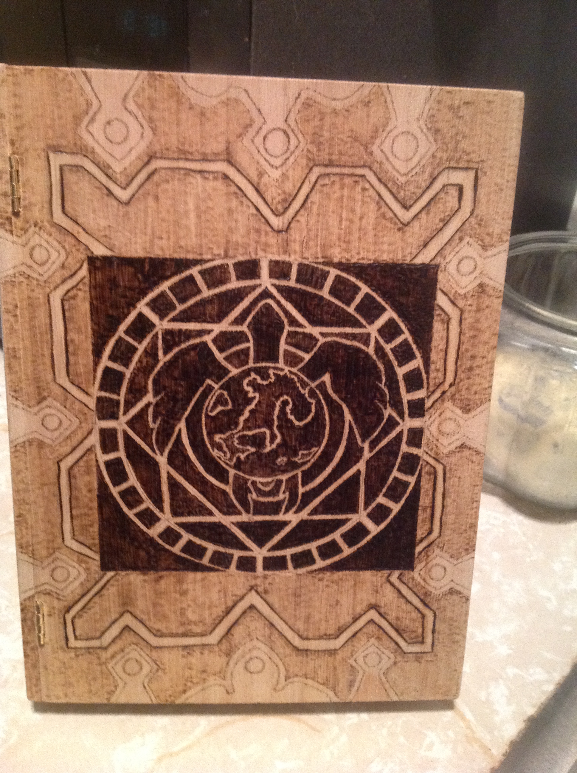
The variable temp burner made all the difference in the world. And I couldn’t put off the spine any longer. I had to get real with it.
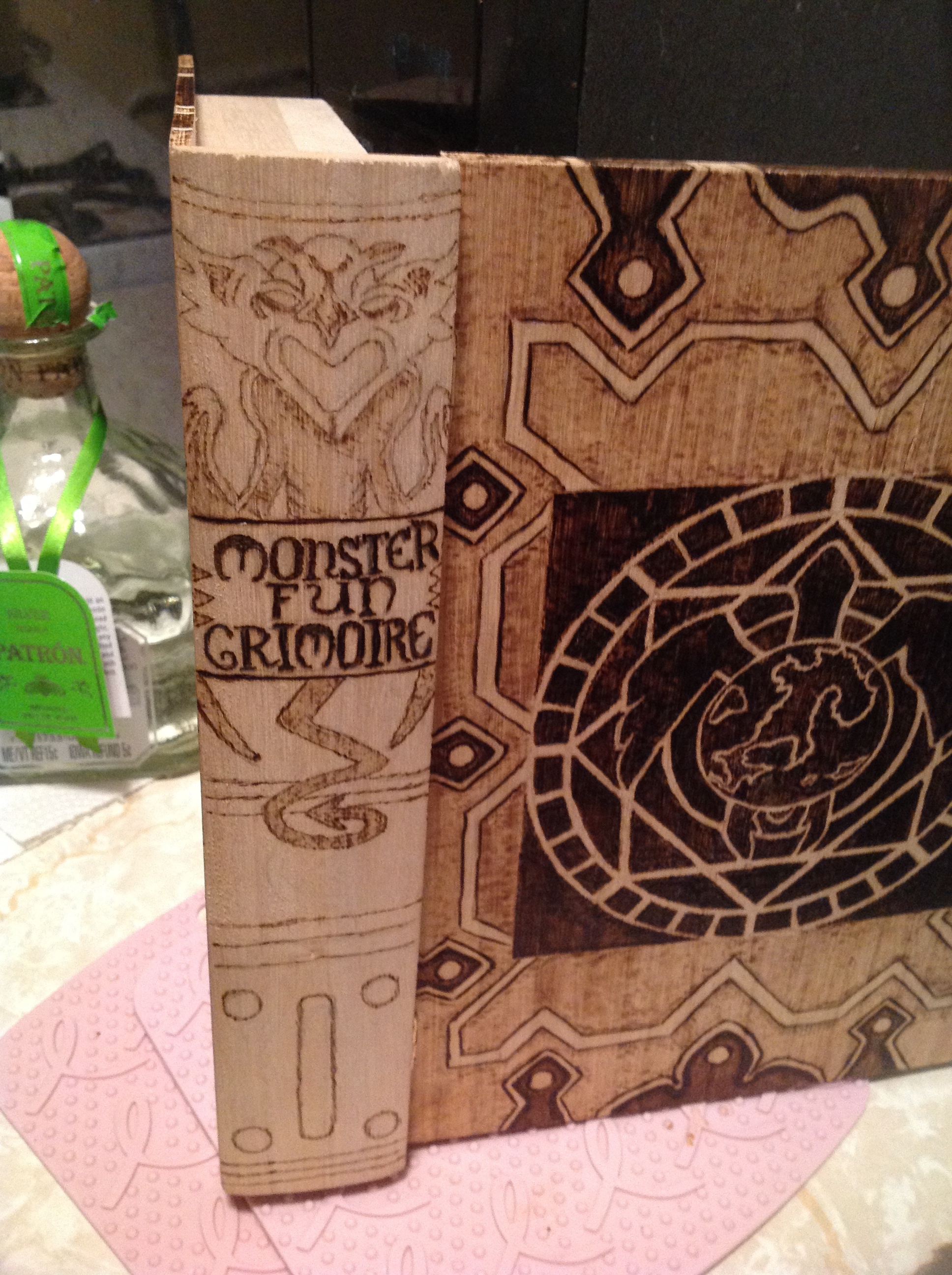
and then get a little braver and darken it up.
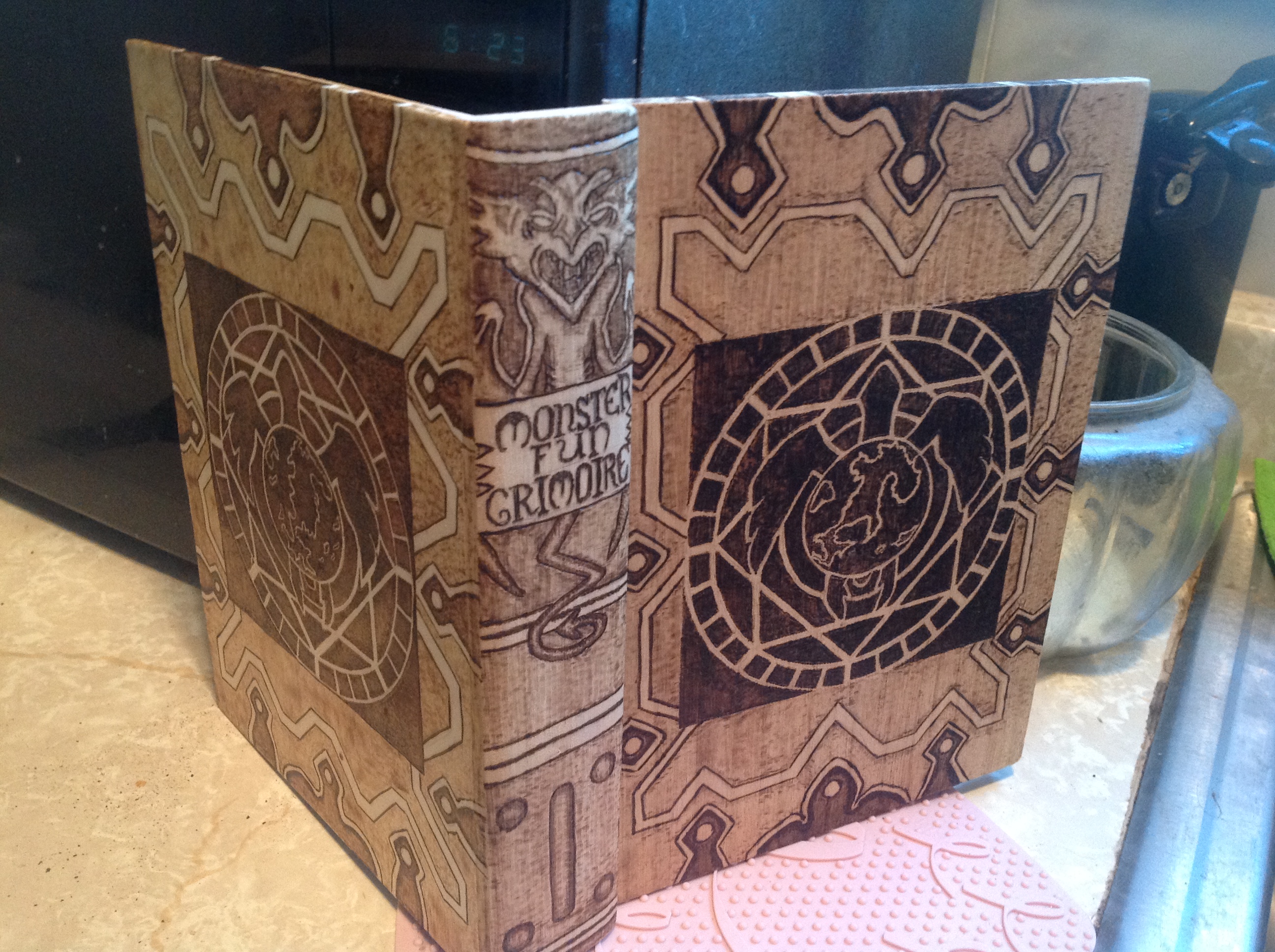
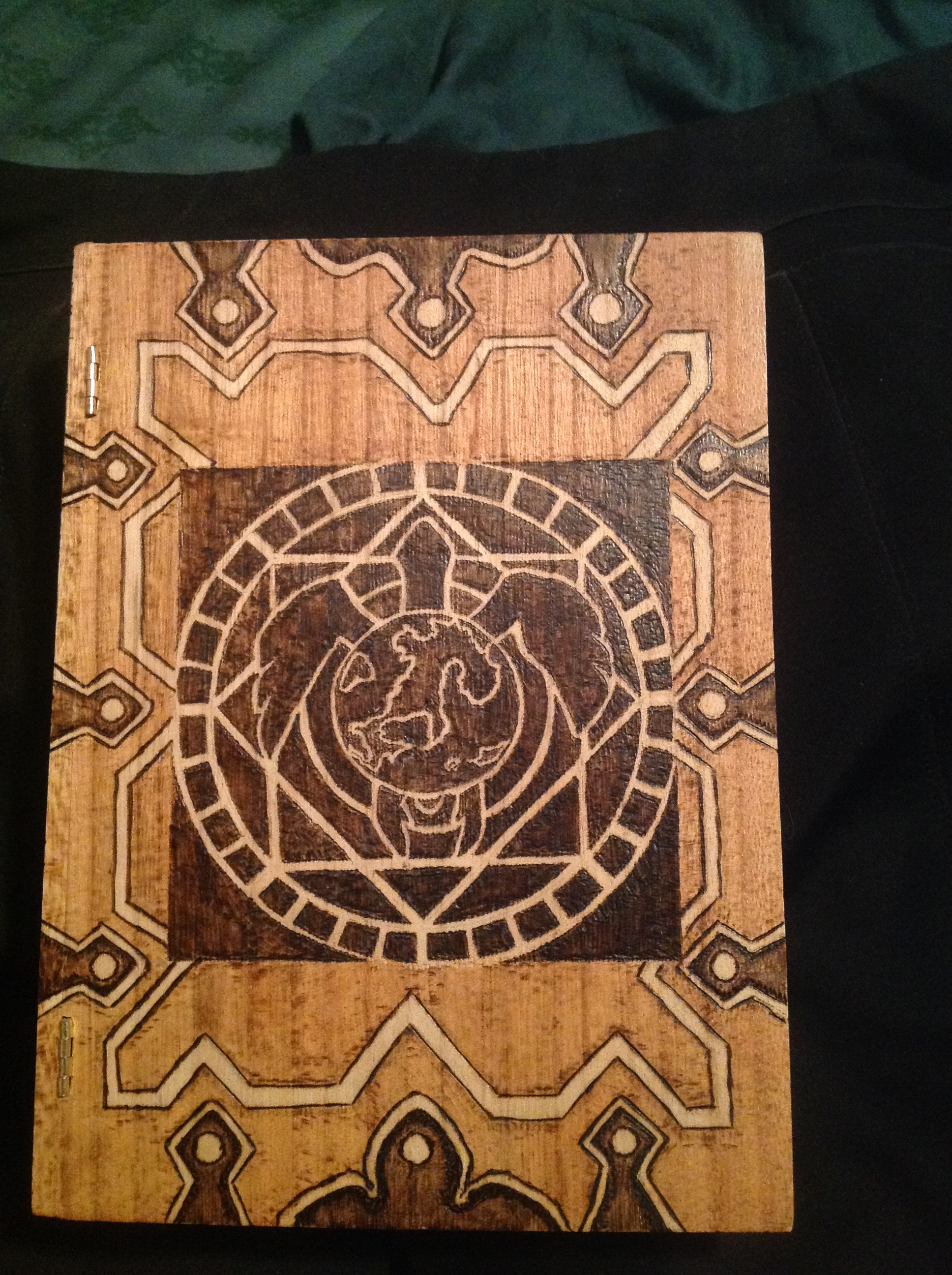
And finally, I figured, I have this colonial maple stain that’s got this red tone….If I put that on the leathery background, it’ll look even more leathery. So I did.
The only thing I wish I didn’t do was stain the sign the monster on the spine was holding. I would have liked it much better the pale white it was. But hey…once you start, you can’t go back.
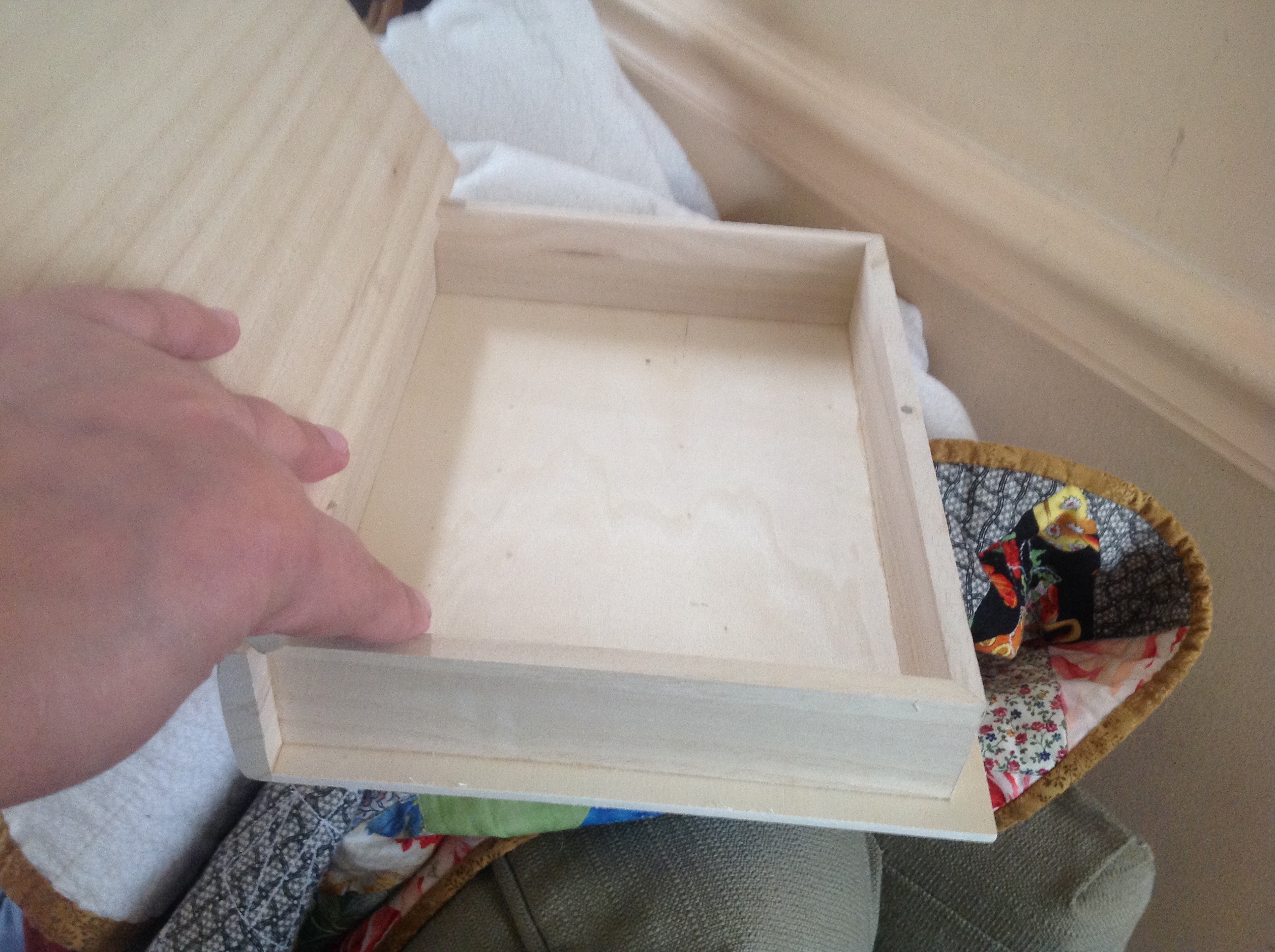
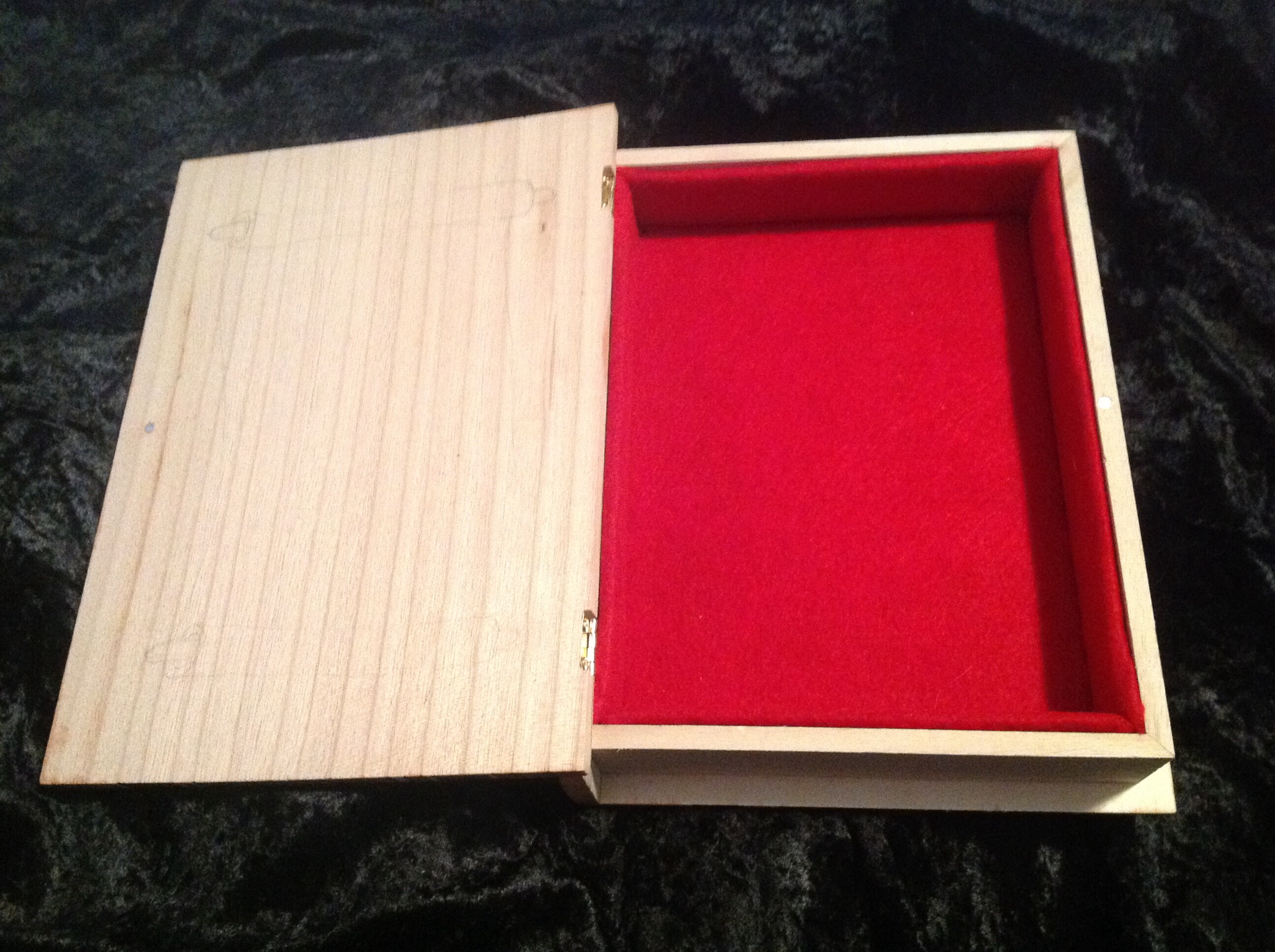
It is now April 11th, and I’m giving it to him today. This page will go live immediately after. I did one last thing and lined the book. I felt like a jerk with an empty box. Red felt for him. Goes well with the cover.
I love you, man.
You are simply AW-MAZING!!! <3
😀
Awww….thanks, Joye. I’m just glad he loves it.
Holy moly! Gorgeous!
And Terry Pratchett!!!!!
My favorite things ever!