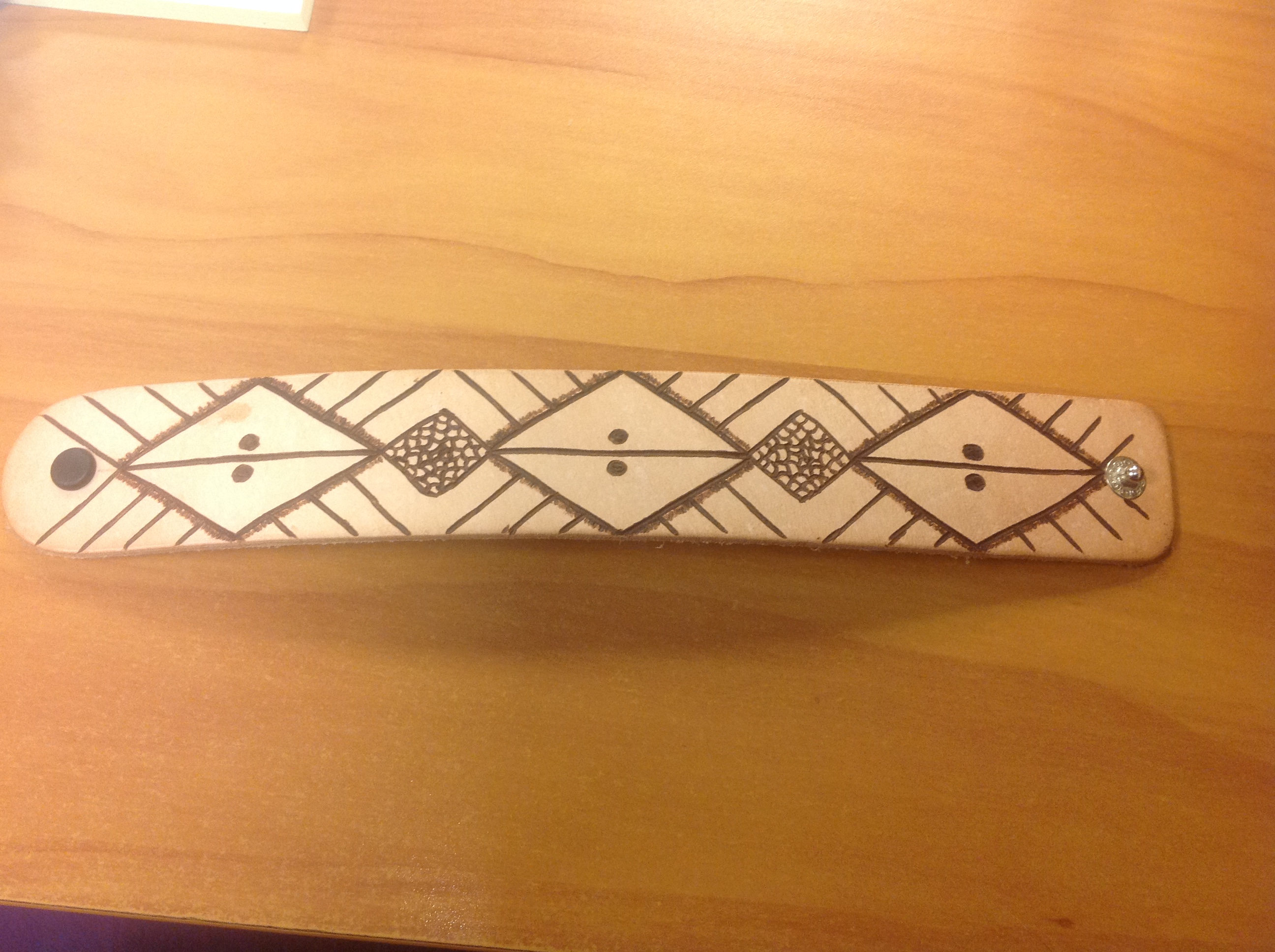
I picked up something else someone gave me. This was a blank leather bracelet, pretty thick. In my shaman work I was given a particular symbol, and I was under the impression I was supposed to bring it from the dream world into this world, so I figured I’d put it on the bracelet. Then it just kind of took a life of its own and ended up like this.
finished bracelet
It’s much simpler than I usually like. I kept feeling like it needed other things…but I have a friend Deveon who does amazing jewelry work. She kind of speaks to the stones and asks them what they want before she does the work. I’m gonna plug her pages here, because her work is amazing.
So anyway, I figured I’d try that a bit, and when I was done the work was like, “No. Nothing else. Please. We said NO.”
It’s not my usual style of work, but I do like it.
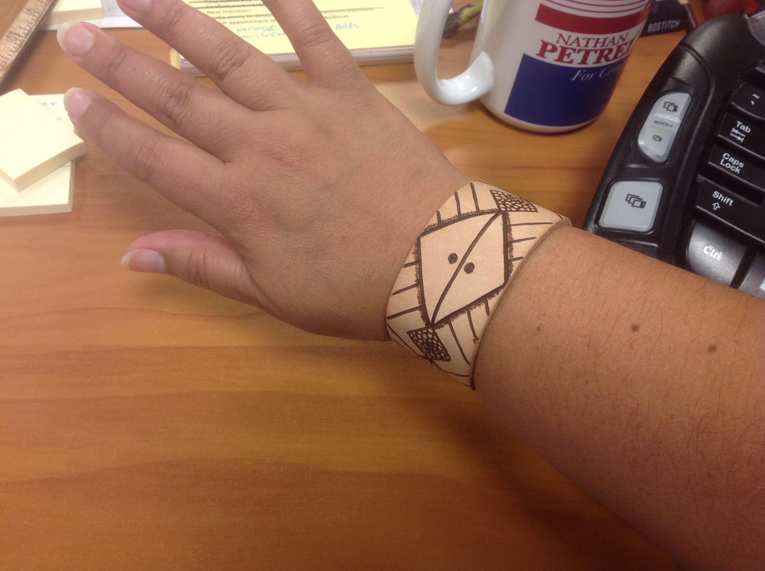
It wears well. And yeah, that’s a Nathan Petrelli mug from the first time Heroes ran and Nathan ran for office.
So I think I’m back to doing the work. We’ll see. I have a lot of things to work on. OH! And Deveon got me a real deer skull! So I can make a sugar skull for real!
My teacher says I need to wear a mask, that inhaling burning bone is really bad. ON IT.
I called the post that because my first thought was, “I bet you wonder where I’ve been…” And the truth is, there has been quite a bit of soul searching going on. My shamanic training has kept me very busy…and when things start happening that haven’t happened to you before that you never really pictured being a part of your life…it’s a little disorienting. It’s starting to ramp up, too, so I kind of have to roll with it or bail, and I’m trying to learn how to roll with it. (I have a Dreamwidth account where I track that stuff, and it’s mostly public. It’s under Mowglikat, and the tag is “Shamanigans” if you’re interested in stuff like that).
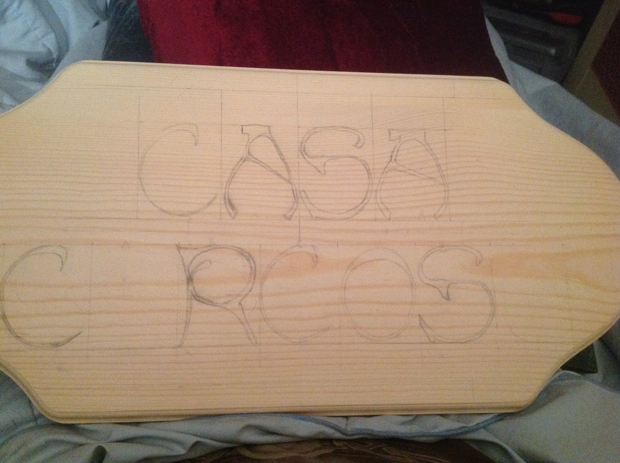
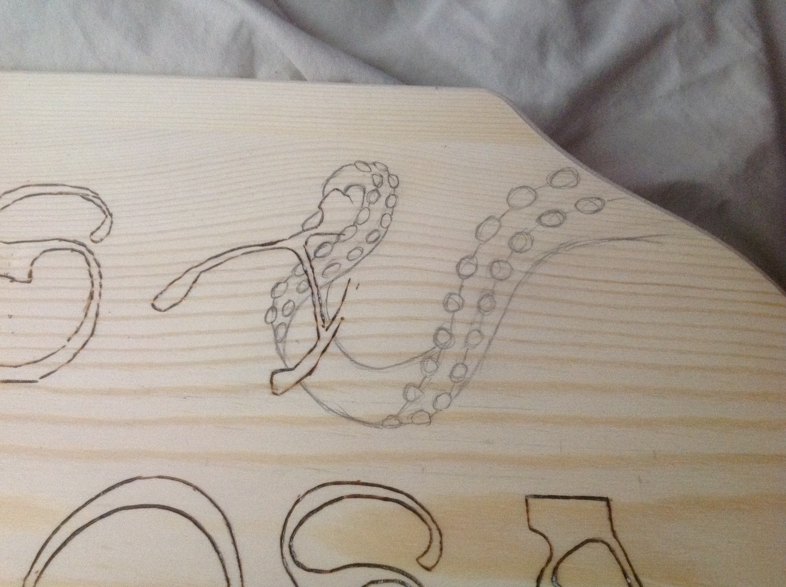
original draft for Casa Carcosa sign
The piece I’ve had on hold all this time is this sign. It’s kind of been the bane of my existence, and it caused me to stop all artistic work and believe I have no talent and will never be a good burner.
There are several reasons for this, starting with the basic design. Carcosa is a game created by a good friend, Adrian Berk, and the world takes place in The Dreaming. (It’s funny how the Shamanic work makes that place so specific in my head, but that’s a digression.) The game has Lovecraftian overtones, or undertones, really, and when he and his wife bought their first house, my husband immediately started calling it Casa Carcosa, and the name stuck. I thought it would be neat to have a sign which reflected the world, but still named their house, yadda yadda, and I suddenly came up with the idea of, “HEY! It could have TENTACLES! And the tentacles could make the letters! (Way too difficult) Or maybe bordering the sign! (Better, but boring, and kind of dead) Or interacting with the letters! (Yes! Great idea! Much more ominous and alive! Love it!)
Wait….How do i draw a tentacle? It’s not as simple as it sounds. In order to give it movement and life, it has to simultaneously imply strength and delicacy and fluidity. It’s more than just shape….it’s implications BEHIND the shape. So I started researching tentacles, tentacle art, tentacle photos, and I confess a little Hentai, because I always wondered what it was and because the anime style of art should bring the drawing down to very simple lines, which would be helpful.
(side note: I’ve come to the conclusion that men who are fans of hentai just probably feel like they don’t have enough penises. Not that there’s anything wrong with that….just…just make sure you learn how to handle the one you’ve already got, okay? Too many guys don’t. Don’t be that guy.)
So anyway, I eventually settled on using photographs as a base for the tentacles, and I wanted them to be grabbing the letters off the sign. So that first image above was before I figured out how I was going to do that.
Eventually I figured out they would actually be plucking the letters, which was the idea I wanted, but it caused a couple of different problems.
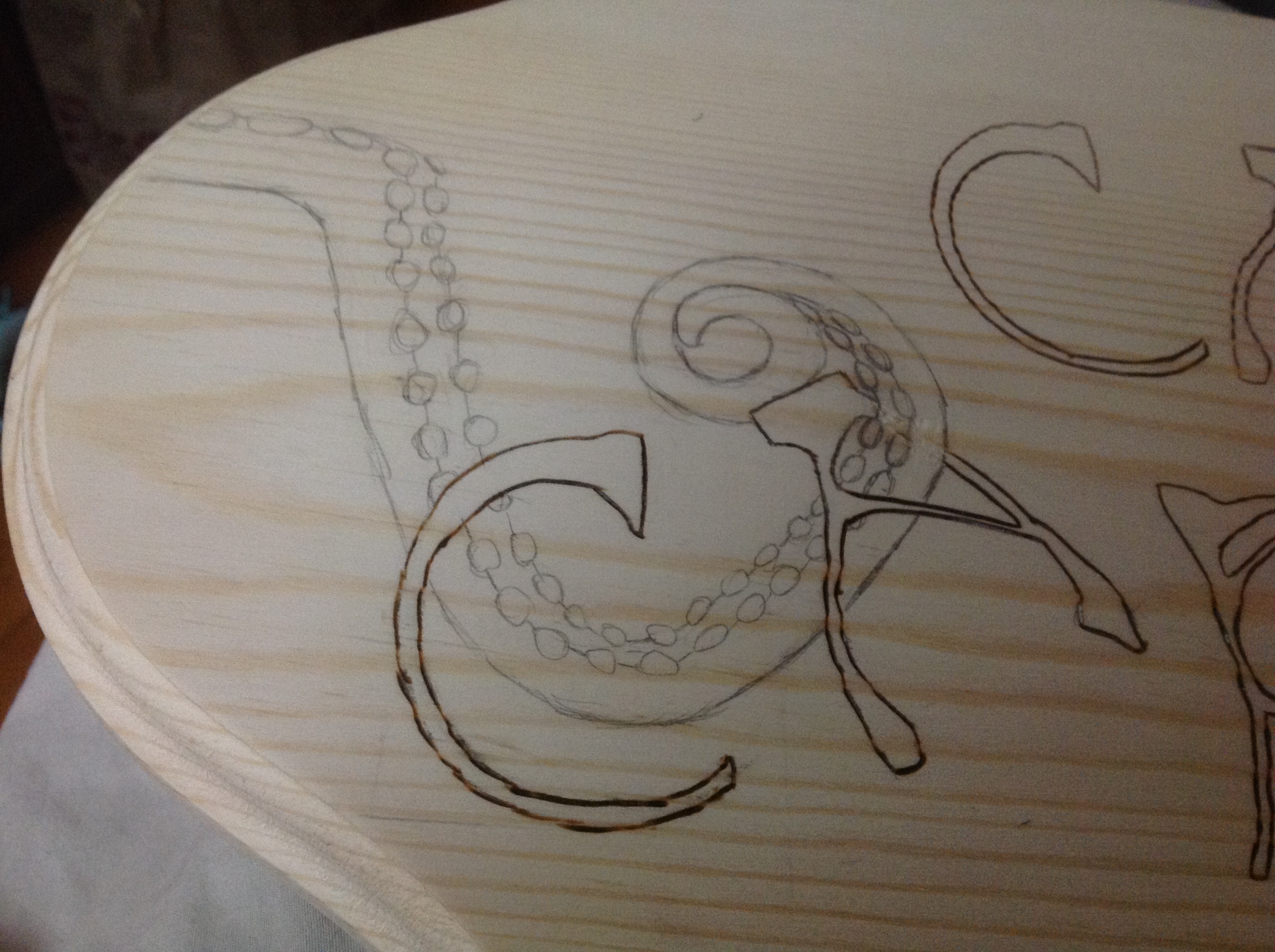
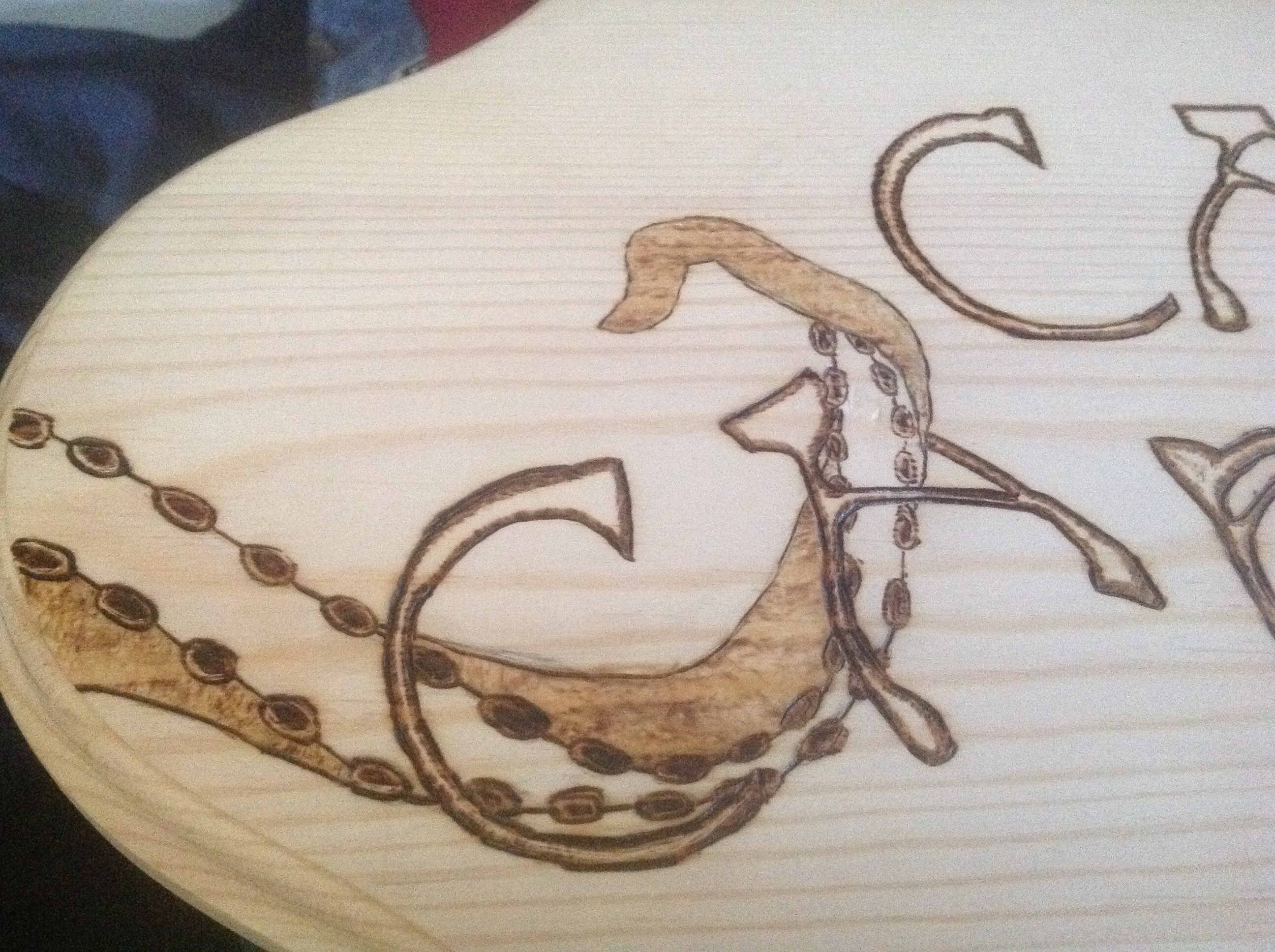
The problem is where the tentacle overlaps the “A”
See, I burned the letter. And then I became REALLY unhappy with that tentacle. It was too wispy, too delicate, not muscular enough. That became compounded by the second tentacle, which came out awesome.
Very happy with the feel of it
So when I went to sand up the tentacle on the left to do it over, some of the letter was already seriously deeply burned into the wood, and in order to get it out, I had to gouge the wood a little bit, which makes burning difficult, and finishing/staining awkward.
PLUS I couldn’t figure out how to fix the damn tentacle, because nothing looked right. I eventually settled on this design, which looked angular and fake, but came from a totally legit photo of an octopus.
I put this whole sign on hold for months. In fact, for so long that I thought I might never burn again because I just sucked. Then I was like, “I can’t let this thing get the better of me. In all the work I’ve done, every time I come up against something like this I put it down for a while, and when I come back I learn something completely new that really adds to my skill base. Let me get back in gear.” So I did.
Totally legit. Swearsies.
As you can see I’ve done some of the shading by now. I also made the mistake of doing the suckers first and starting on the left…so I figured I’d shade them and then make the darker center. When I did the right side, I did the darker center first, and it looked MUCH better with NO shading. So I had to sand up some of the work on the left to readdress it, AND I used a Dremel to sand out some of the gouging by the letter A on the left.
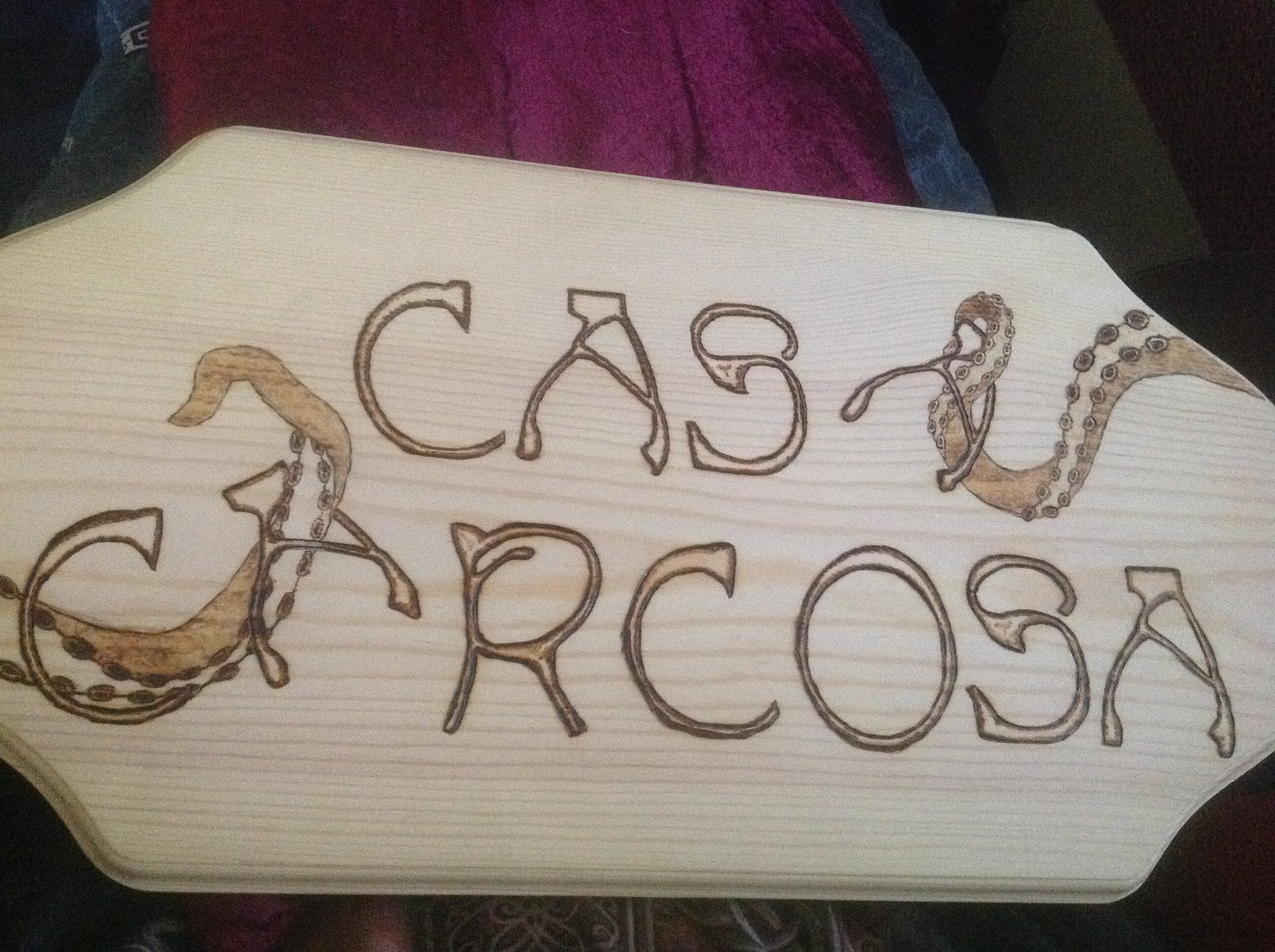
Sign for Casa Carcosa
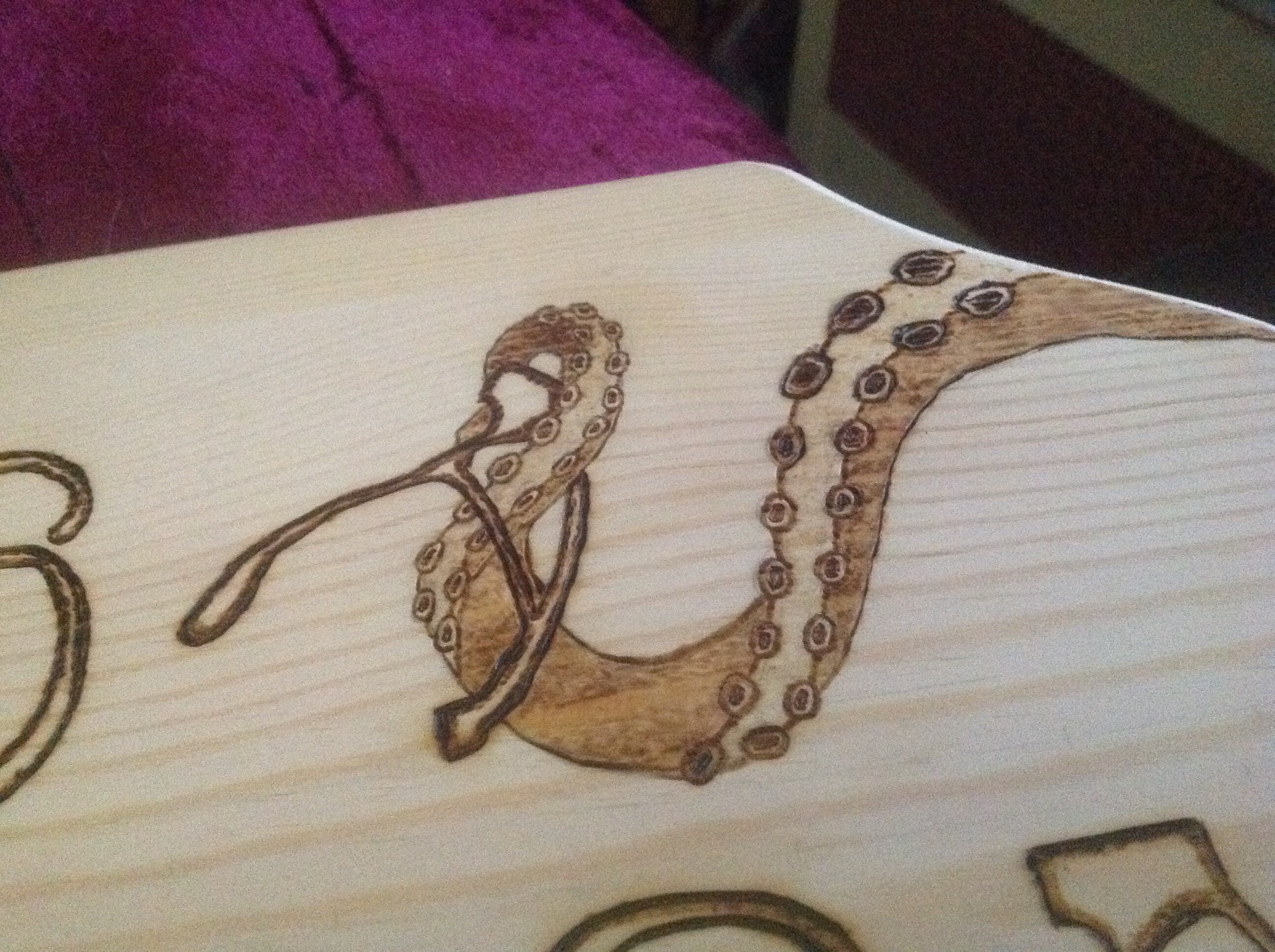
And here’s the tentacle on the right, which looks FAR superior to the tentacle on the left.
Boss Tentacle.
The grain is fighting me kind of hard on this one too. You can’t tell, because I’ve spent extensive time trying to even out the burn, but if you’re looking for it you can see it in the shaded bits. That’s just going to have to be more time, there’s no way around that.
So now that I’ve got the basic concept down, I need to 3-d it up a bit. I’m debating whether the letters should have shadows or not, I haven’t decided. But the tentacles definitely need it, and each individual sucker is going to need some work to make it pop.
But I like it, at least. And it’s not telling me I suck anymore. So that’s an improvement.