I was approached by a friend who is married to a woman who does healing work, and who works extensively with Angel energy. He wanted to get her a box for her tools, and to burn something on it for her, preferably something angelic. I loved listening to him speak about her, he loves and respects her so much, and there’s something beautiful that happens to a man’s face when he speaks about his partner that he is proud of and loves. It lights them up in this lovely way.
So he chose this box and had it shipped to me. I prefer this now, that way the purchaser knows EXACTLY what they’re getting, and I don’t have to include the cost of materials into the work. It was a nice size box, thick like a small suitcase, and the size of a large purse or a small attache case.
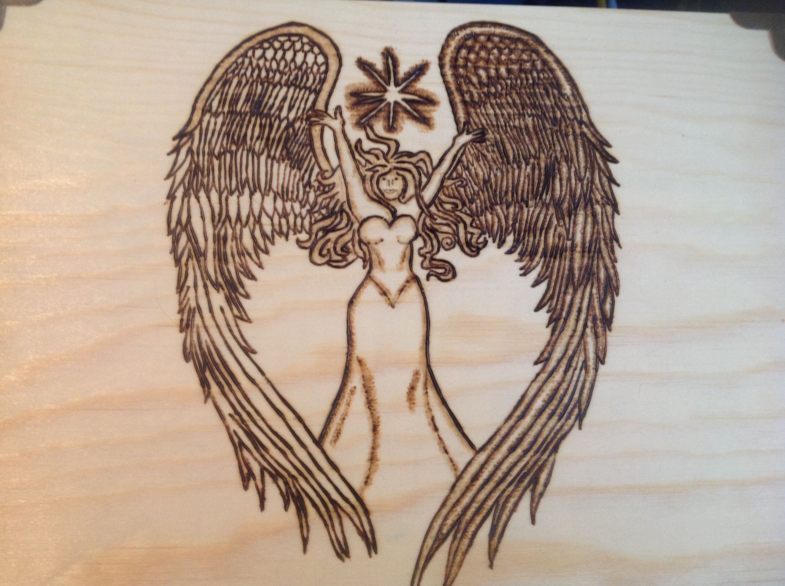
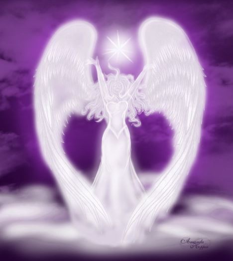
He found an image he liked, and we discussed adjustment of it. With the size of the box, I thought having the wings spread across the box would be a nice image. He liked her wings in the shape of a heart, so we kept it that way.
I contacted the artist, Amanda Hopper, and asked her if it would be alright to use her image. She gave me permission, and I want to make sure you can find her if you want something. So here is her contact information. It is also on the “Links” page.
Amanda is available for commissions, and has an Etsy shop, so check out her links at:
Deviant Art Page: http://sapphireiceangel.deviantart.com/
Etsy Page: https://www.etsy.com/shop/SapphiresDesigns?ref=hdr_shop_menu
FB: Amanda Hopper
The first draft of the burn came out like this.
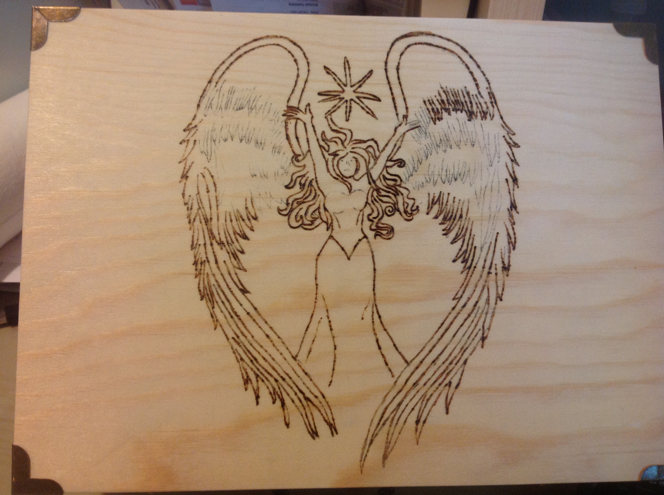
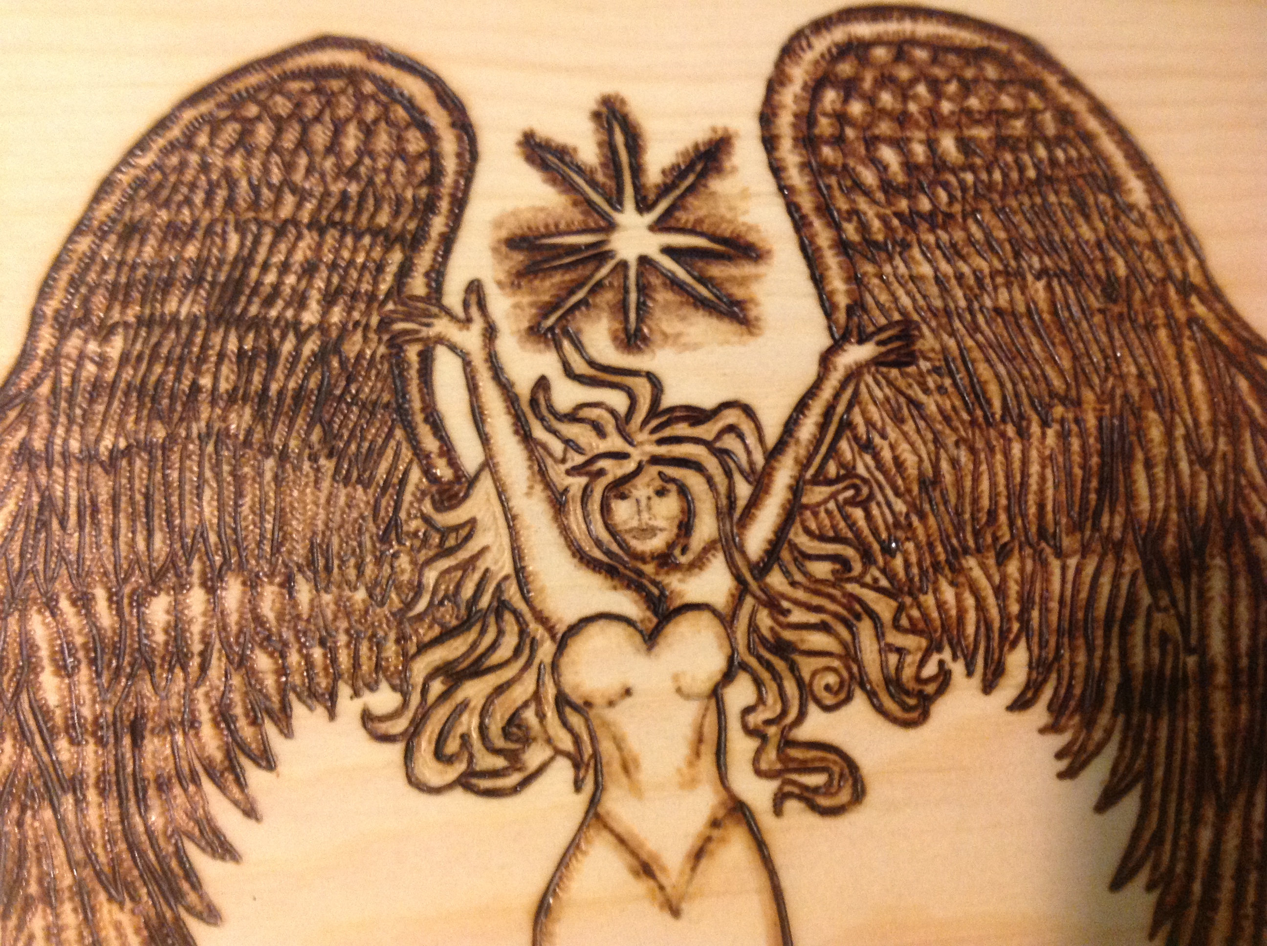
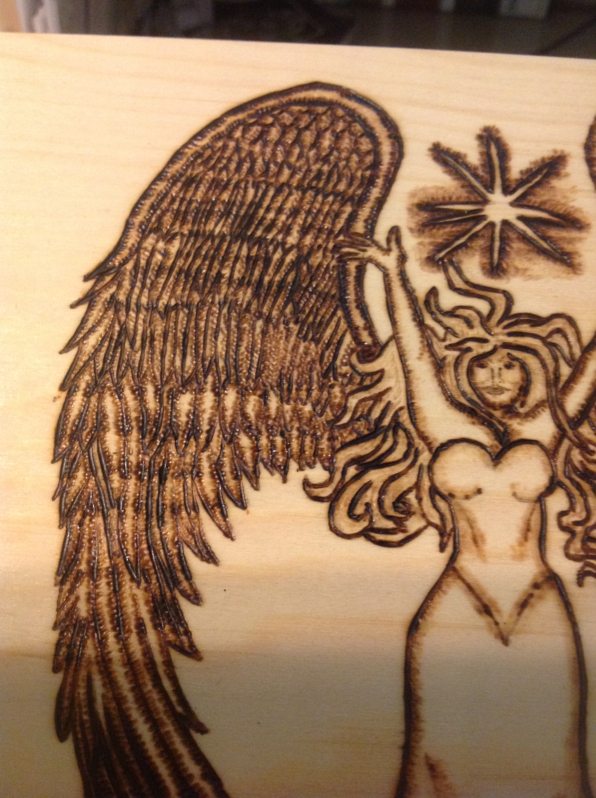
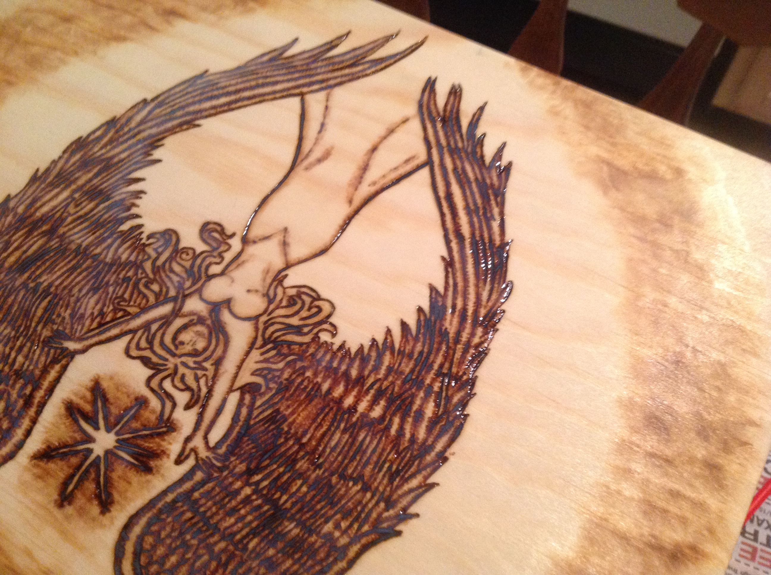
I wasn’t quite happy with this…I wanted more detail on the wings, for one thing, and I also knew that some shading on the body could make or break it. The face was going to be difficult too…it was small compared to the rest of the image, and getting fine details like lips or eyes was going to be difficult even with a needle-size burner. I placed the eyes, and figured I’d work with it as I got to it.
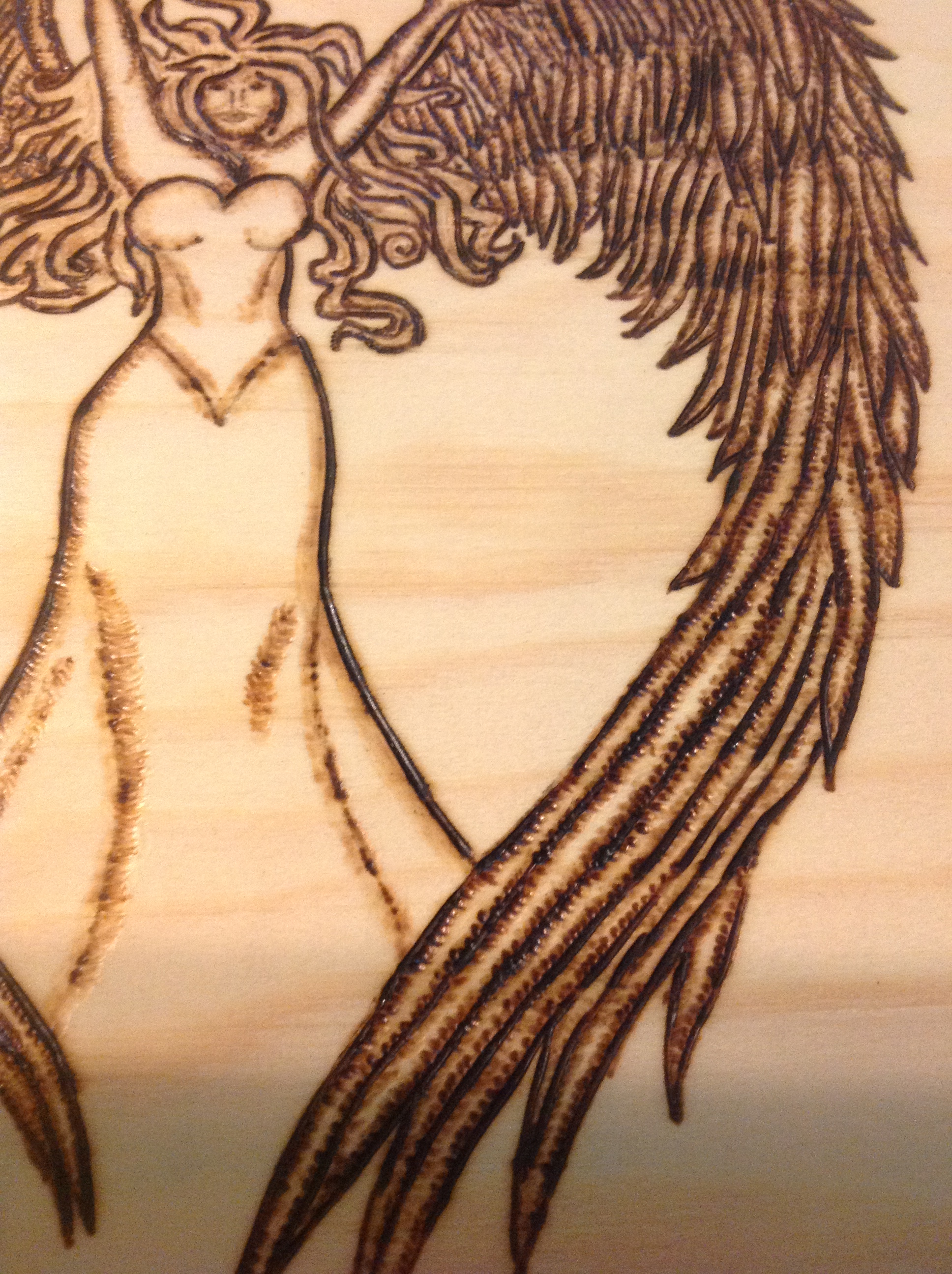
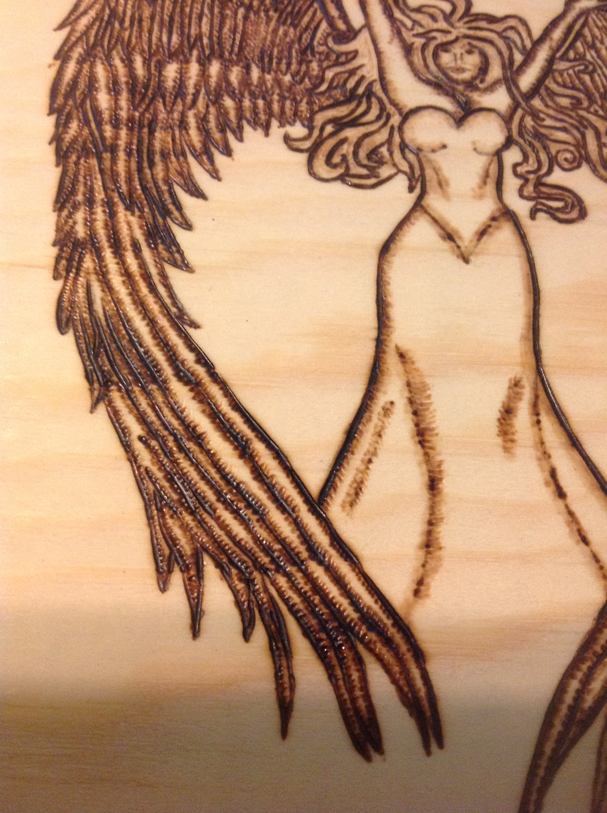
Meanwhile, I worked on the wings to separate the feathers and get them a little more detailed. I looked at several images of real wings and illustrated wings to figure out the transition for the size of the feathers from the top to the bottom. I was pretty happy with the result.
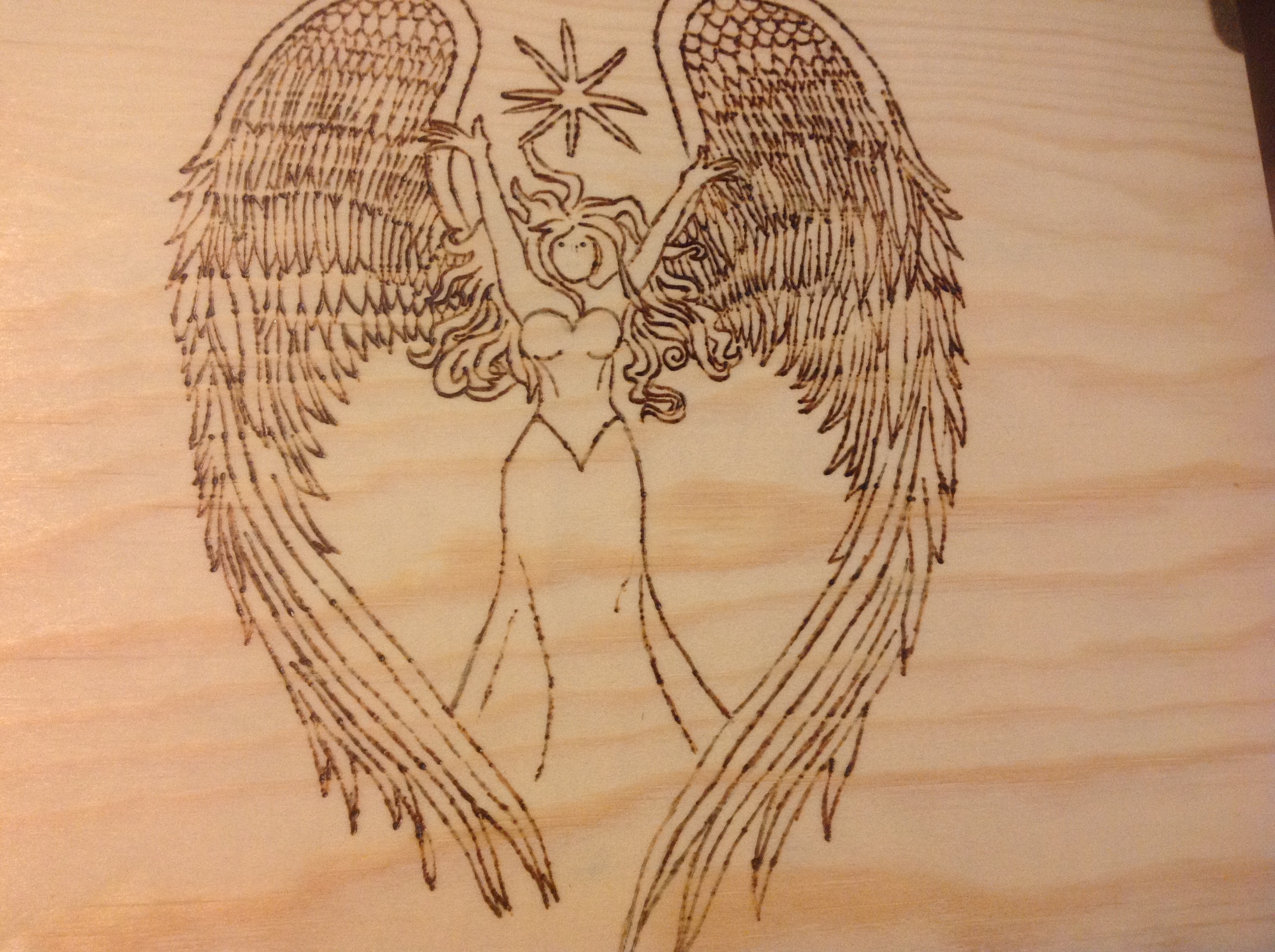
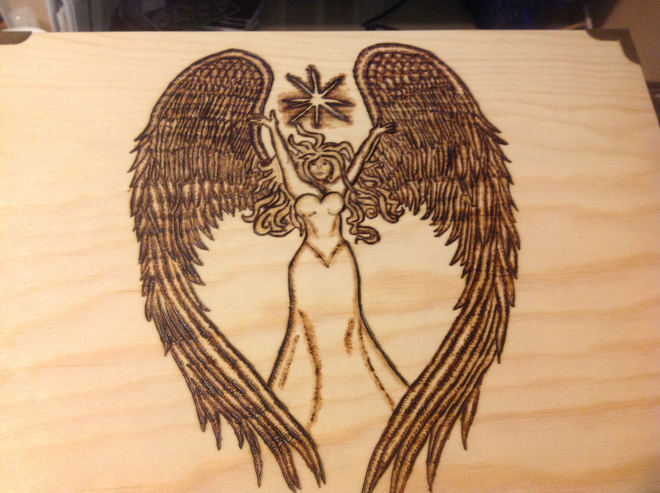
So we did a quick check in to make sure things were moving smoothly. He was pleased, so I deepened the burn.
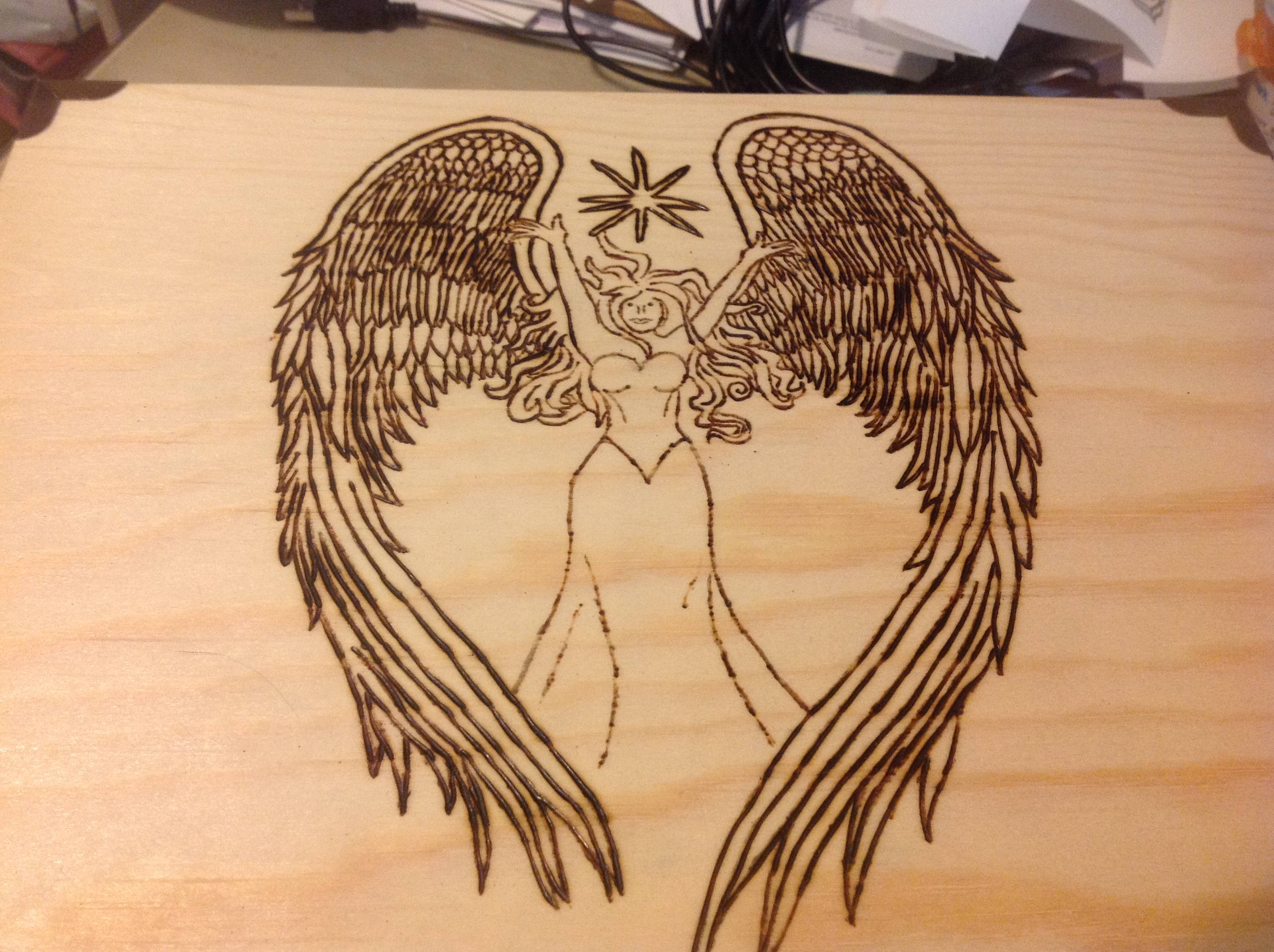
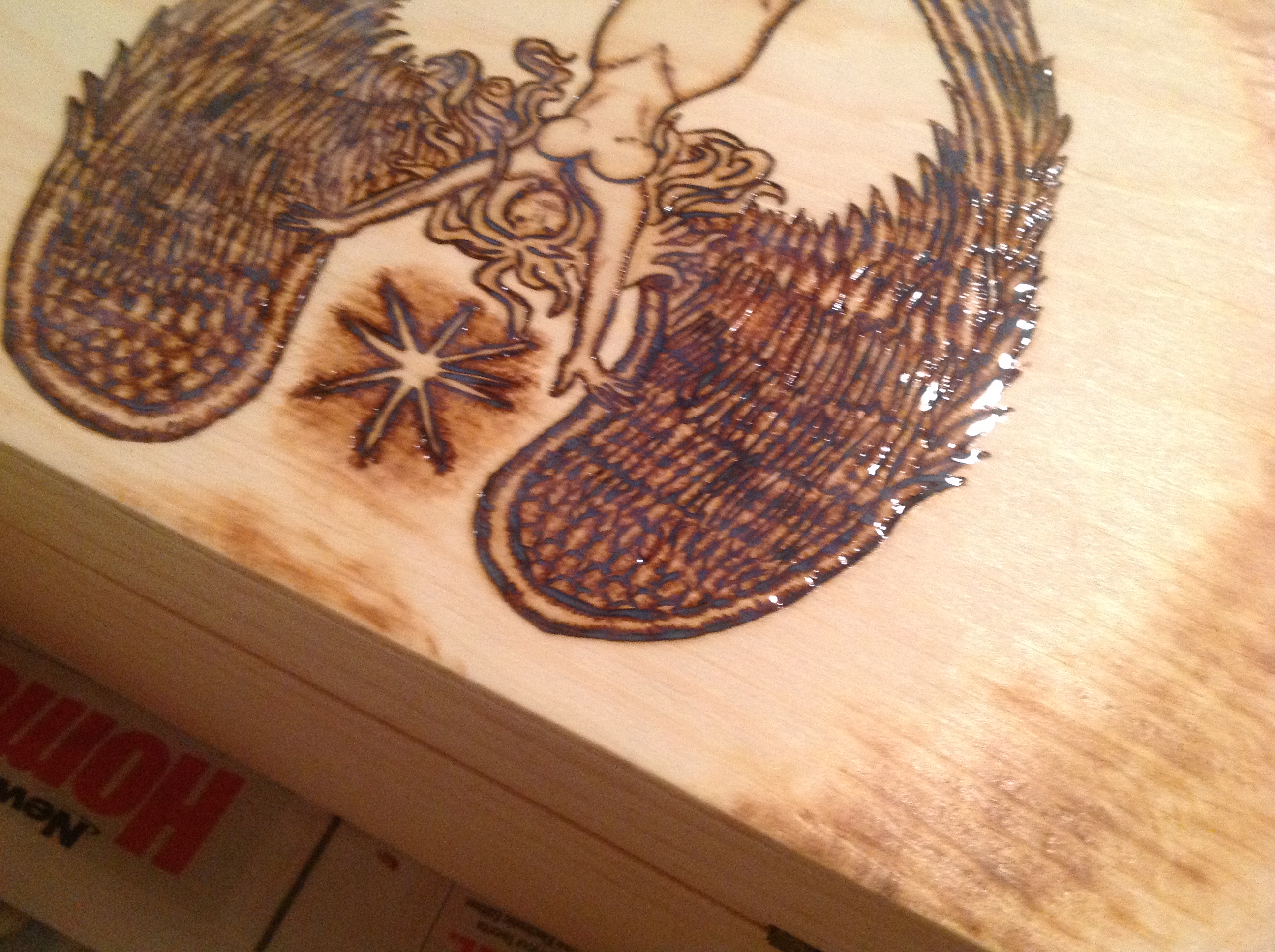
I then decided that this wasn’t good enough. I needed to work with each individual feather to get that feathery feel. And of course, I needed to work with her body and get some shading in. It was also time to start working with the shadows. I figured I’d test around the star first, to see how the wood would take it, and to figure out the temperature I’d need for smokey-aura-type stuff.
Alrightey then. Time to commit and get to the finer details.
And I sent him a full shot so he could see where we were at.
We discussed adding a kind of halo-ish ring around her, so I did it. The wood proved to be difficult at this point…the grain wasn’t consistent, so some areas gave me this lovely kind of cloudy look, and other parts the grain was very tight, and burned before the flat of the wood. I wanted a consistent fade, and the wood just wasn’t working with me on that. I wasn’t sure if that was a positive or a negative thing…should I let it show the grain in a natural way? Should I force the burn darker next to the grain so that it looked more controlled? I wasn’t sure.
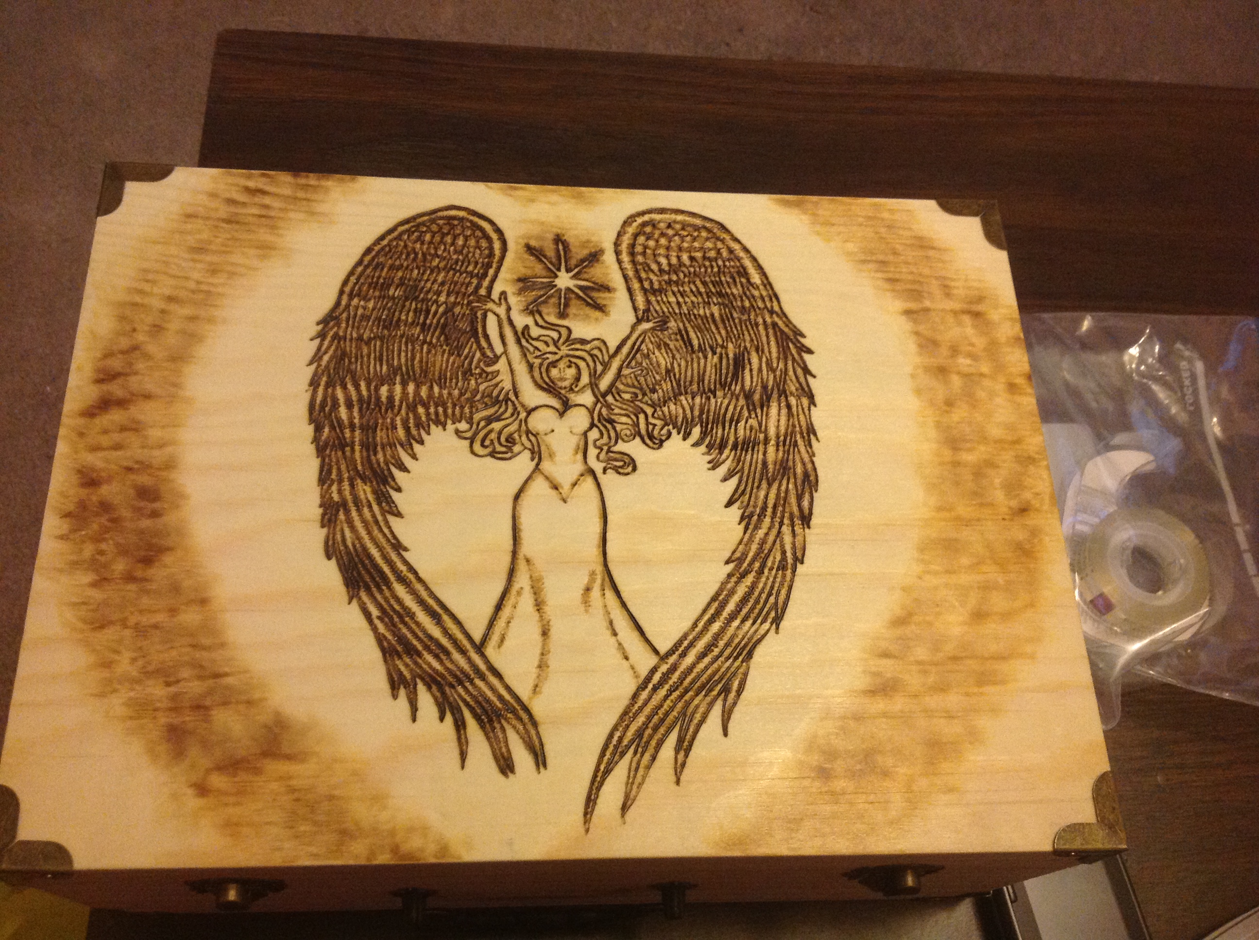
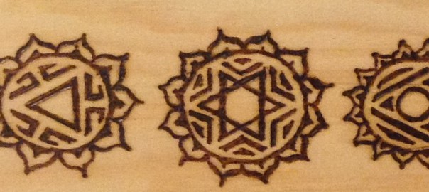
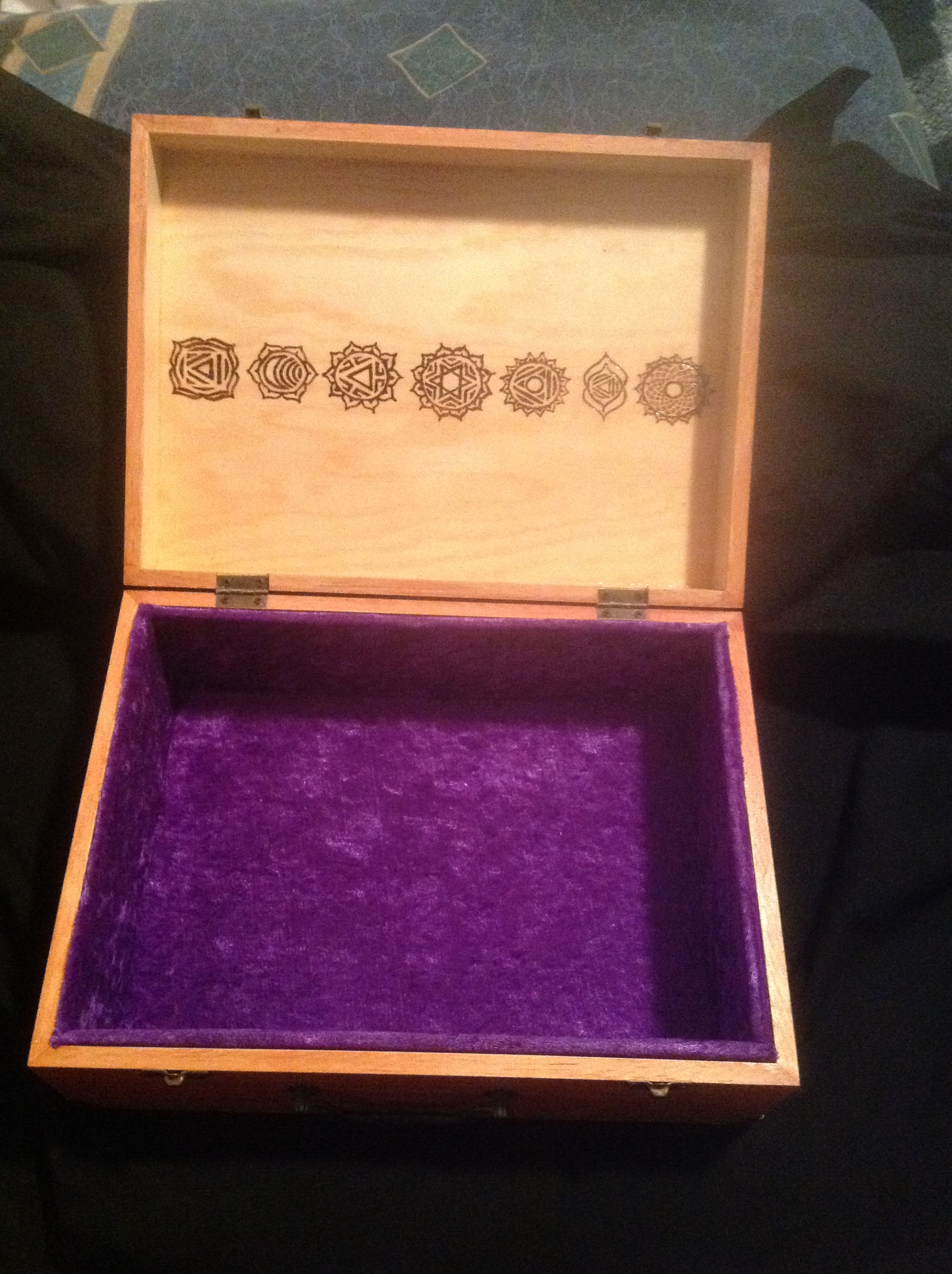
I decided to work just with the spots that were glaringly difficult, and let the natural grain show through on the rest. Oh yes, and meanwhile, I forgot to mention the INSIDE of the box. He had asked for the traditional chakra symbols on the inside of the lid. I’ve given some closeups and a final group shot here.
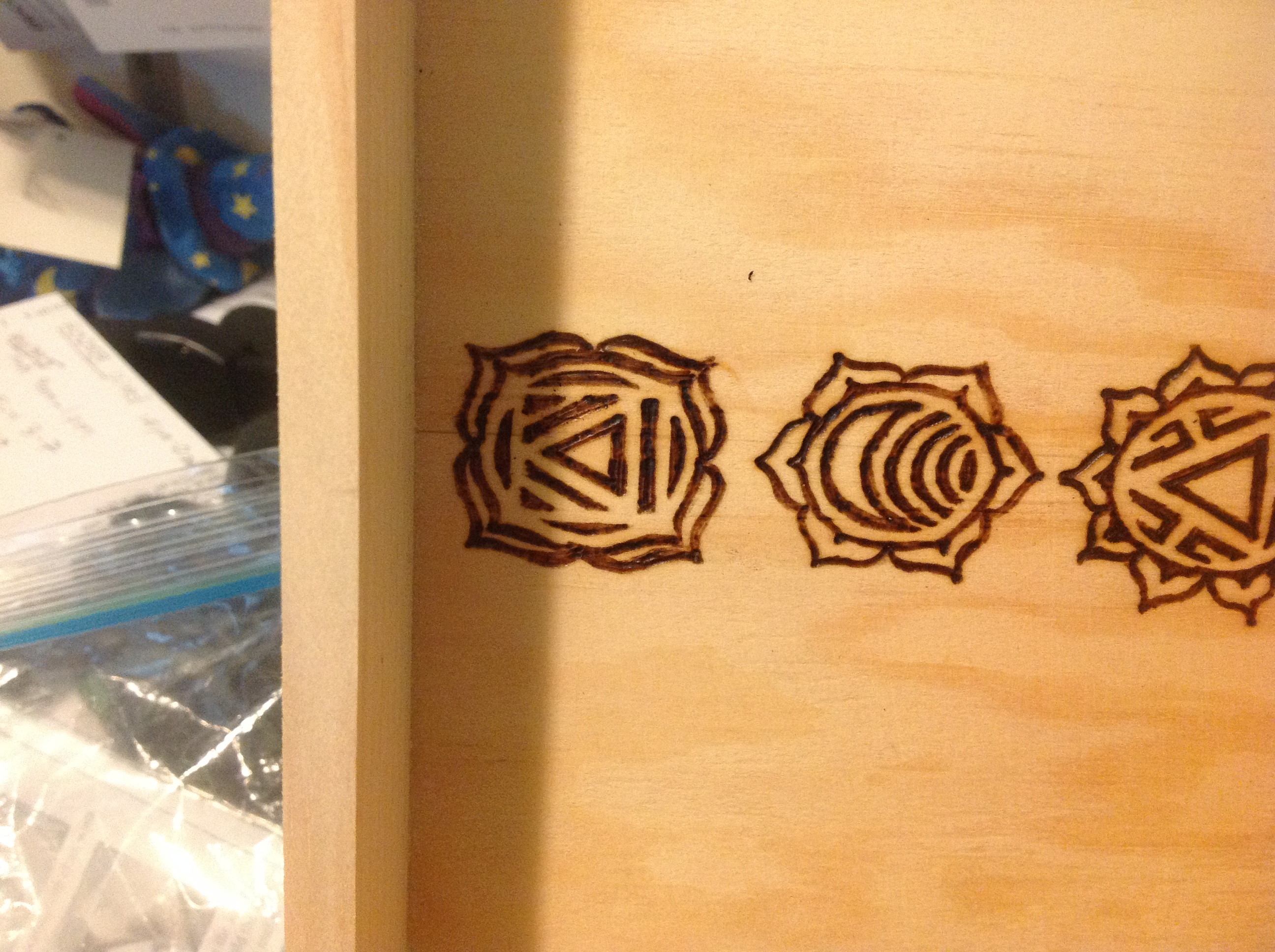
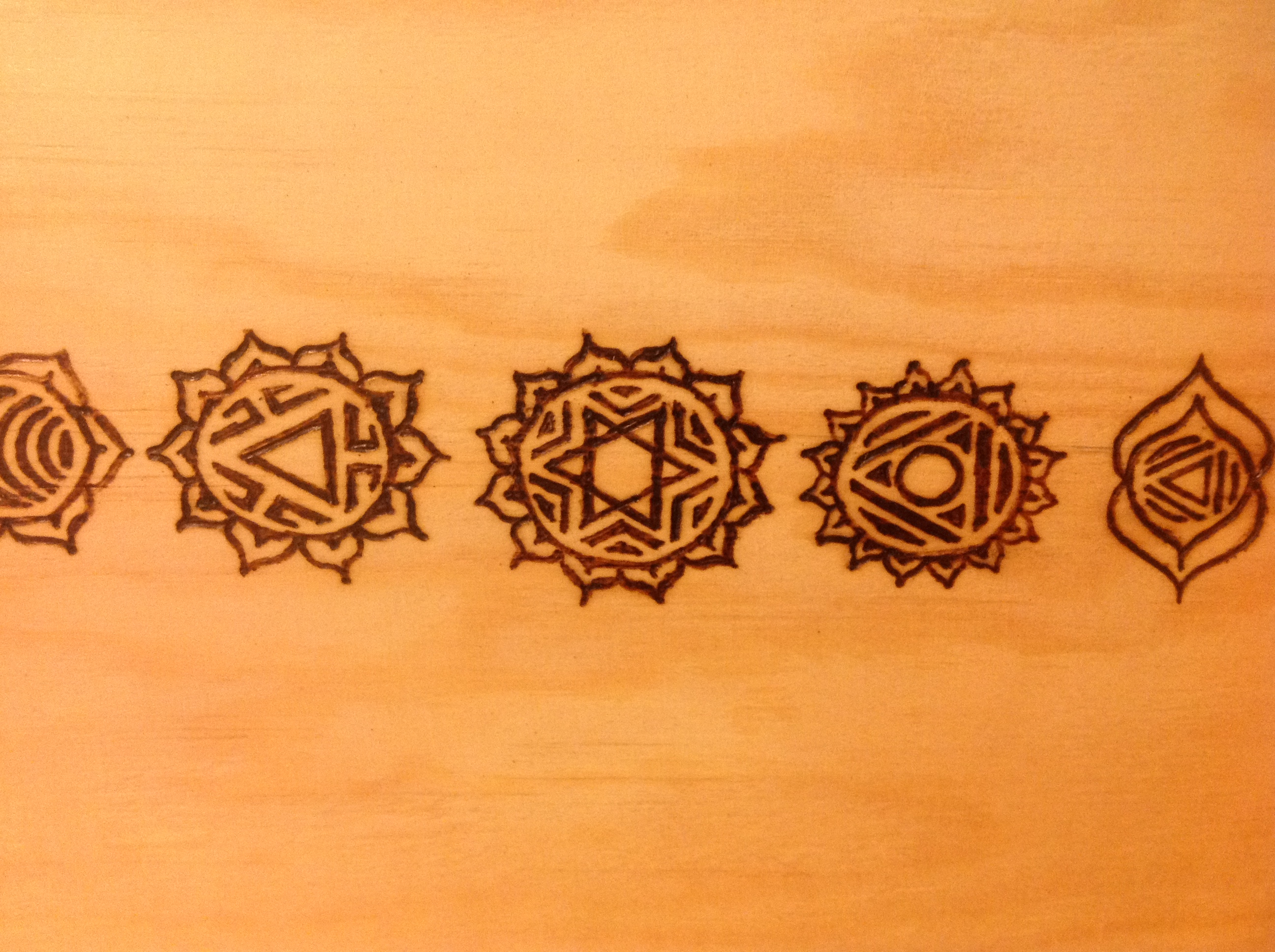
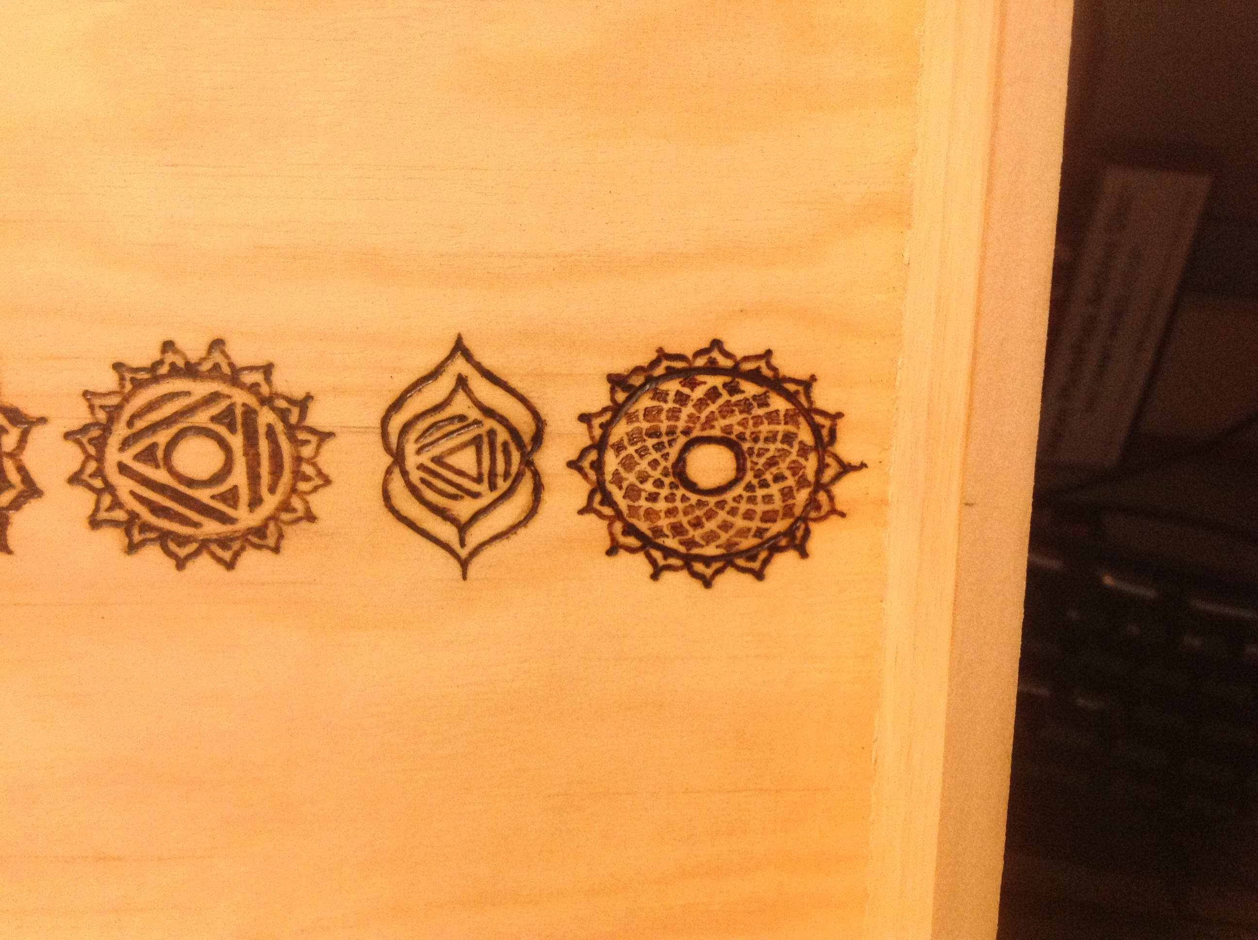
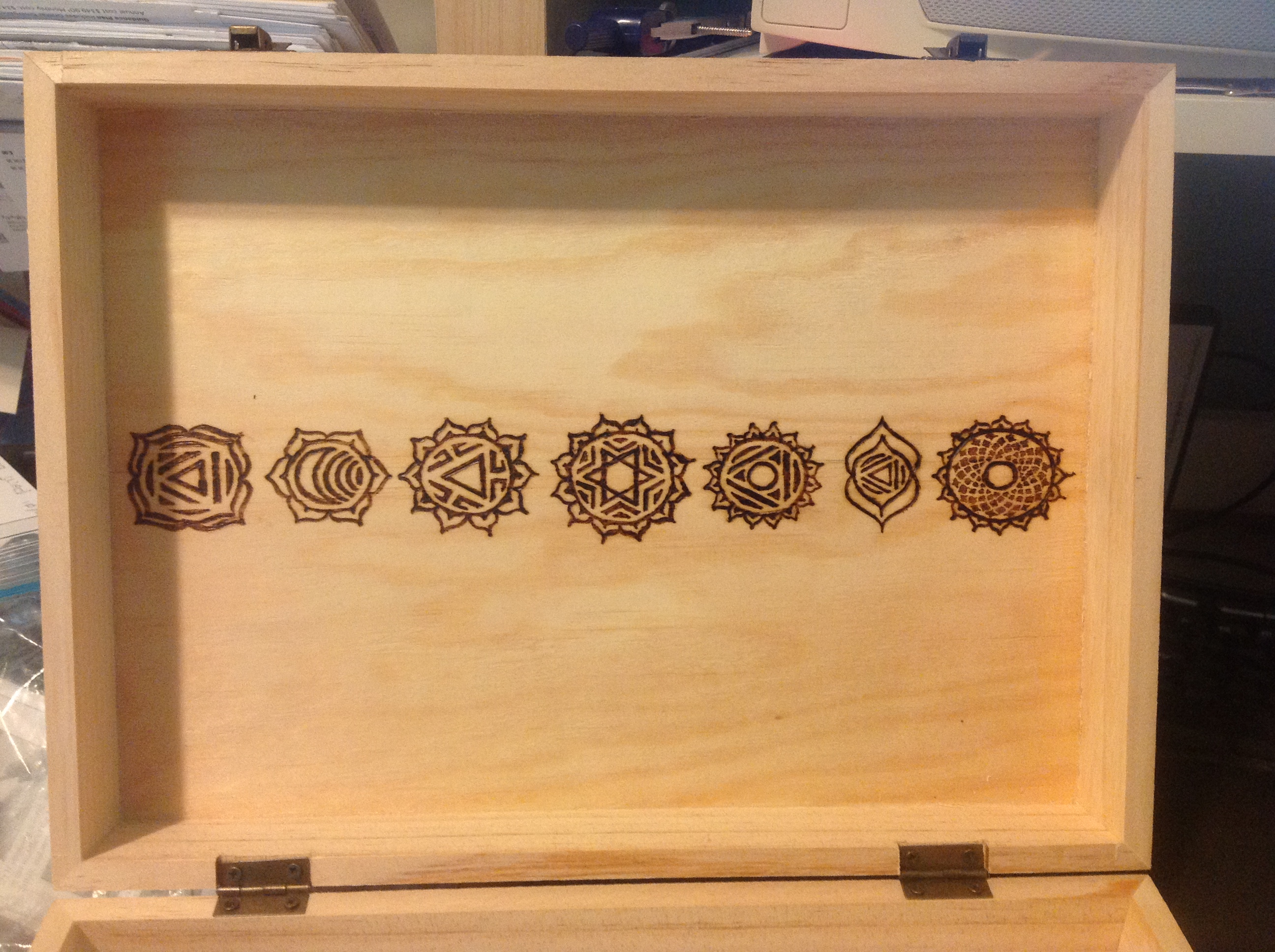
I asked him if he wanted me to use the ink to dye the chakras the specific colors, and he said no. All good. I knew the Angel was done at this point, and started varnishing just her. That way, when we stained the box, she wouldn’t take any color at all, and would stay just the way she is. This kind of work needs to be done with a small paintbrush to get right into the corners of the burn without going over the edge.
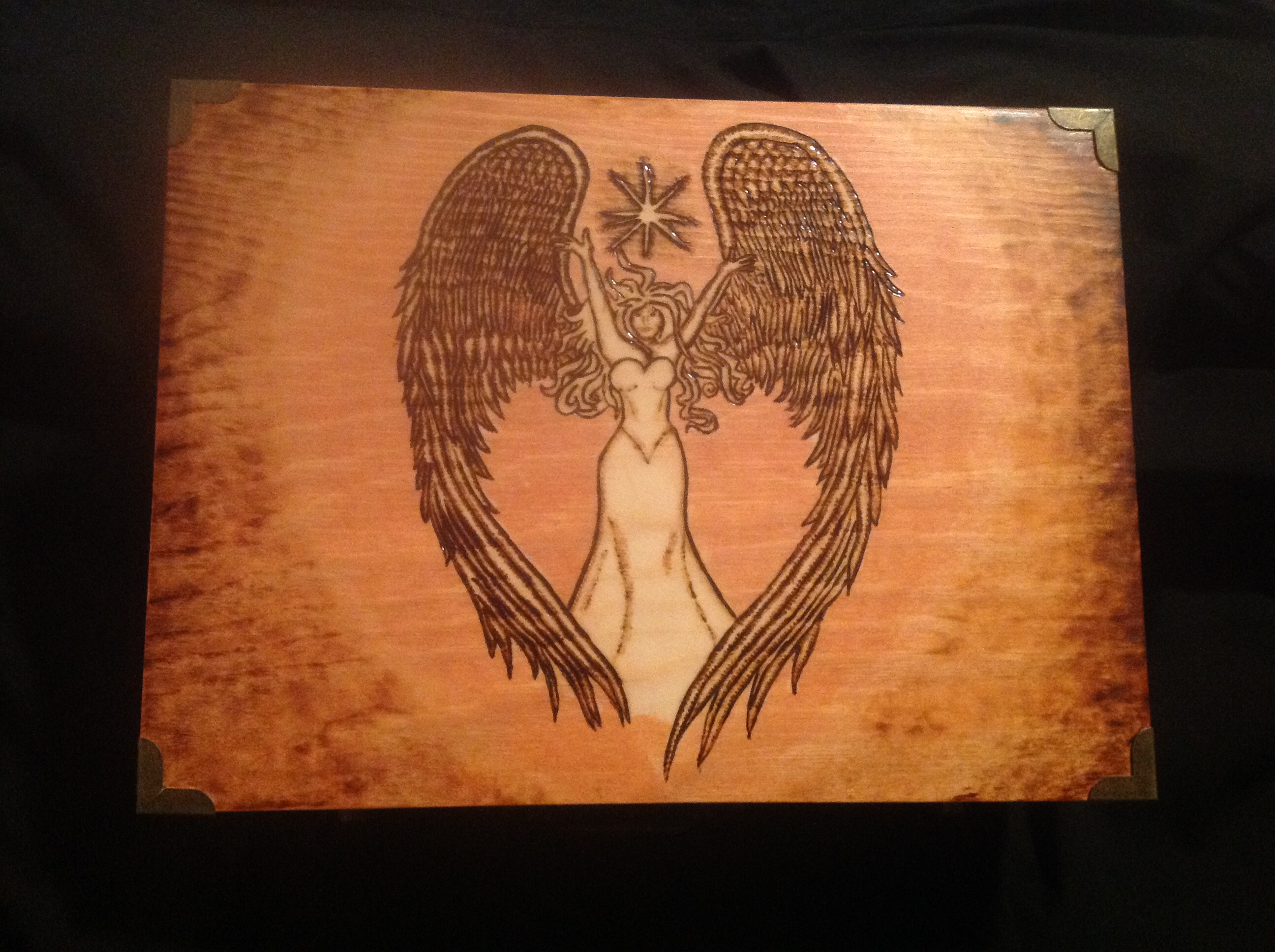
Then he said we should take the halo out to the edges of the box. Originally we had decided against that, because the sides of the box weren’t going to be burned, and we didn’t want them to look “unfinished” somehow. But I liked the idea. I have to say, it was a perfect choice.
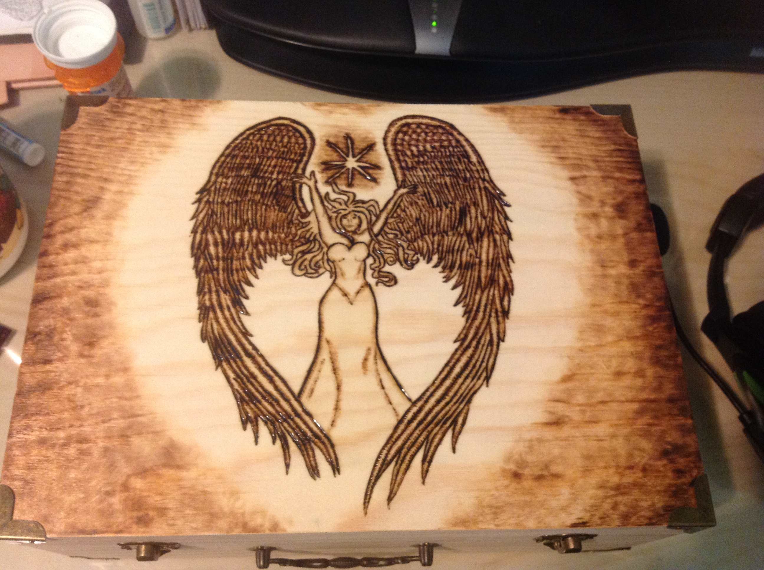
I think it also resolves the issue I was having with the grain. She looks beautiful, I have to say.
We’ve chosen the purple crushed velvet for the lining. And now we just have to discuss staining.
Part of the issue with staining is that burned wood doesn’t take the stain in the same way. It’s like burning the wood seals the capillaries, and it just doesn’t absorb in the same way. I have to burn a sample on a scrap piece of wood and see how the halo will take it. Also, there’s the choice of stains. He thinks cherry, I’m thinking golden oak. But customer is always right. I’ll be talking to him soon to nail it down. At this moment it is July 6th, 2015, so it won’t be long now.
…..
So it’s now October 2nd. The box was finished, stained, and delivered in early September, but the recipient’s birthday wasn’t until late September, so I couldn’t reveal any images until then. So now, here’s the updates….
and inner lining here:
So that was the LONGEST wait I ever had for an art reveal EVAR. But I hear she loves it. So that’s an awesome reward.