I was commissioned by a friend for an anniversary gift. They’re both really big Harry Potter fans. There’s a bazillion versions of this image, right up to and including cross-stitching. Here’s a screenshot of a google image search. It’s not even a full page, just three rows.
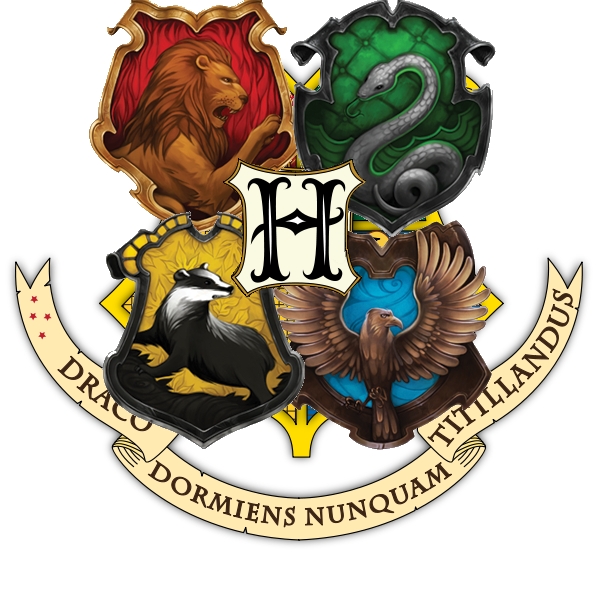
So we had to think about what we wanted. We emailed back and forth and eventually we found an image that had been used on several different media sites, and we liked the look.
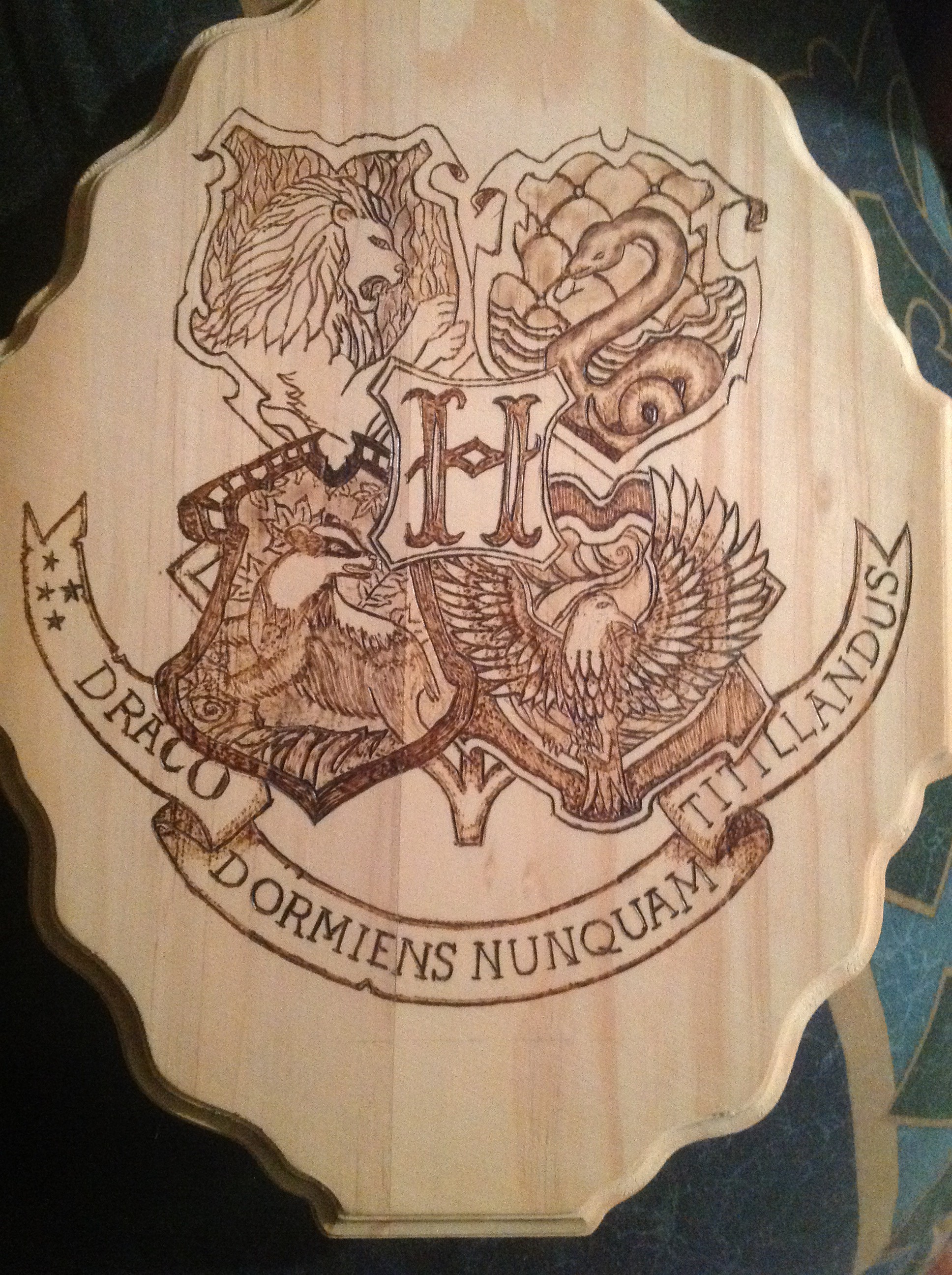
The problem was converting that to a black and white line drawing. The darks were very dark, and I didn’t realize until later all the details in the background. There’s leaves behind the badger, swirls of air behind the raven. The quilted cushioning behind the snake is clear, but I didn’t notice the detail on the flames.
So converting it to black and white wasn’t enough, because there were large splotches of black with not detail. Then I realized I could DRAW an outline, take a picture, and convert THAT. So I did.
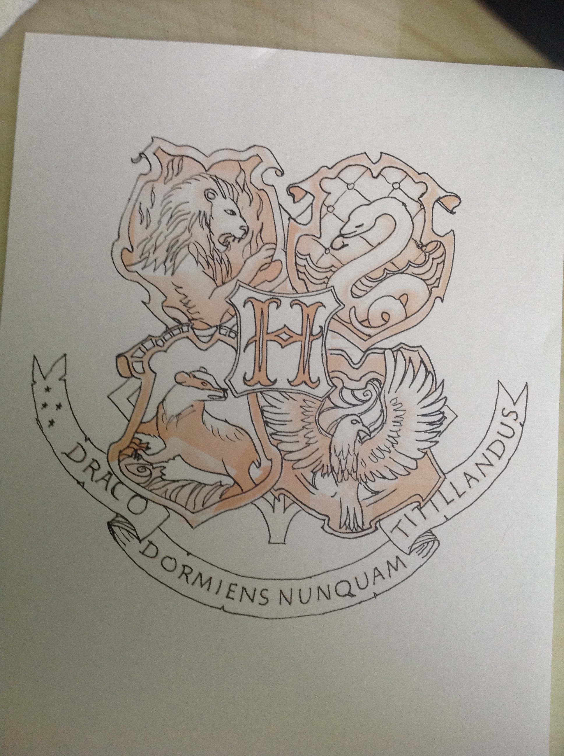
So I had printed it very very pale, and drawn with black marker whatever I could see. as you could see, it wasn’t everything. But I was able to use this .jpg to create a final image for transfer.
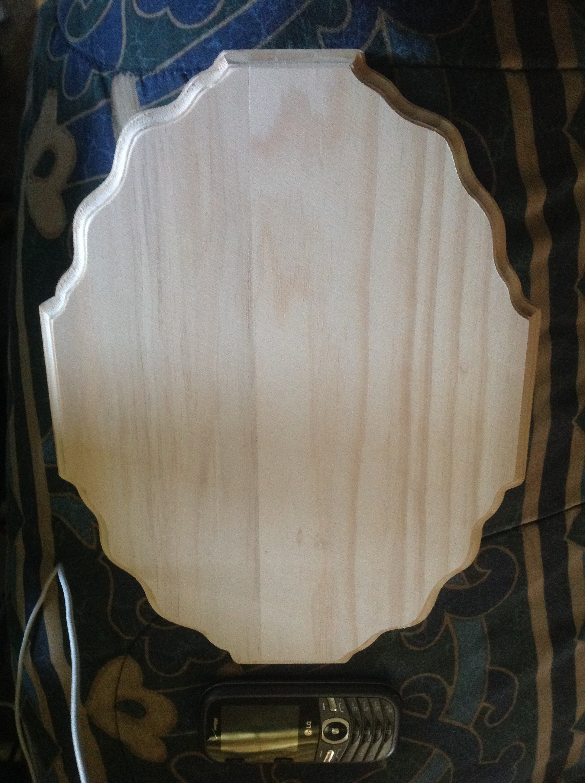
There was also a question of what we were going to burn it ON. I found a lovely plaque shaped piece in Michael’s, and I sent the image to Jon. He approved it.
So once that was all done, I was able to transfer the image onto the wood.
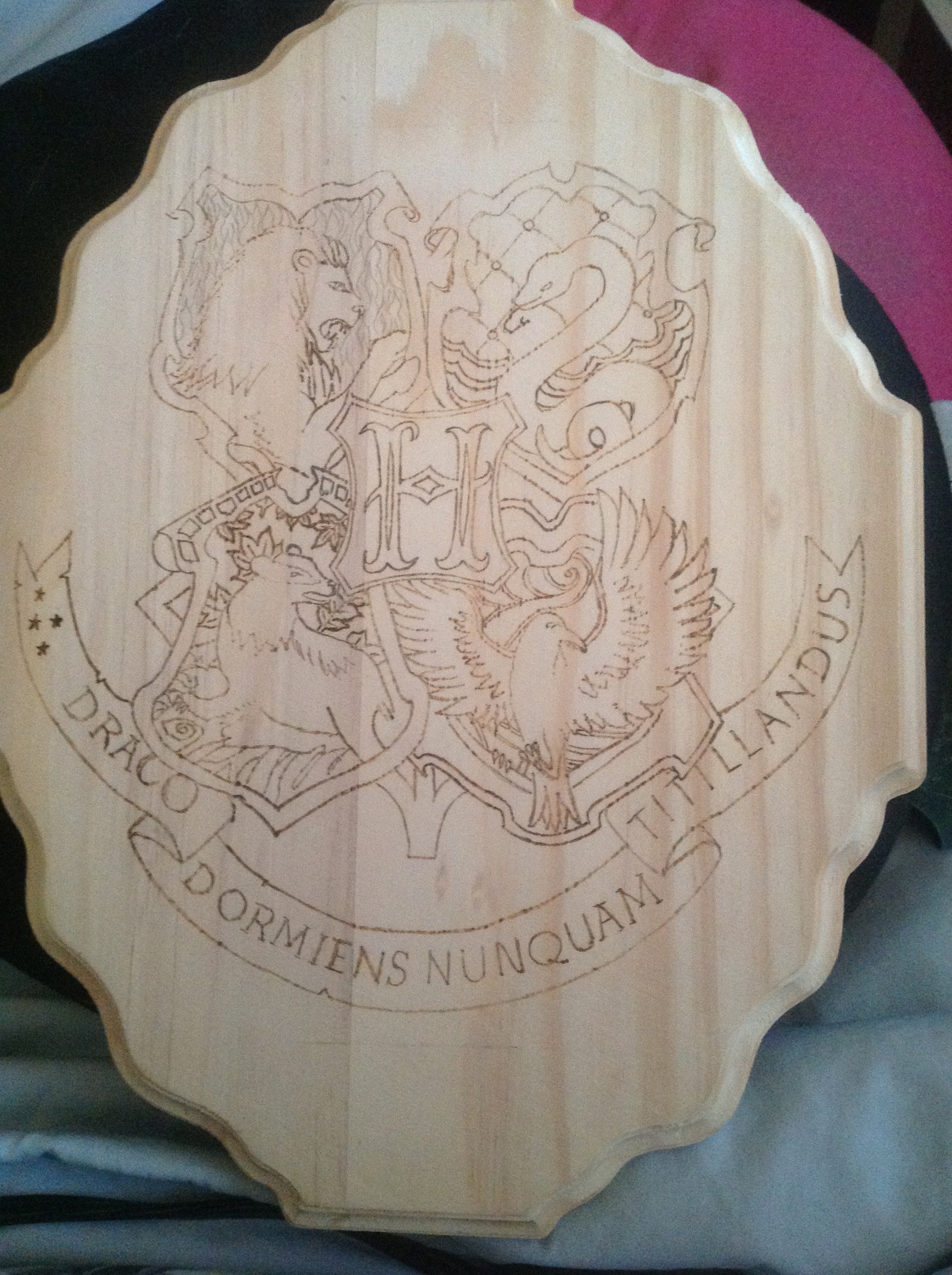
The image is unusual in that it’s wider at the top than the bottom, but the shape of the wood means I can only bring the image so low before the banner starts running off the edges. But eventually I got that straight.
When he approved it, (and he did right away, he was almost as excited as I was) I was able to start burning.
I was a little nervous about this one, because I didn’t really know where to start. There’s a lot of stuff on there. Eventually I figured the outlines of the individual crests would be a good place to start.
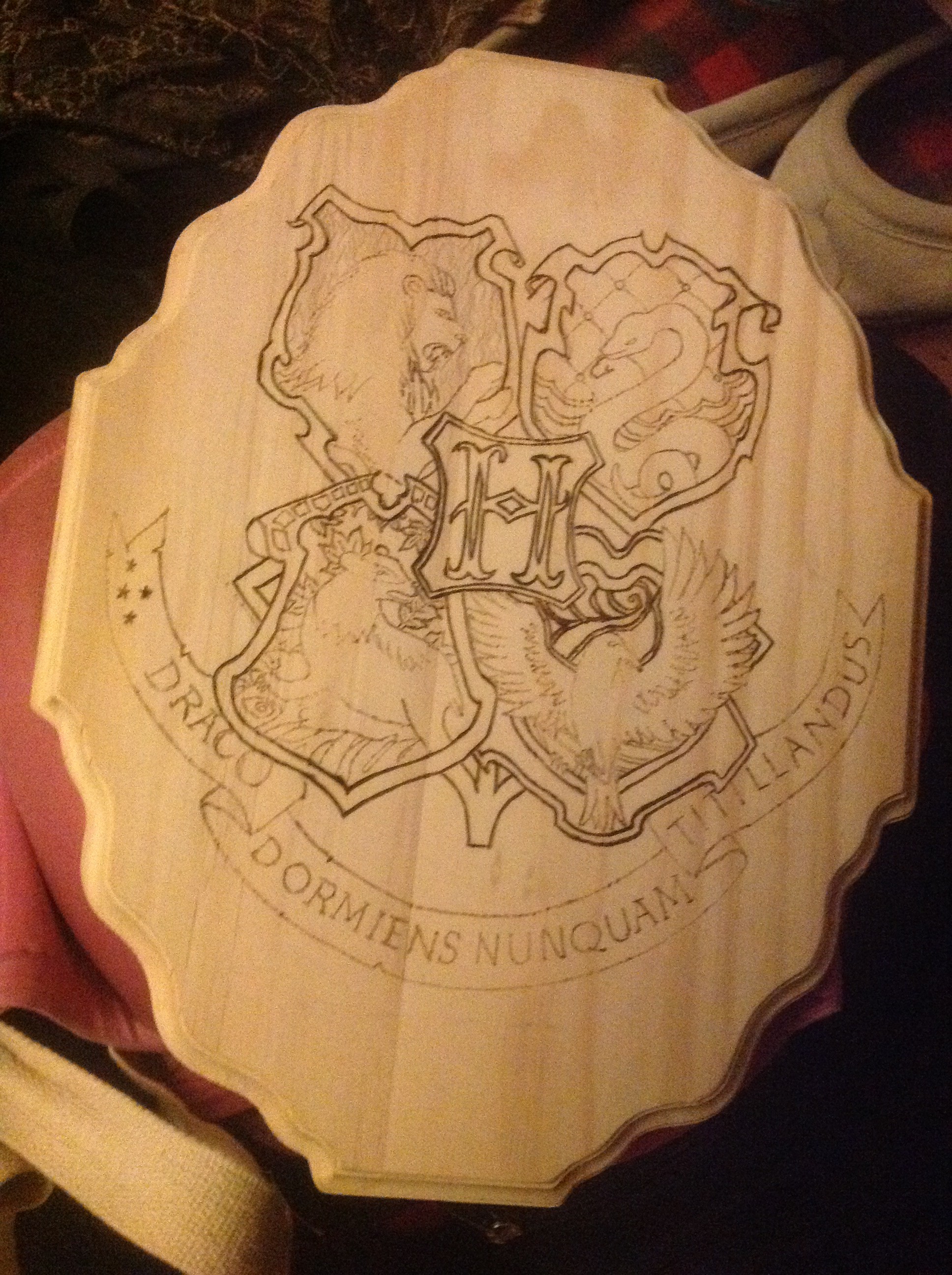
Surprisingly, it already lent an air to the piece I wasn’t expecting. Both Jon and I were very excited, and I spent all my spare time on it in the next few days.
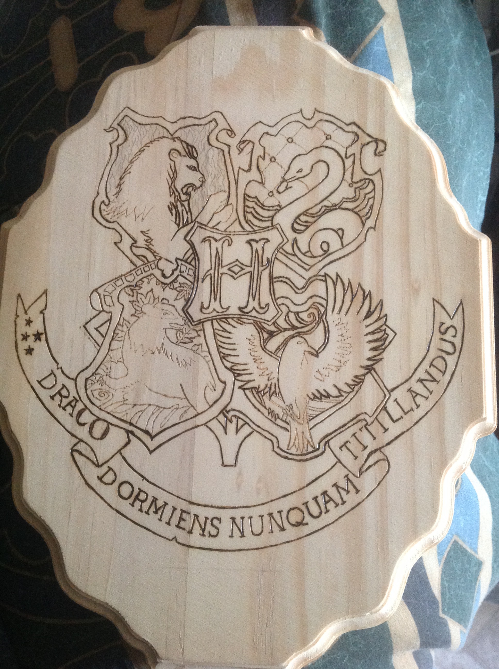
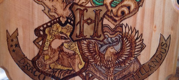
The wood was taking the burn VERY nicely…after the box I learned NO KNOTS IF POSSIBLE, (This photo shows why) and this piece was pretty pristine. There was a weirdness that runs vertically right around the Lion’s nose down in between the E and the N in Dormiens…that dark piece of the wood burned easier than the rest of the wood, so I had to be careful around there and about an inch to the left of it, but the rest of it was pretty smooth sailing.
Oh, this was coming out lovely. Jon was very excited, and at this point it was June 4th. The gift was being given at the end of July, but we live a few hours apart from each other (NY/NJ) and I was going to be in NJ over July 4th weekend, so I wanted it to be done by then. My schedule was packed (I had a lovely Shaman weekend study event called Shaman’s Quantum Universe among other things) and I was kind of stuck. I was stuck because of the flames behind the Lion, and the leaves behind the badger. How was I going to work that? I spent a couple of weeks picking it up and putting it down, trying to figure it out in my head. Plus, I really, REALLY wanted some color in it. The House colors are well known to the fandom…I had knit a scarf in Gryffindor colors for me, and in Slytherin colors for my husband…I knew the deal. I wanted something in there to authenticate it even further.
I had already learned that putting ink directly on the wood wasn’t going to work, unless I varnished those pieces separately. I had to think of something else.
I decided instead to use the flames from the ritual box as a reference for the flames behind the lion. which meant shading each individual lick of flame. I’m okay with that. It’s work, but it needs it to look right, so I’m on it.
Then I had this genius idea. What if, instead of putting the ink on the wood, I put some ink into the varnish? I was very excited about this idea. I got Jon’s blessing, and went back to work. It was now June 22nd.
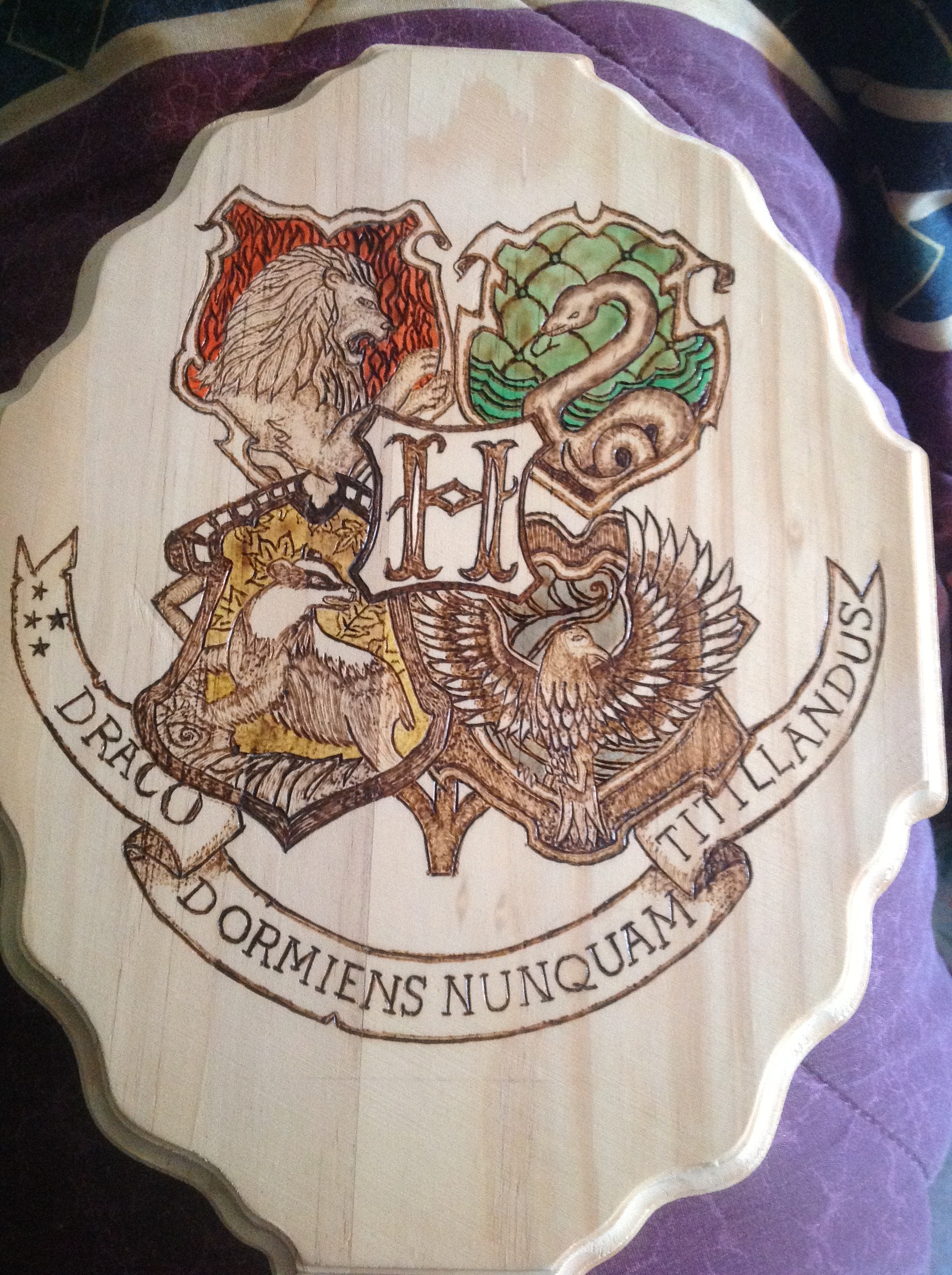
So then I learned that adding more ink does two things. First off, it waters down the varnish, which can be a problem if you don’t want it to run. But second, it does NOT change the color darker or lighter…it just increases or decreases color saturation.
So I added a LOT of ink to that blue. And it got watery. and it wouldn’t get darker. I had to let it go. I started thinking of ways to compensate…but there was nothing I could do unless I sanded it down. I gave up on it for a little while and started concentrating on staining.
I wanted the banner to look like older aged parchment. That meant using a darker stain than the rest of it. Eventually I chose a Golden Oak for the banner, and to bring the piece a bit more unity (it was looking a bit busy to me. It didn’t look bad, but it had a lot going on) I used the same tone for the border of all the shields, and also the H in the center.
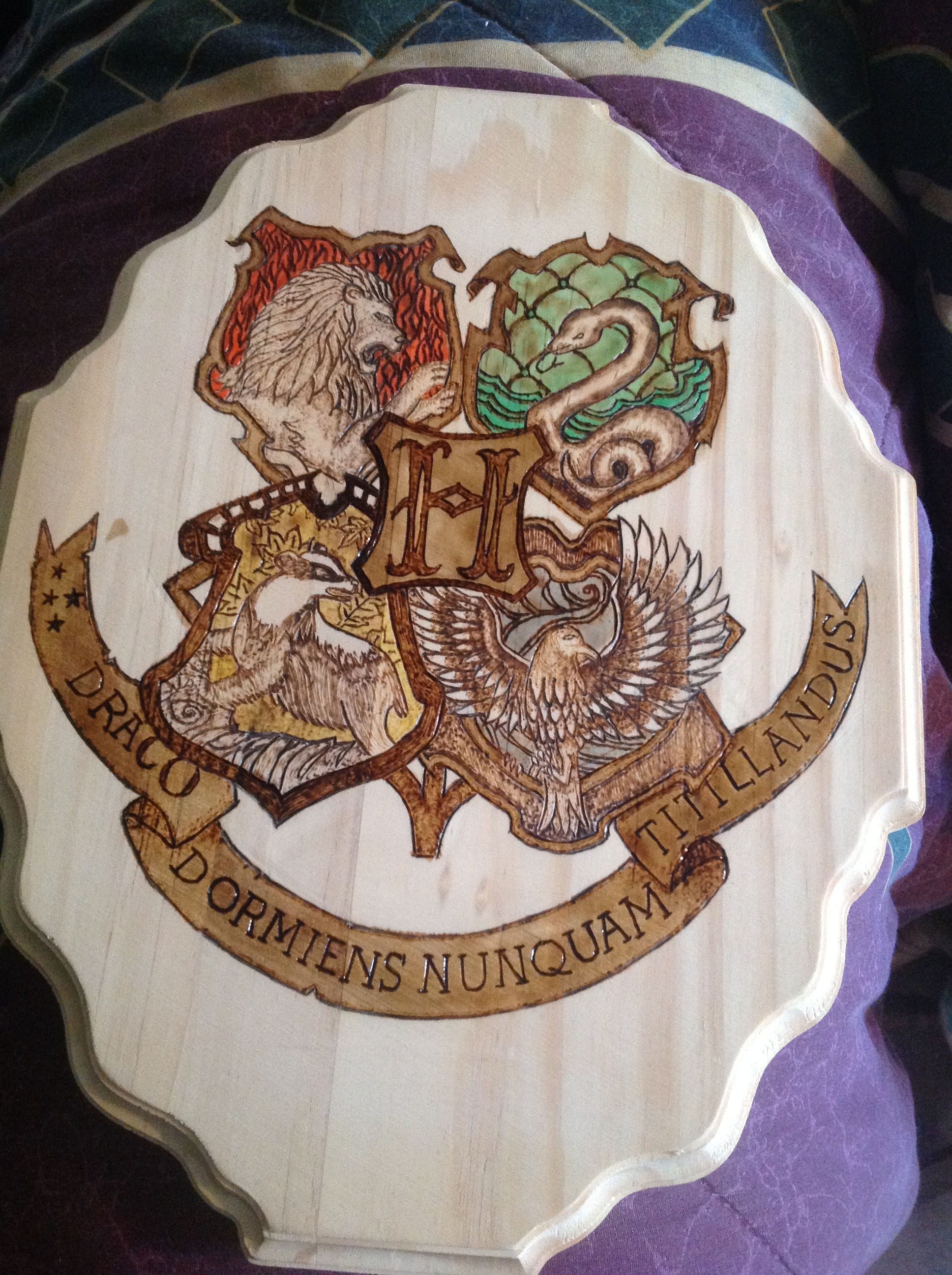
Then I used the Golden Pecan for the rest of the wood. Something I should have thought of happened, but it hit me like a happy accident.
As the wood got darker, the parts that were already varnished didn’t take the stain, which meant all the colored backgrounds, including the blue. Suddenly the blue looked more vibrant because all the colors around it were muted.
I was bumming a little about that line from the lion’s nose down to Dormiens, but it didn’t look terrible…it’s just a flaw in the wood. But still, you know, you want your babies to be perfect.
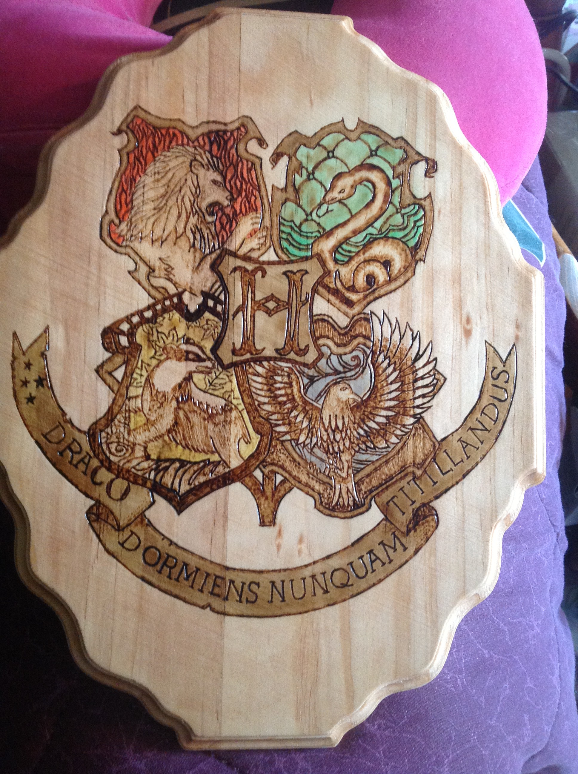
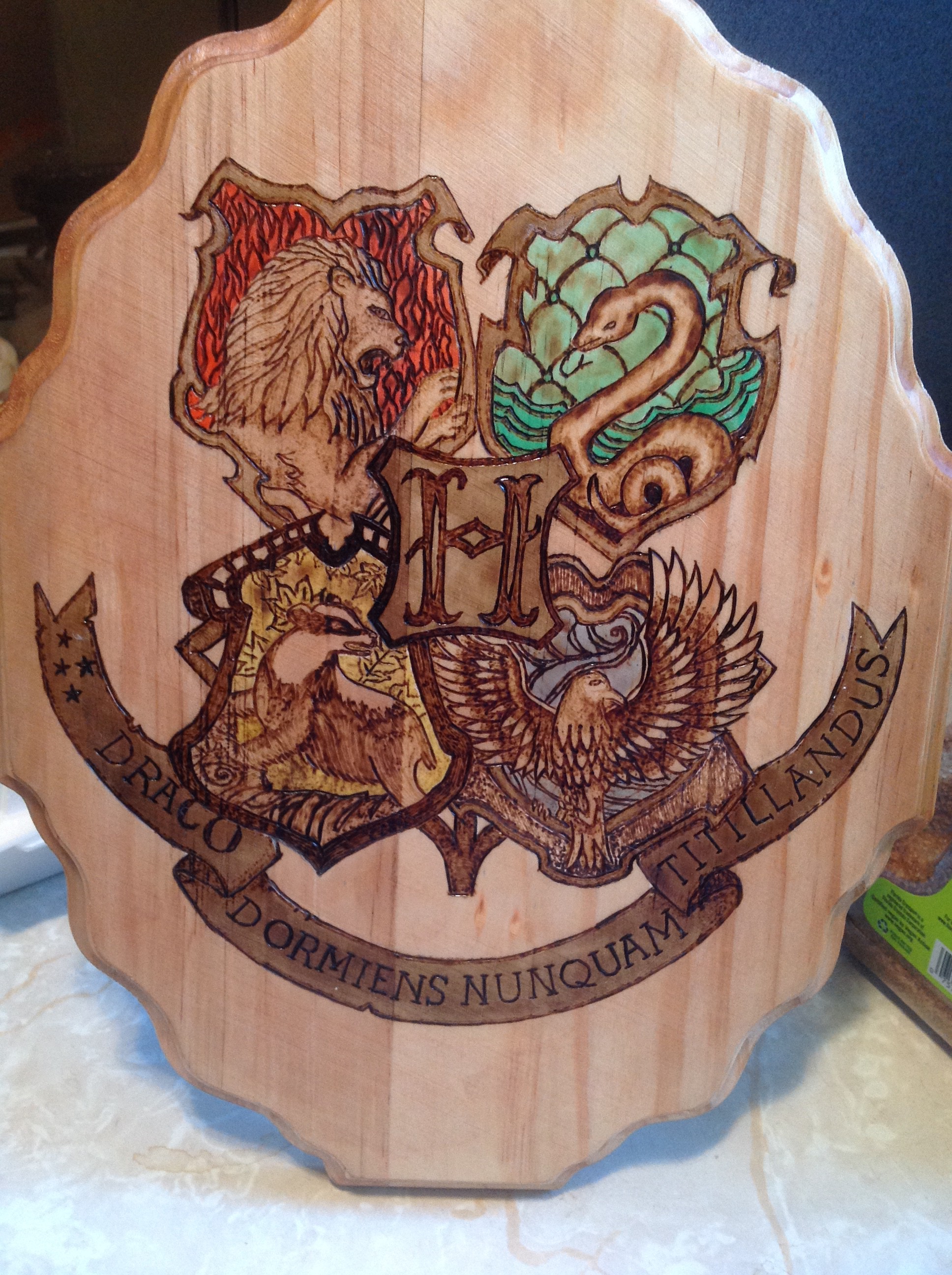
We chose a semi-gloss for the finish because it was all supposed to have a somewhat aged and dignified tone. It suited it well.
Jon was able to pick it up over July 4th weekend. I’m typing this on July 17th, and we’re waiting until the gift is given to go live. Then I’ll post this link as part of the gift.
Jon was ecstatic with it. He loves it, and he can’t wait to give it. We’re both kind of holding our collective breaths.