I was approached to do two treasure-chest type boxes for a friend. I imagined them to be a particular size, and we spoke about having several images on them and some text, some on the outside, some on the inside, and she asked for a rough price quote.
I worked out how long it would take and I gave her a quote, which she was happy with, and she sent me a check and the boxes in the mail.
When I looked at the boxes, they were MUCH smaller than I had imagined them to be, and the price I had quoted for her…I couldn’t fit enough work on those boxes to equal that amount of money, and we had to re-evaluate. She decided I should keep the money, and I said I would refund whatever we didn’t use and send her a check back.
I already knew I was buying newer, bigger boxes for her girls. It wasn’t fair any other way.
So I bought two boxes I found in Michael’s for her. They were sealed in plastic and when I shook them, they had something sliding around inside, but I didn’t know what. I figured I’d just get surprised when I got home.
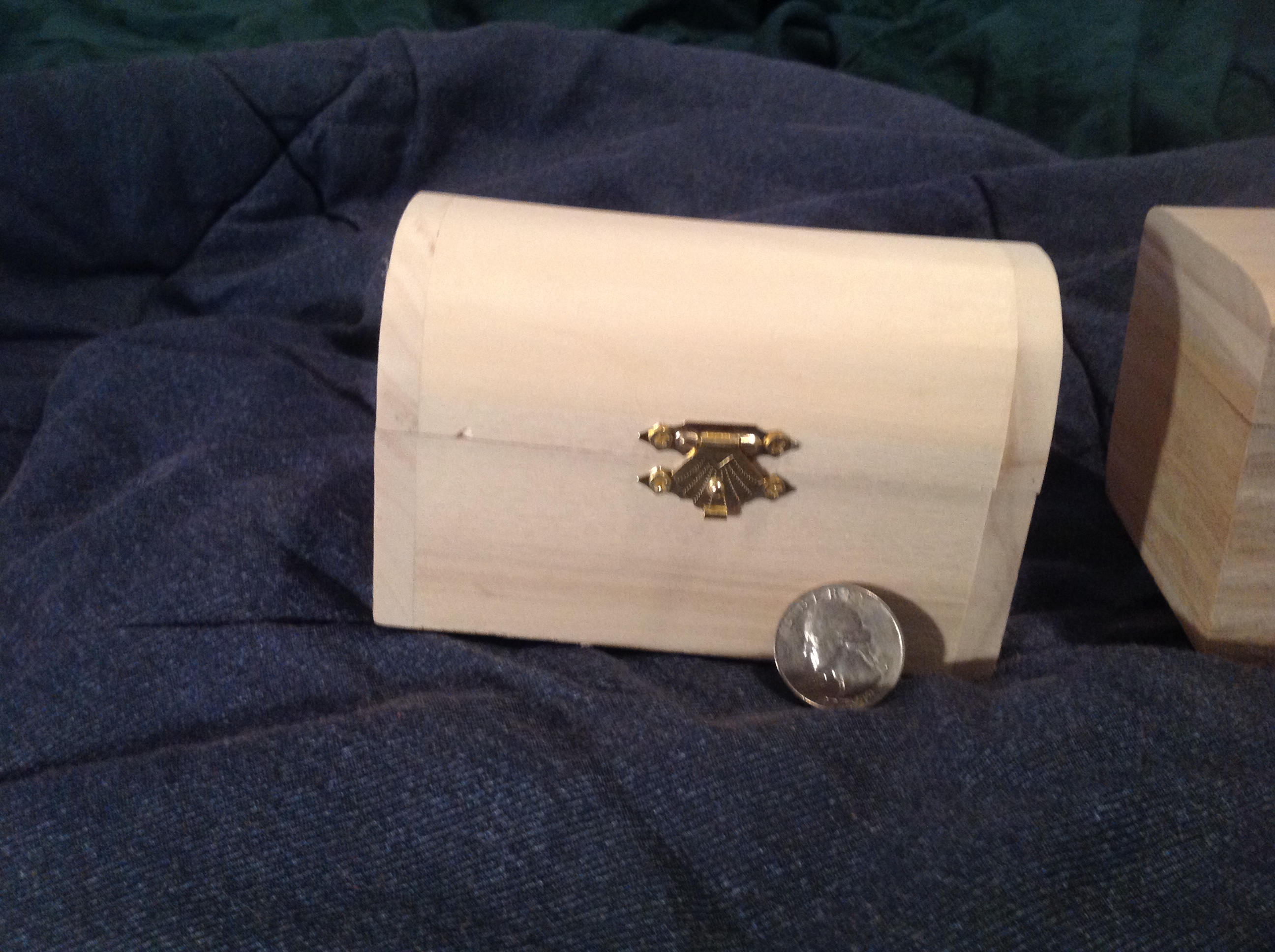
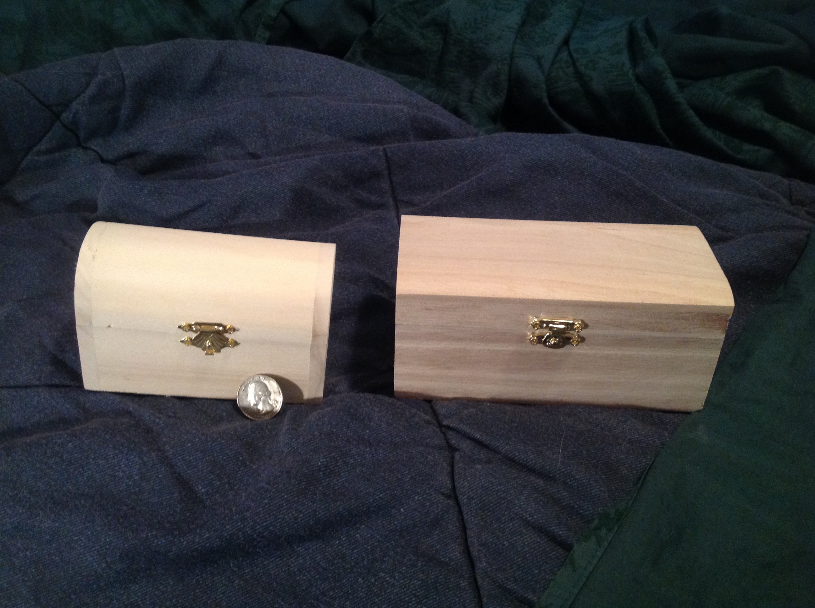
So I bought a box just a teeny bit bigger. I took this picture and I sent it to her. The tops were different, you see. The new box was larger with a flatter top, but the old box had more of a treasure chest look to it. I didn’t want to make the decision for her.
The cool thing was when I opened the newer, larger box.
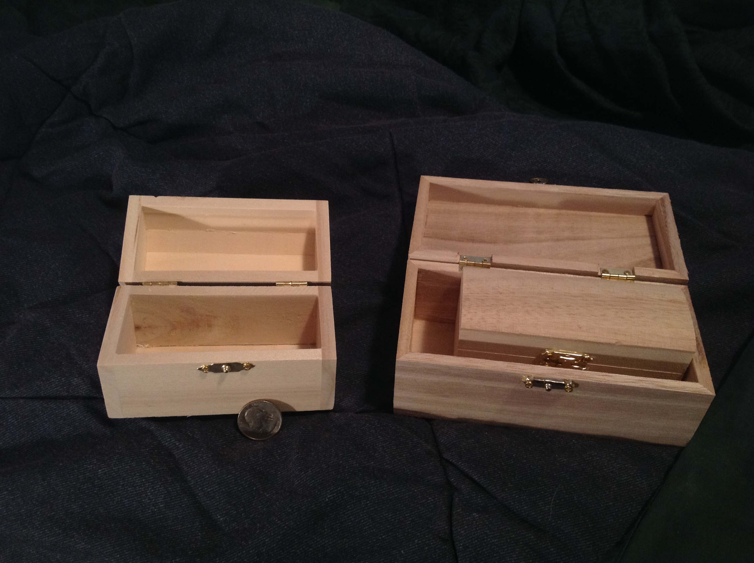
She loved the box-within-a-box thing. Awesome. We’re in business.
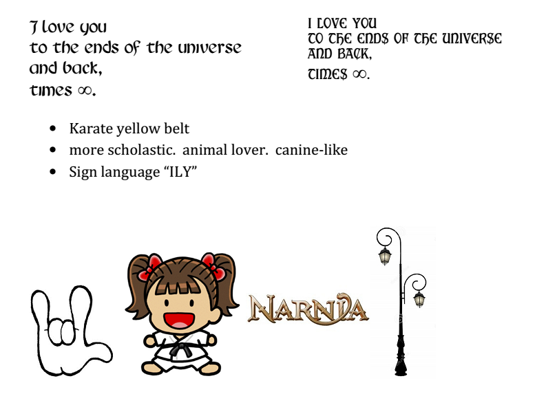
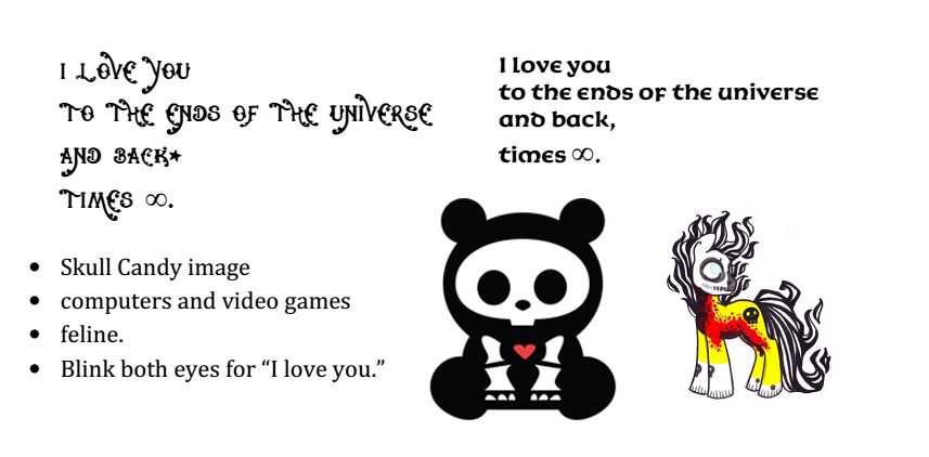
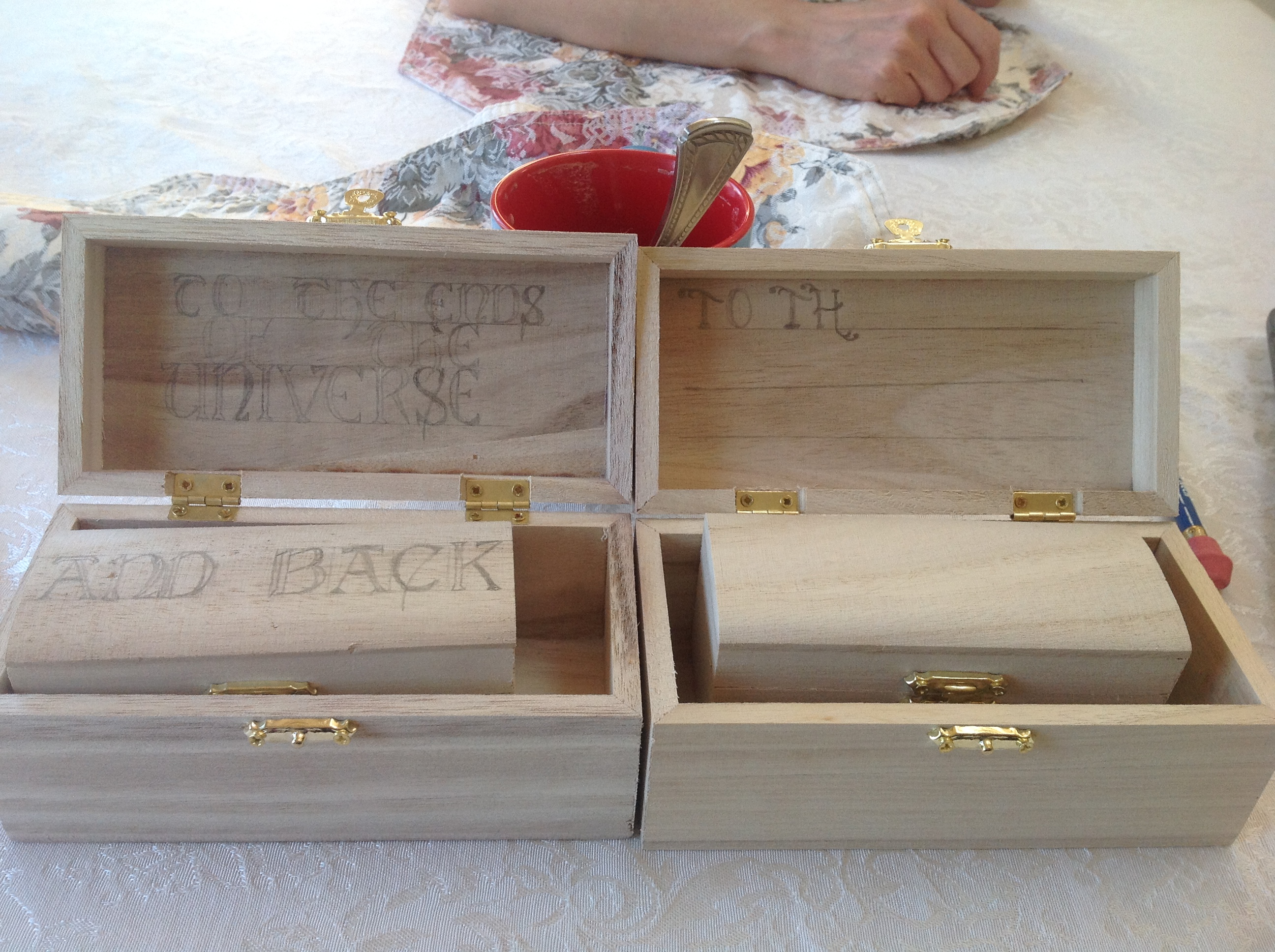
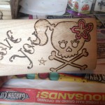
We had already spoken about the quote she wanted on the box. It was to say an inside joke between her and the girls. “I love you to the ends of the universe and back, times infinity.” The original idea was to put some of that outside the box, and some of that inside. I sent her a document that had four pages of fonts to choose from.
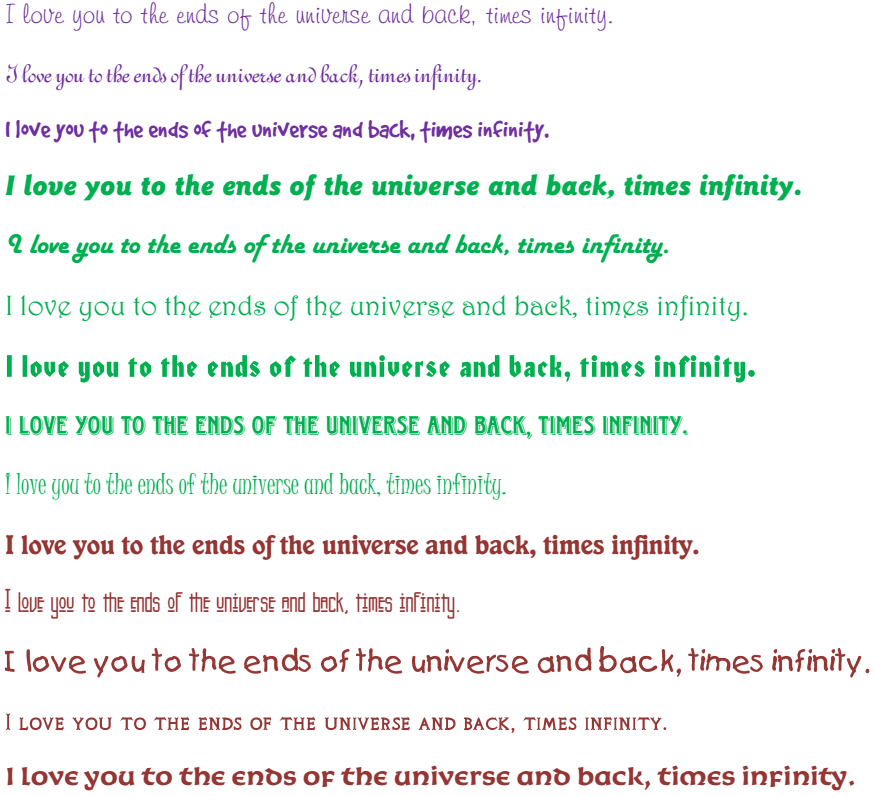
Something like this can be so personal. The font also delivers a message. So I was looking for what she was trying to say with her font…was this humor? Sentimentality? Was this an oath? Each of those needs a different style of writing.
She chose two fonts for each girl, so I could choose the one that was best for me to work with. Next we chose the spacing. Each box would say:
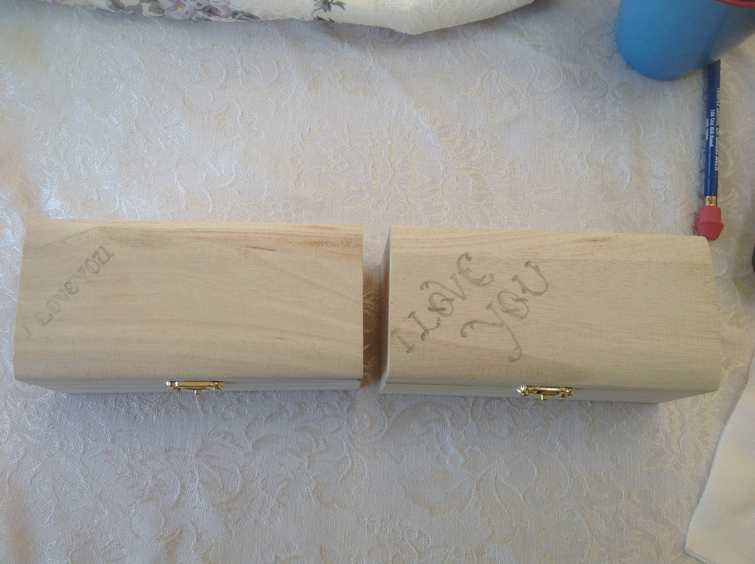
Outside Larger Box – I love you
Inside Larger Box – To the ends of the Universe
Outside smaller box – and back
Inside smaller box – times infinity.
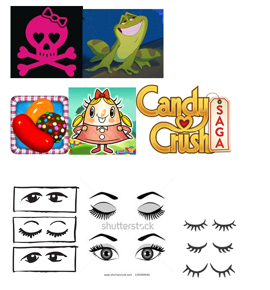
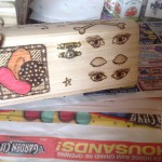
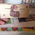
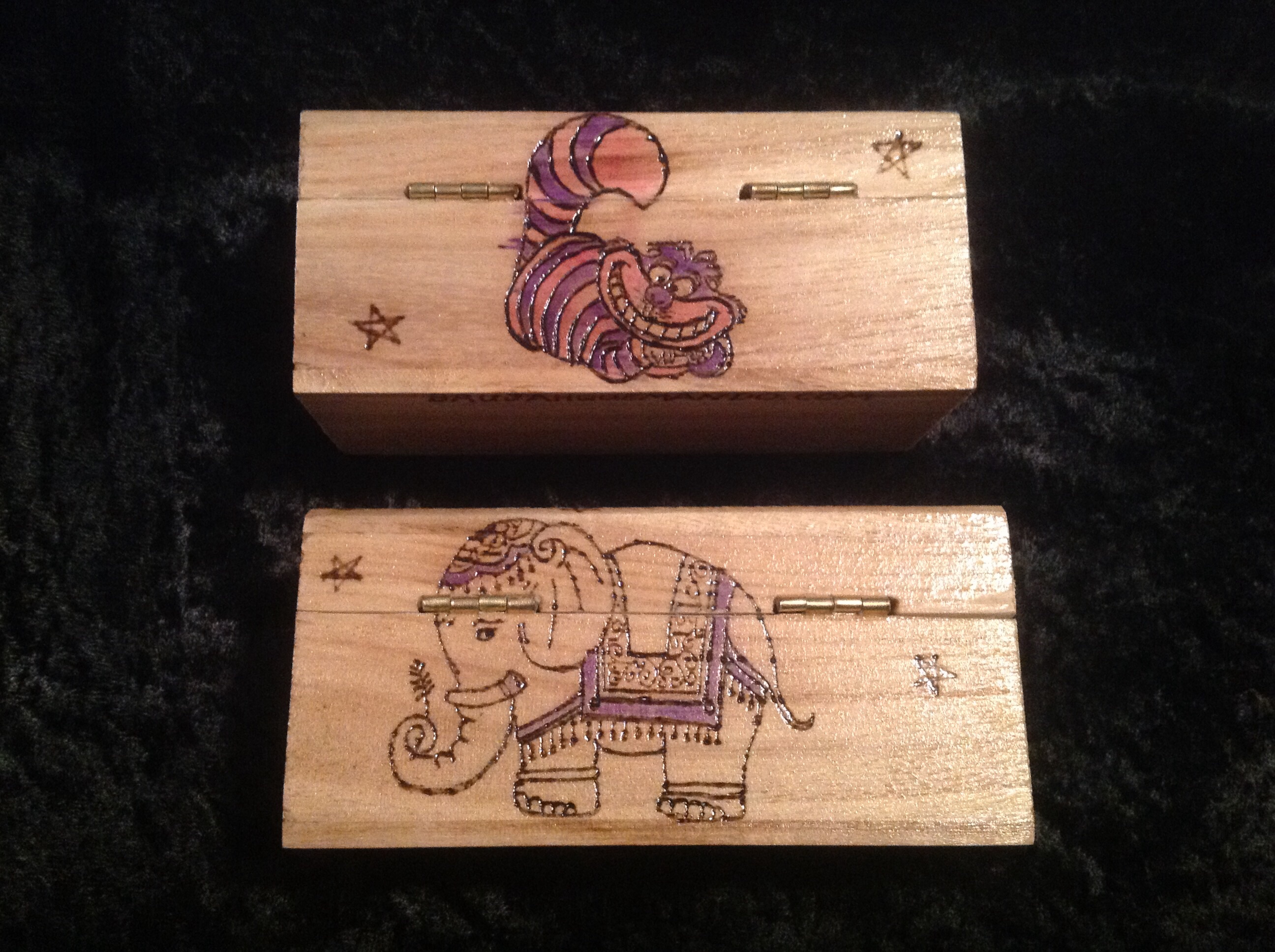
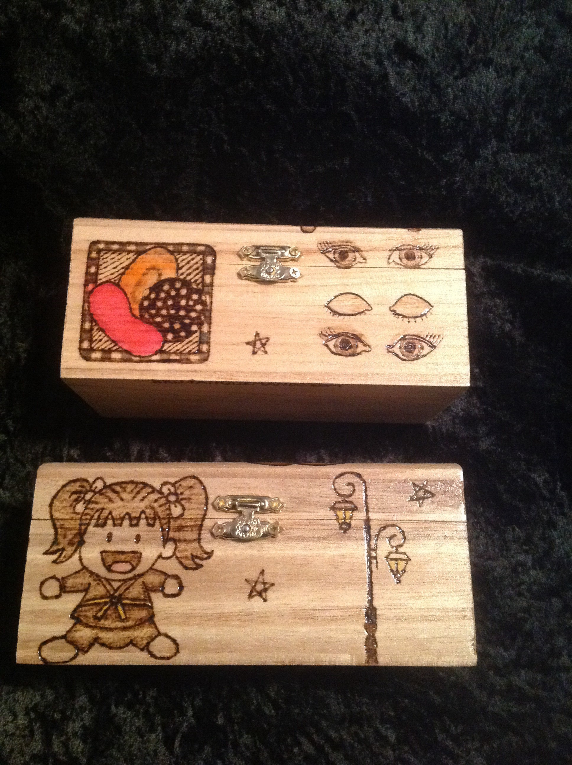
Meanwhile, we were choosing images. They said “I love you” to each other in two different ways. One of them used the “ILY” hand gesture, while the other would have a long blink, like a cat kisses you from across the room. (Cats blow kisses at you like that. Swearsies. True story.) So how could I put that on the box? Also one plays video games like Candy Crush, the other reads and likes Karate. How to get that on the box?
I sent her another document with some images. For example, her ILY
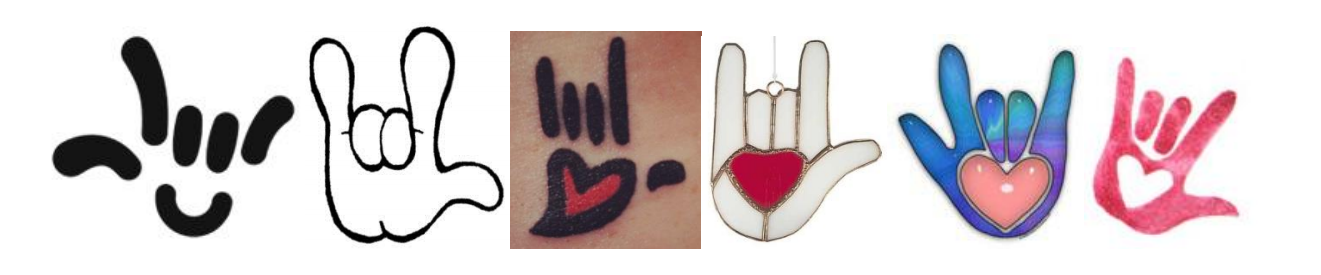
And all the other things she said. She chose from all the images I gave her, and then we came down to the following. This is from the PDF with her.
And meanwhile, I started working on the lettering for the boxes. This is what I have so far.
Once I got her okay on the text, I started burning.
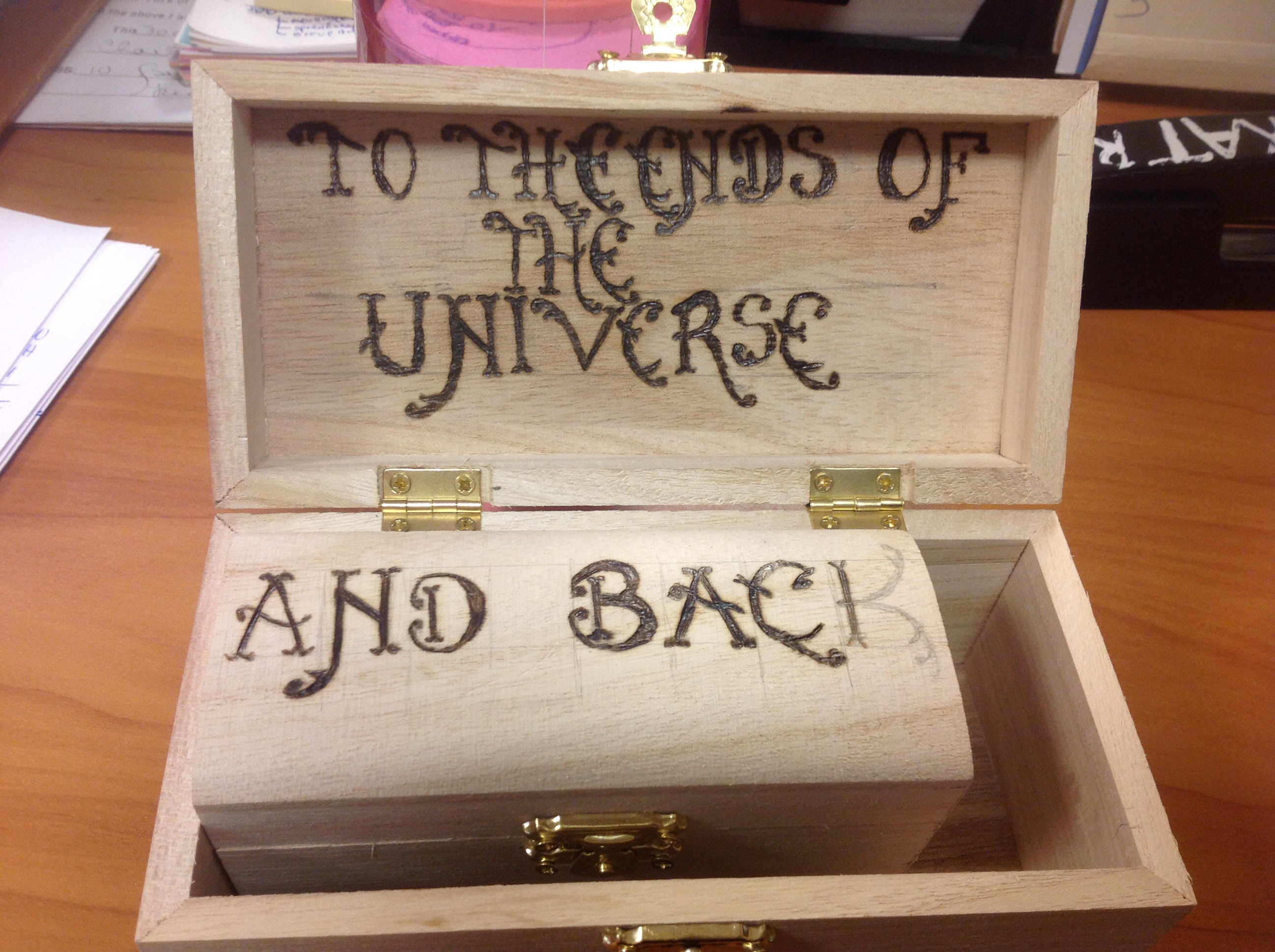
I have to admit. I love this font. It’s a pain in the ass because of tall the squiggles and flourishes, but it looks good. Just a little circus-like.
Final images were chosen and burned, and then we decided which would get splashes of color. For instance, on the luck cat, the Red Bib is VERY specific for various reasons.
Then I did the varnish. The unexpected happened. It smeared some of the ink, even though the ink was already dry.
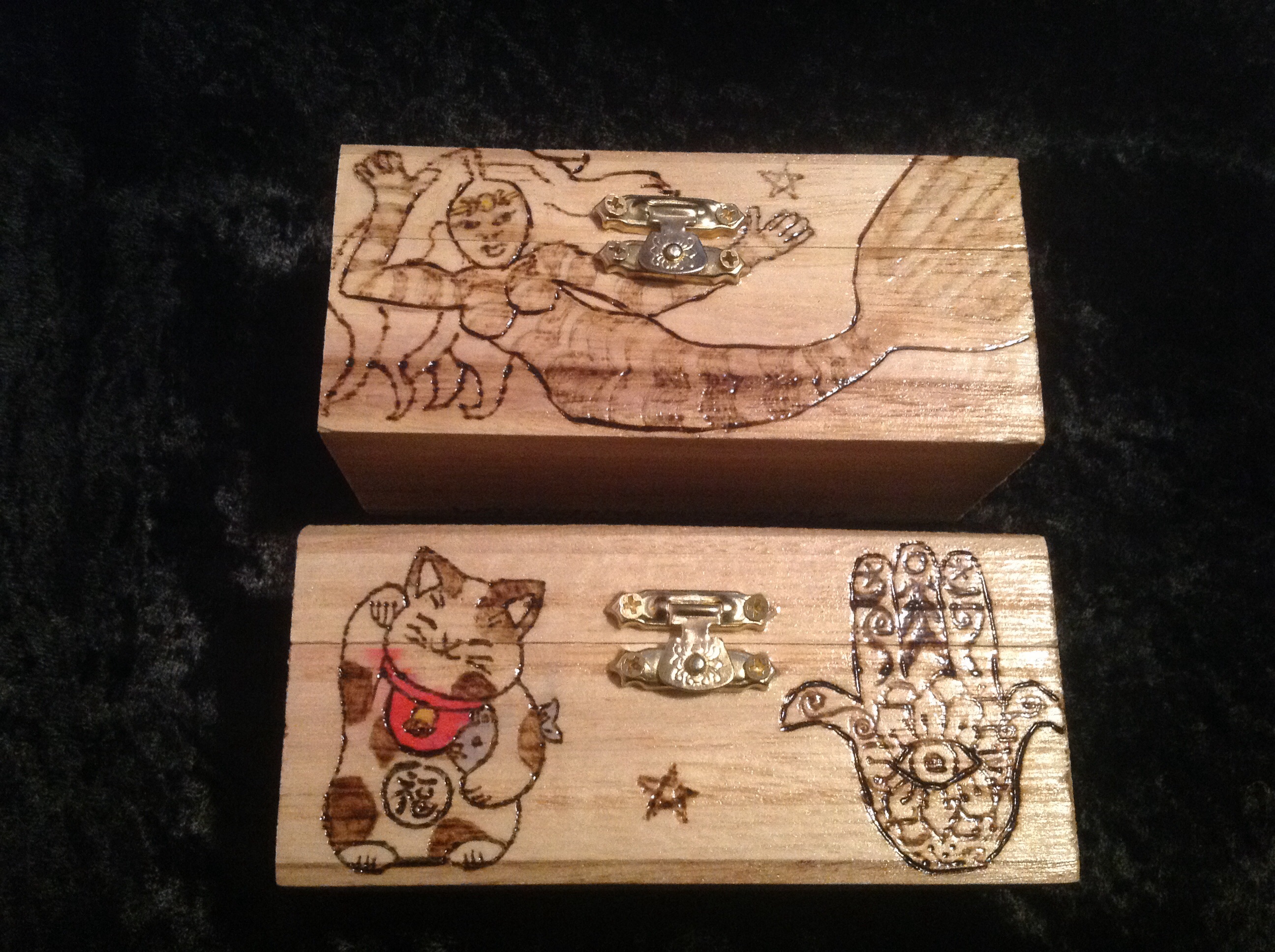
Apparently the red is the most susceptible to it.
I learned some things about working with inks, and the finished project is here: