This started as a LARP prop project with a friend. He wanted an Alchemist box, something that looked magickal and ominous. Of course, I’m Pagan, so I had to ask, “How realistic do you want this to be? I’d prefer it if we didn’t put too much realism into a game prop, you know?” He was very cool about that, and he sent me a bunch of images that he wanted me to use on the box. Here’s what he sent me:
http://upload.wikimedia.org/wikipedia/en/c/c8/Coheed_and_Cambria_(emblem).png
http://stickerish.com/wp-content/uploads/2012/03/FullMetalAlchemistHomunculusSymbolBlackSS.png
http://fc06.deviantart.net/fs17/f/2007/197/1/3/Fullmetal_Alchemist_Symbol_by_Pachyderm11.jpg
http://asknoypi.com/wp-content/uploads/2014/03/Illuminati-and-Freemasonry-Symbols.jpg
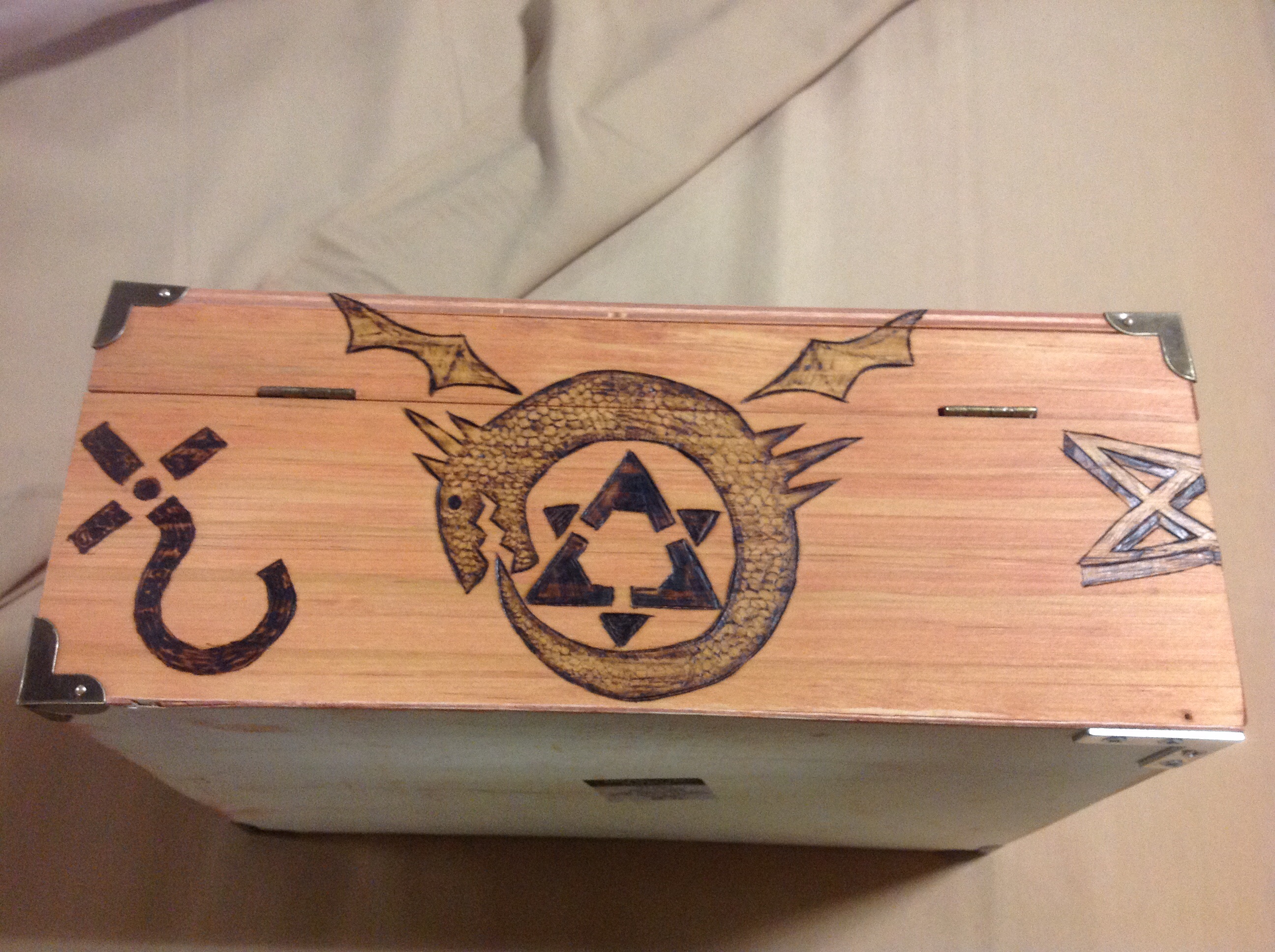
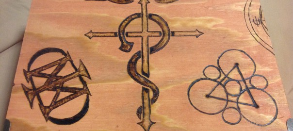
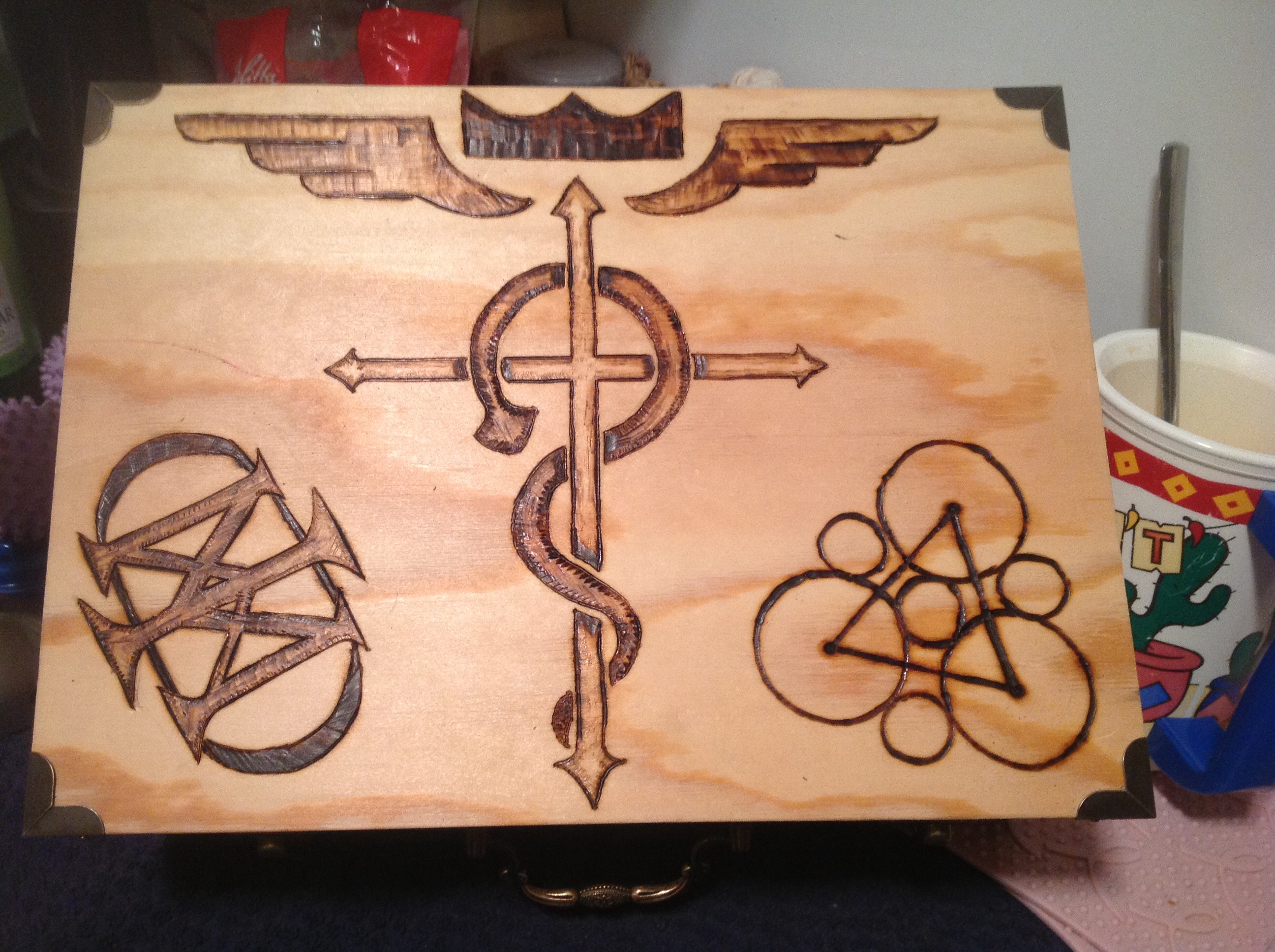
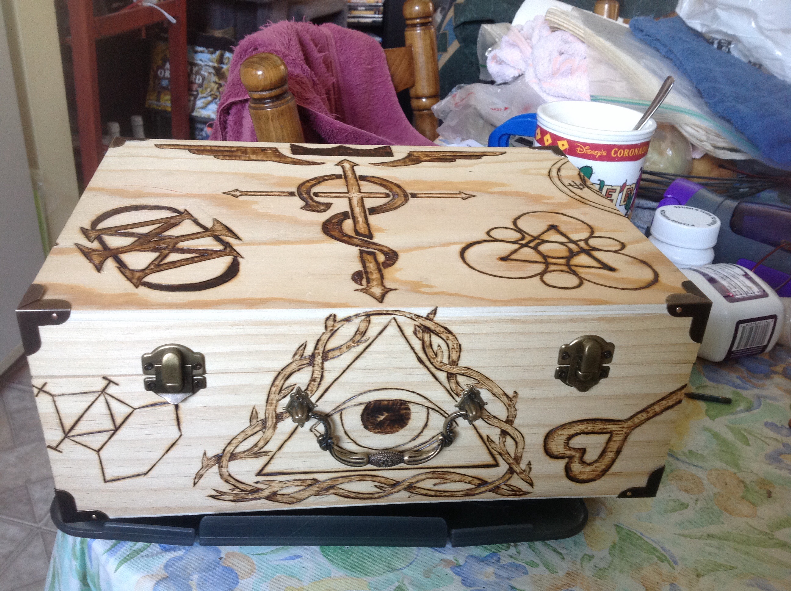
All work is customized, so we looked at all the symbols and decided what would look cool and what wouldn’t, and where we would place each symbol. We both agreed that the Full Metal Alchemist symbol should go front and center on the lid. It’s a great looking symbol.
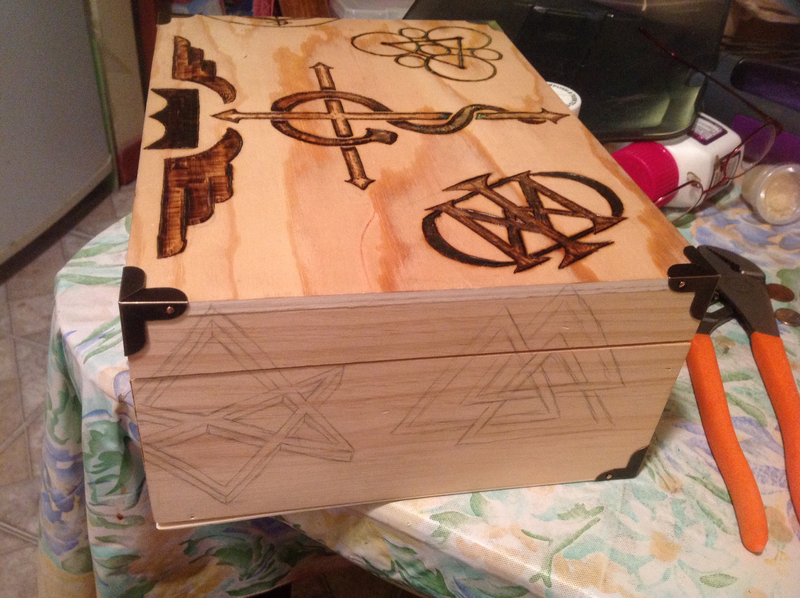
So to start with, the box looks like this:
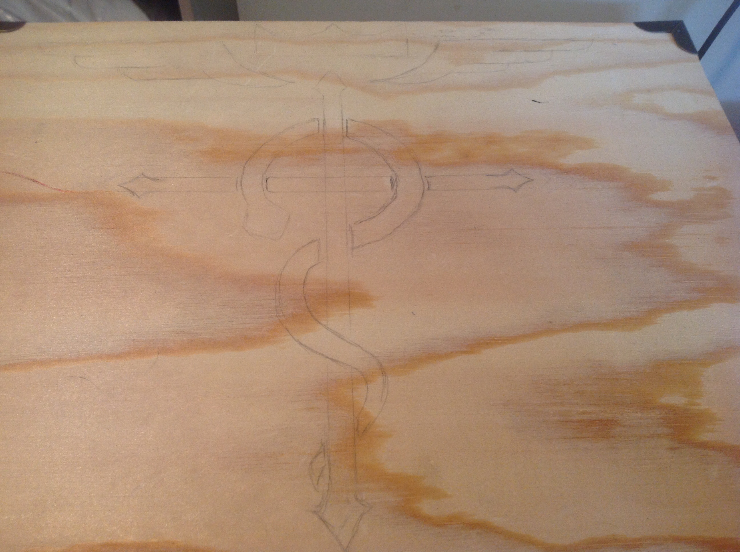
But then I realize that this image is just a solid black thing. There’s no creativity in it, and it’s such a great image! The least I could do is give it a feeling of the snake weaving around the cross…I mean, the original image didn’t give any depth, but I wanted to keep it a little tribal-looking. So I just gave it some breaks wherever the snake overlapped with the cross it was on.
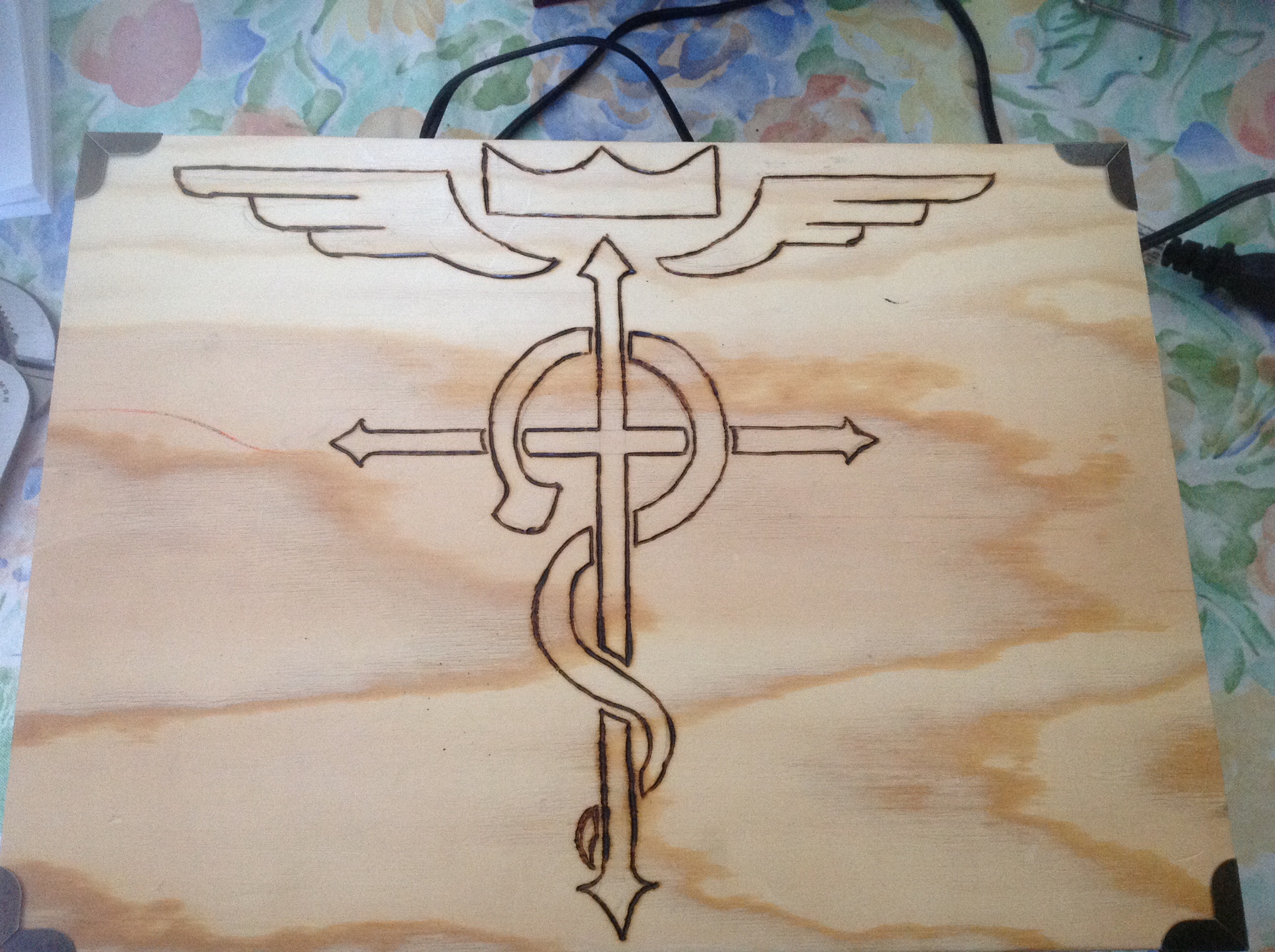
Lucky for me, he loved it. So I started moving on to the placement of some of the other images. We had room to the right and left of the main image, plus there were the four sides of the box. We were PM-ing back and forth on Facebook, but he was taking sooooo long to decide, (he had life stuff going on, and I just really wanted to get to work)…so I started with the shading while I was waiting. I didn’t know if it would work, but like I said, I could always just make it solid black, if I had to.
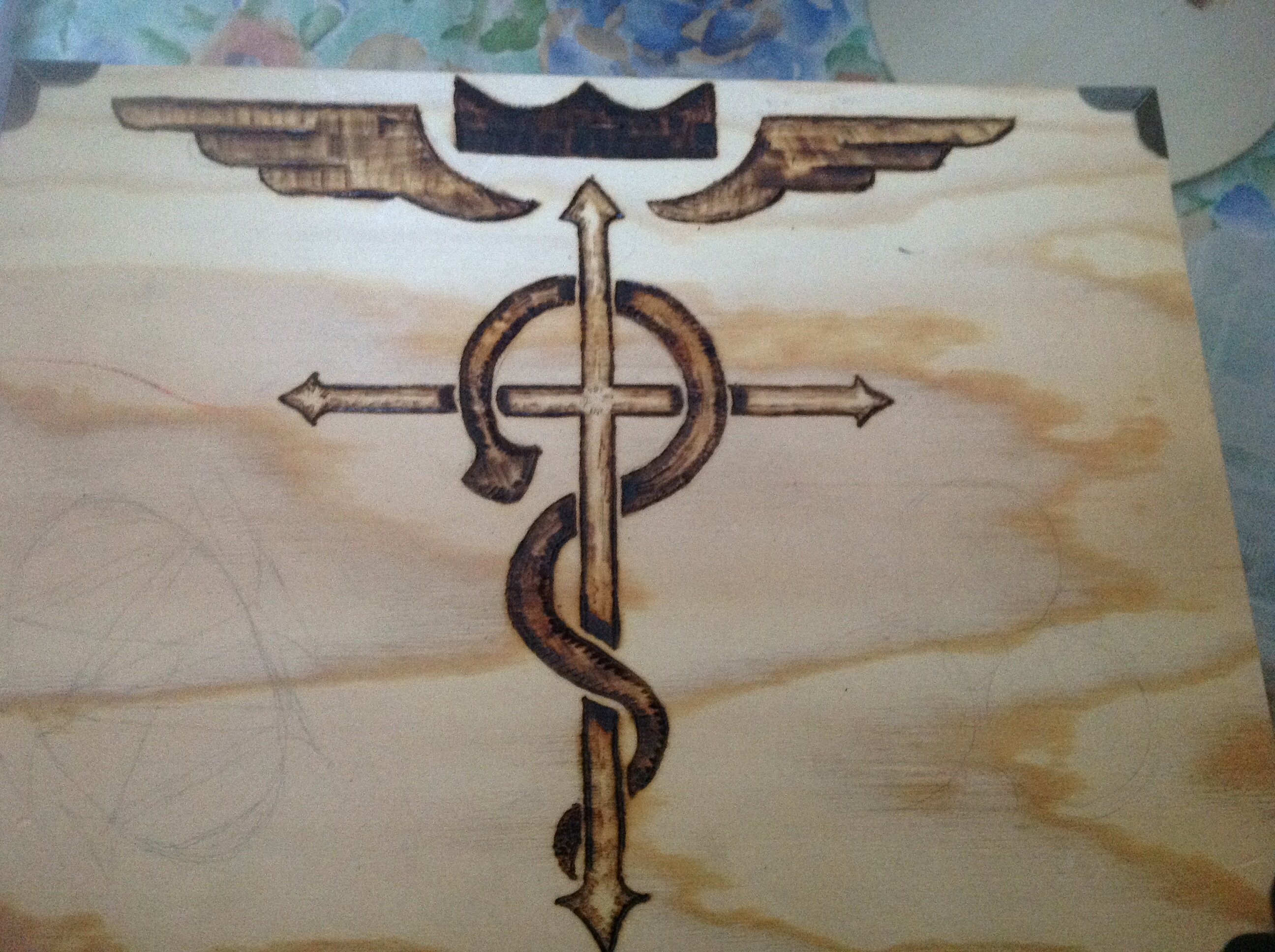
Keep in mind that, at this point, I didn’t even have a variable-temperature burner. I only had “OFF” and “ON” as my options.
Meanwhile, as you can see from the pencils, he had chosen a couple of symbols, and I asked if he thought that positioning was okay. He was fine with it. He didn’t want all the symbols to look “neat,” he said. He wanted them to look a little messy, like they were either hastily drawn, or that they had seen combat. He said I could even take a hammer to the box to bang it up a bit.
Lemme just get the burning done first, you know?
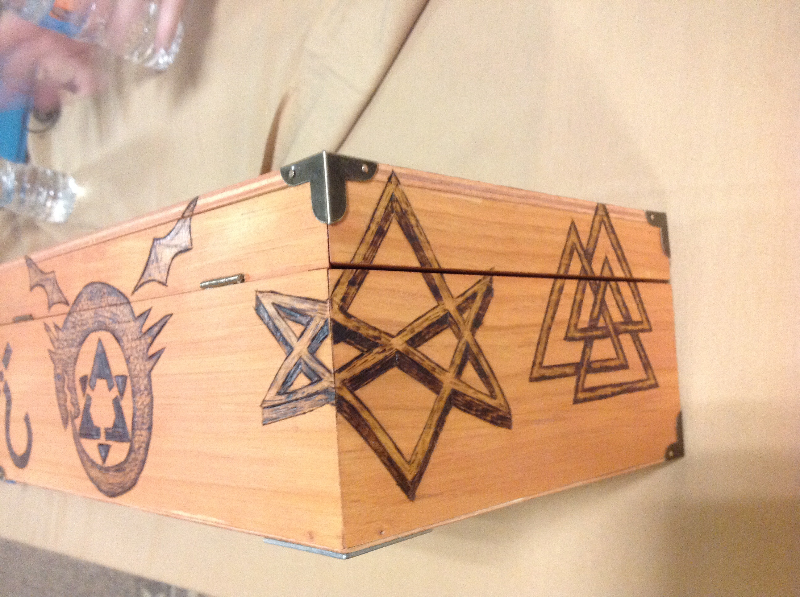
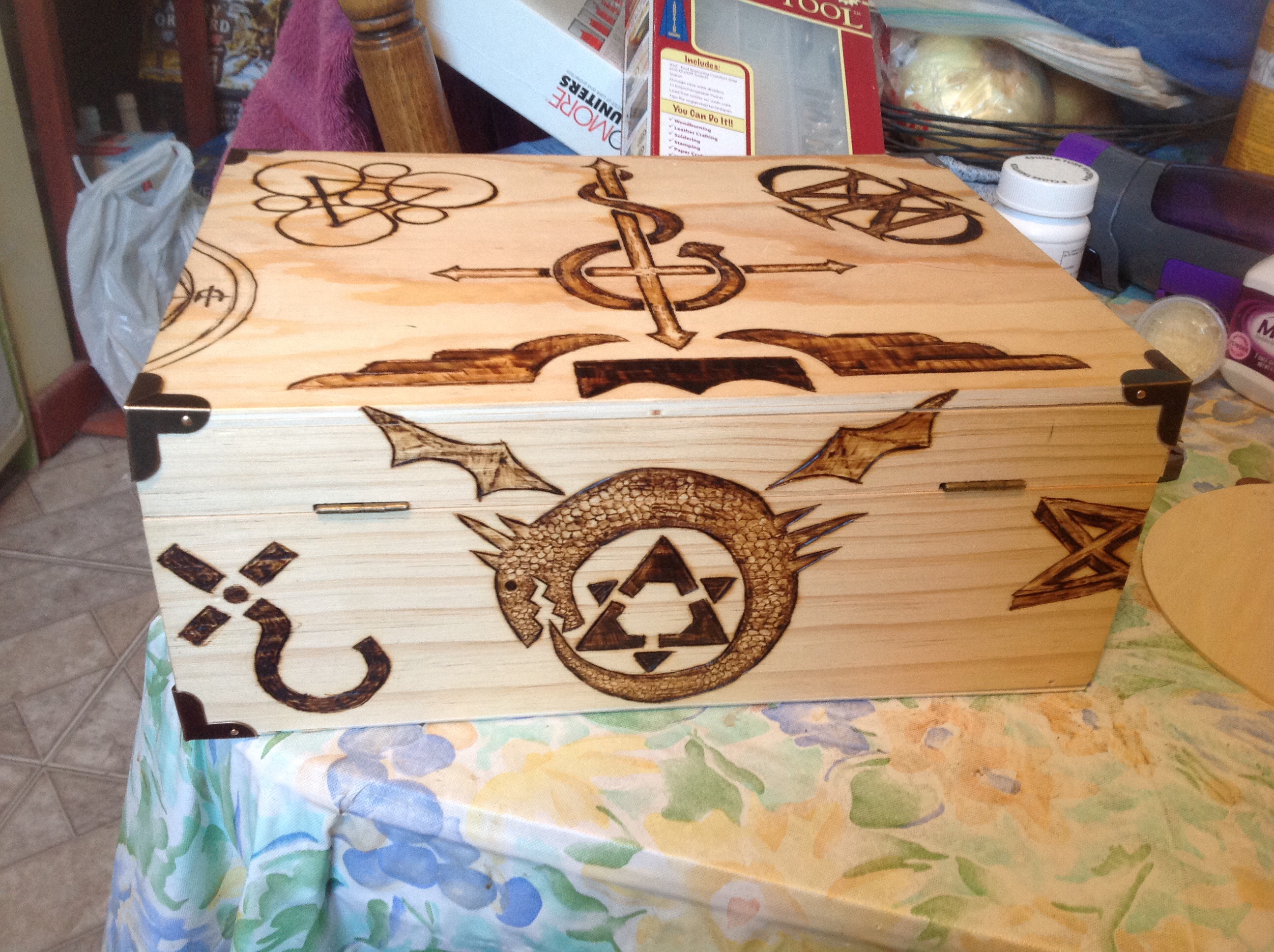
So I burned the next two symbols on the front. One is a VTM symbol for Majesty, and the other is the Coheed and Cambria symbol.
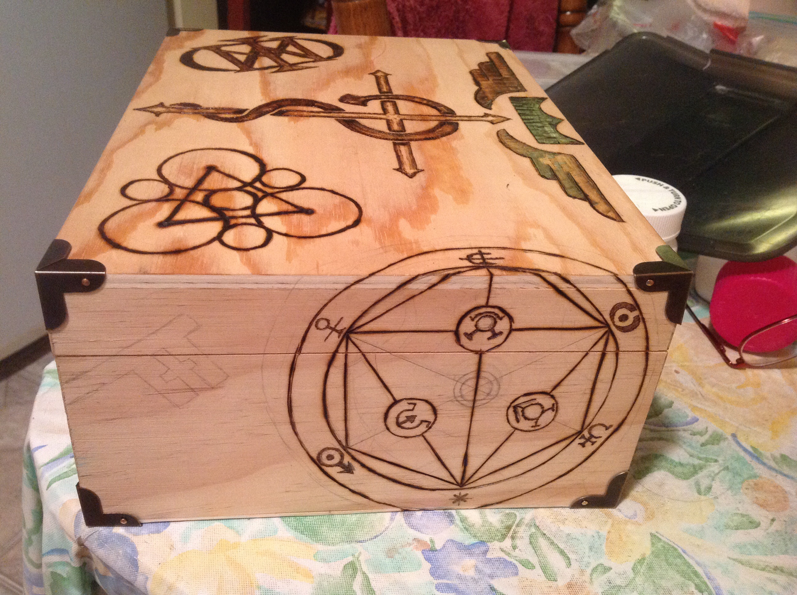
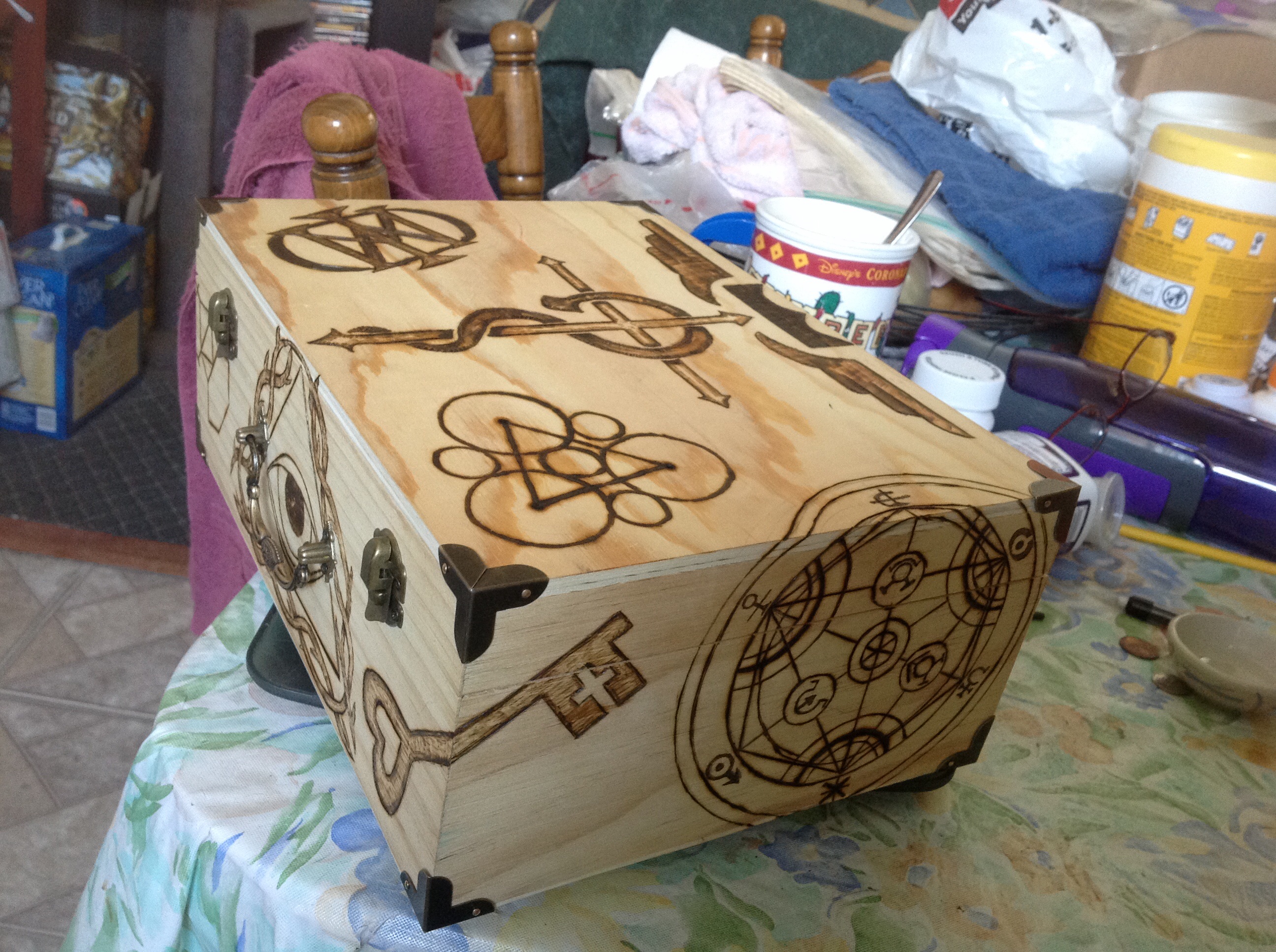
Meanwhile, he chose some other symbols. We agreed that the Homunculous piece needed to be kind of shown off, so I wanted it in the middle.
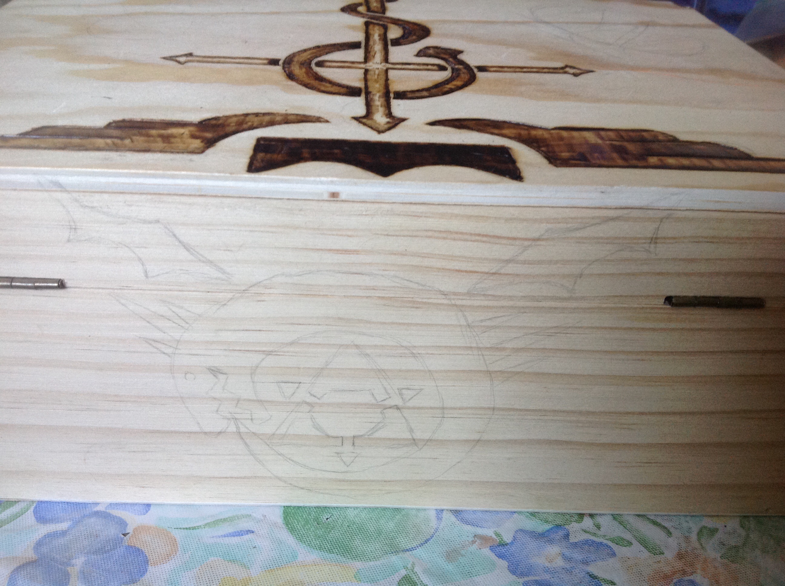
So there’s the pencilling of it. Next he says, “The symbols can wrap around the box. They don’t have to stay in one plane.” THAT was an AWESOME idea. And I knew just which symbol needed the wraparound treatment.
That was one complicated symbol. I had to keep coming back to it to add more pieces, and to sketch more stuff. Because if I didn’t, I would smudge the pencils and have to start all over again.
Next came that Illuminati symbol. If you look at the symbol he gave me, it’s much simpler, there’s these rays sticking out of it, and they’re also very simple, very tribal. I wanted something cooler and more intricate. I kind of overrode him on that one. I knew he would love it (he was super happy with what had been done so far) and I knew that this image would be much cooler than the one he gave me originally. And for some reason, I needed to do this bramble thing. Really-really.
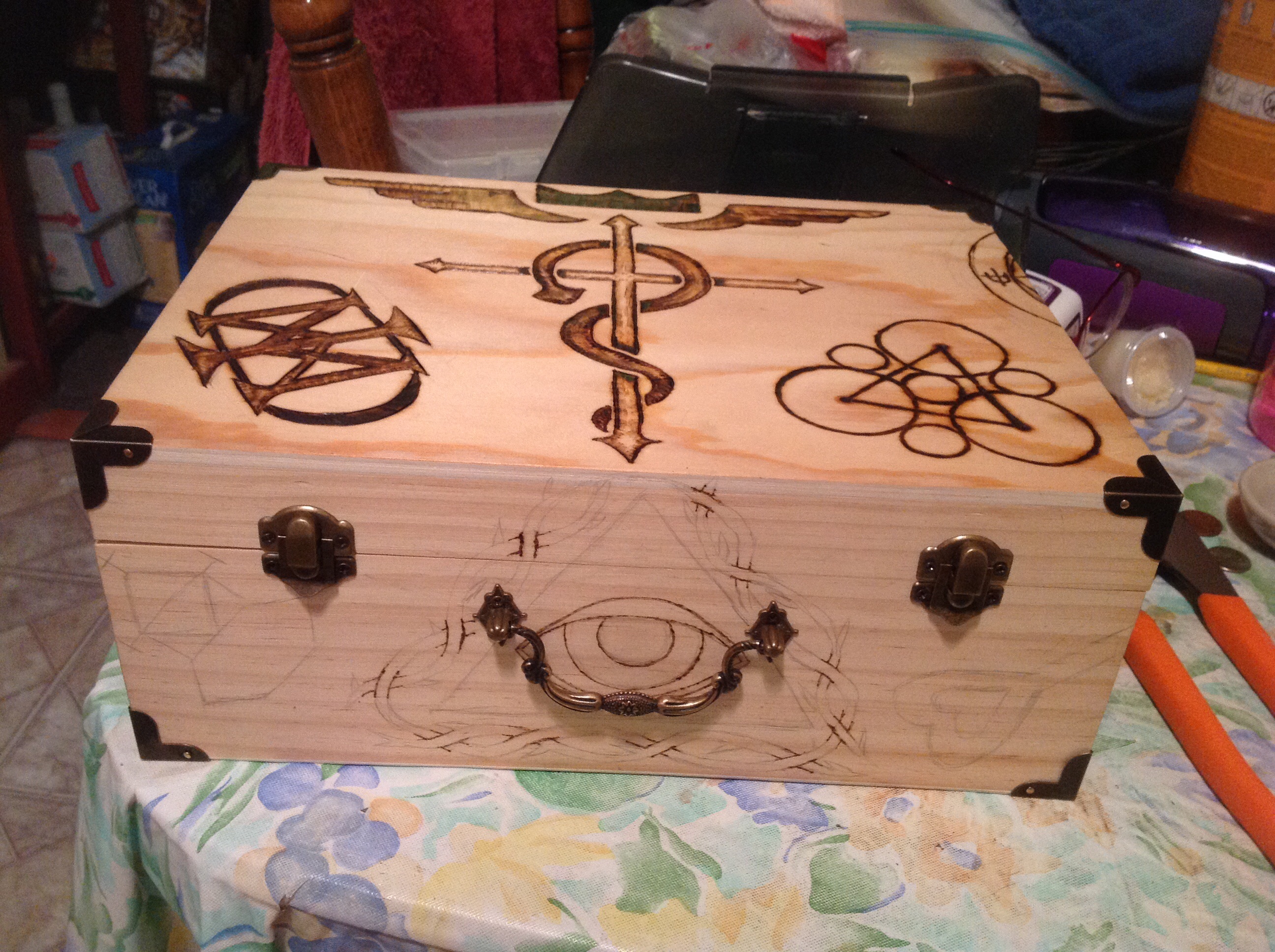
I did the crossover points first so I would get kind of a twisty-woven look.
So I added in a couple of the other symbols he had given me, but they seemed kind of plain next to the other work. So instead of just making them solid, I tried to give them some perspective so it wouldn’t just be a black line on a box.
That Valknut was crazy…with all the over/under/over/under work…Phew! But I’m really proud of the fact that I did it without screwing it up.
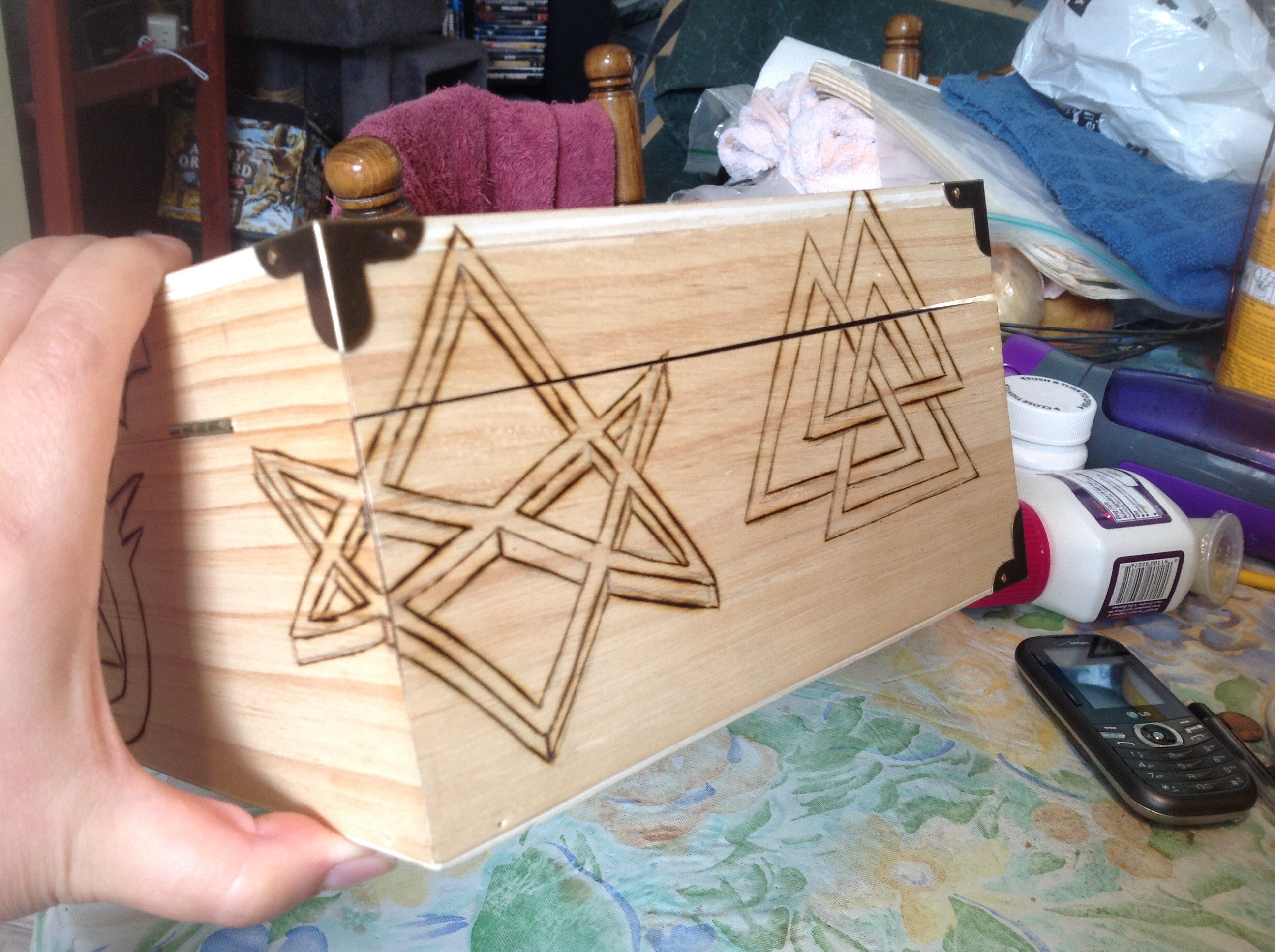
I couldn’t add perspective to the Valknut, too. It would be too much of the same thing on the same side. But I could do some shading and make it prettier. So I tried to imagine what I wanted to do while I worked on another section.
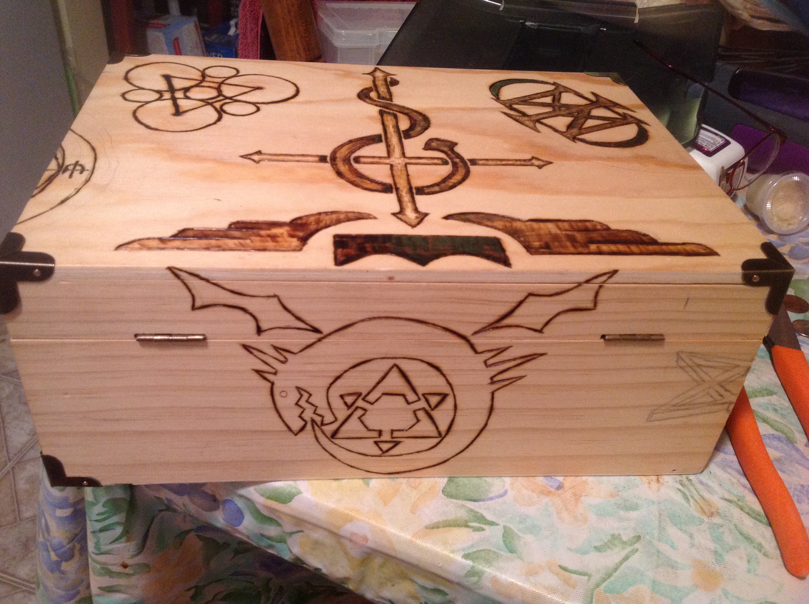
The Homunculous turned out to be the last thing I finished. I really hated the idea of making it solid black. What it really needed was scales. But I didn’t know if I could pull off scales…again, just an on-off burner at the time. So I kept putting it off and putting it off until the very end.
So I went back to other pieces. Specifically, the Illuminati Eye.
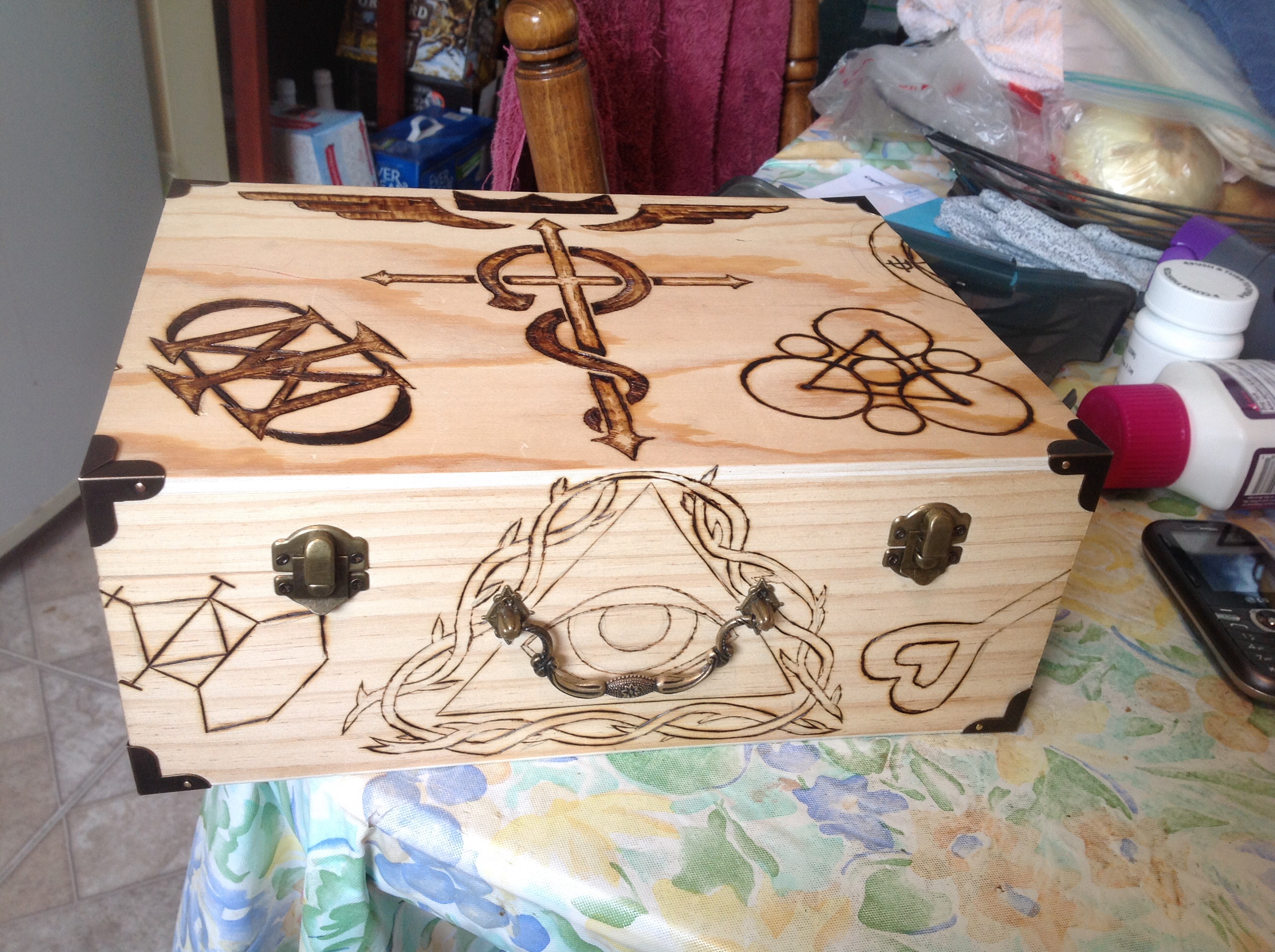
I loved the way it was looking. I knew I had to shade it. But I was wondering….just how realistic could I push that eye? Without a variable temp burner, I would have to be really careful…but I could try and just burn it black if it looked bad. That line of thought had gotten me pretty far on the rest of the box….so let’s see what I can do.
Meanwhile, I was gradually coming back and doing more work on that crazy magic circle. As you can see, it has crazy detail on it.
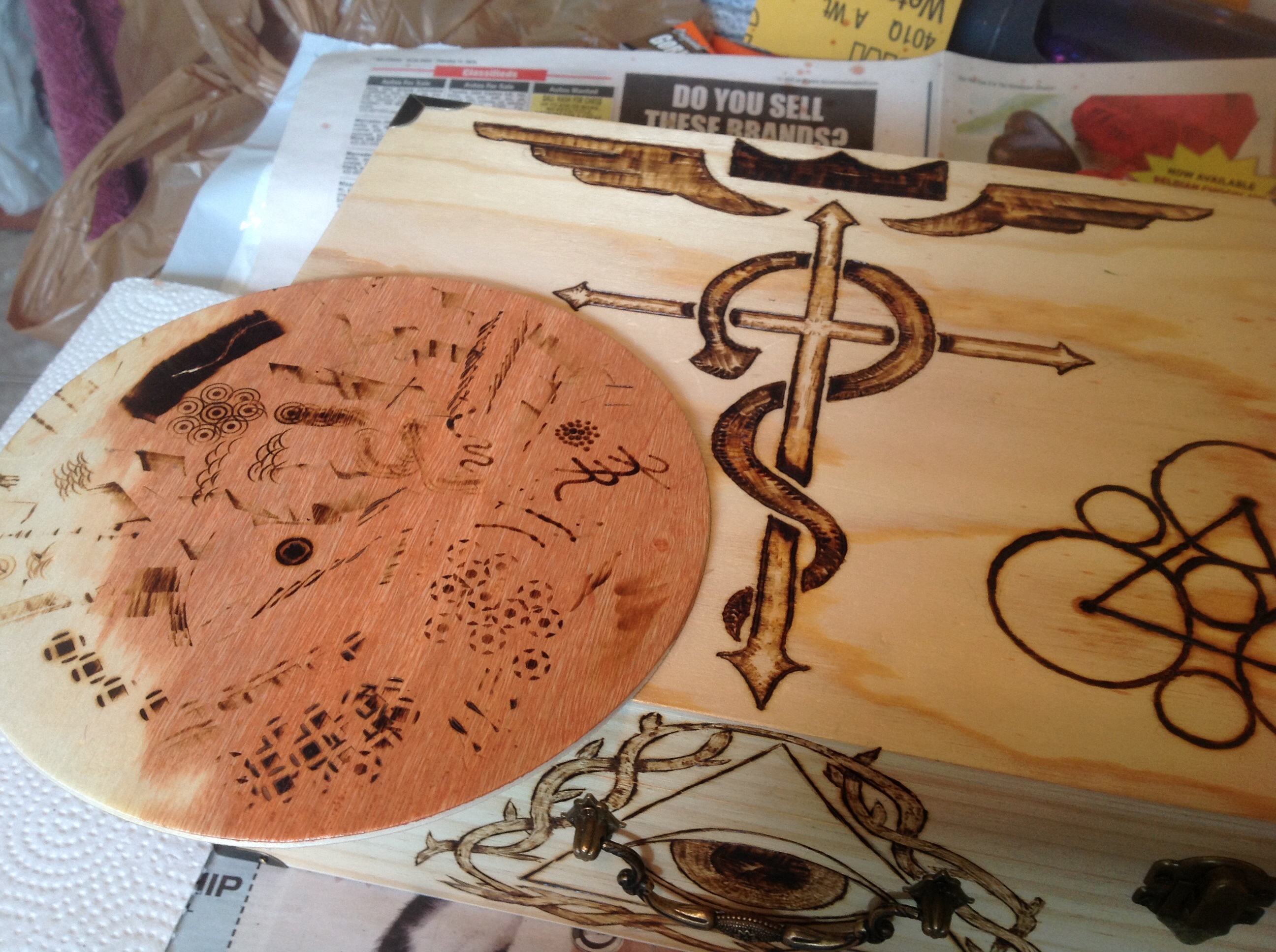
Oh…and that disk is the scrap piece I used with various heads to check the temperature before I touched it to the box, to see what different things would look like, and to test the eventual scales I added to the Homunculous.
So he approved the stain, and I stained it and gave it to him at a gaming con we were both attending. (Dreamation!) when I suddenly realized….
ALL THIS WORK AND NO PHOTOS OF THE FINISHED PRODUCT! What was I thinking?
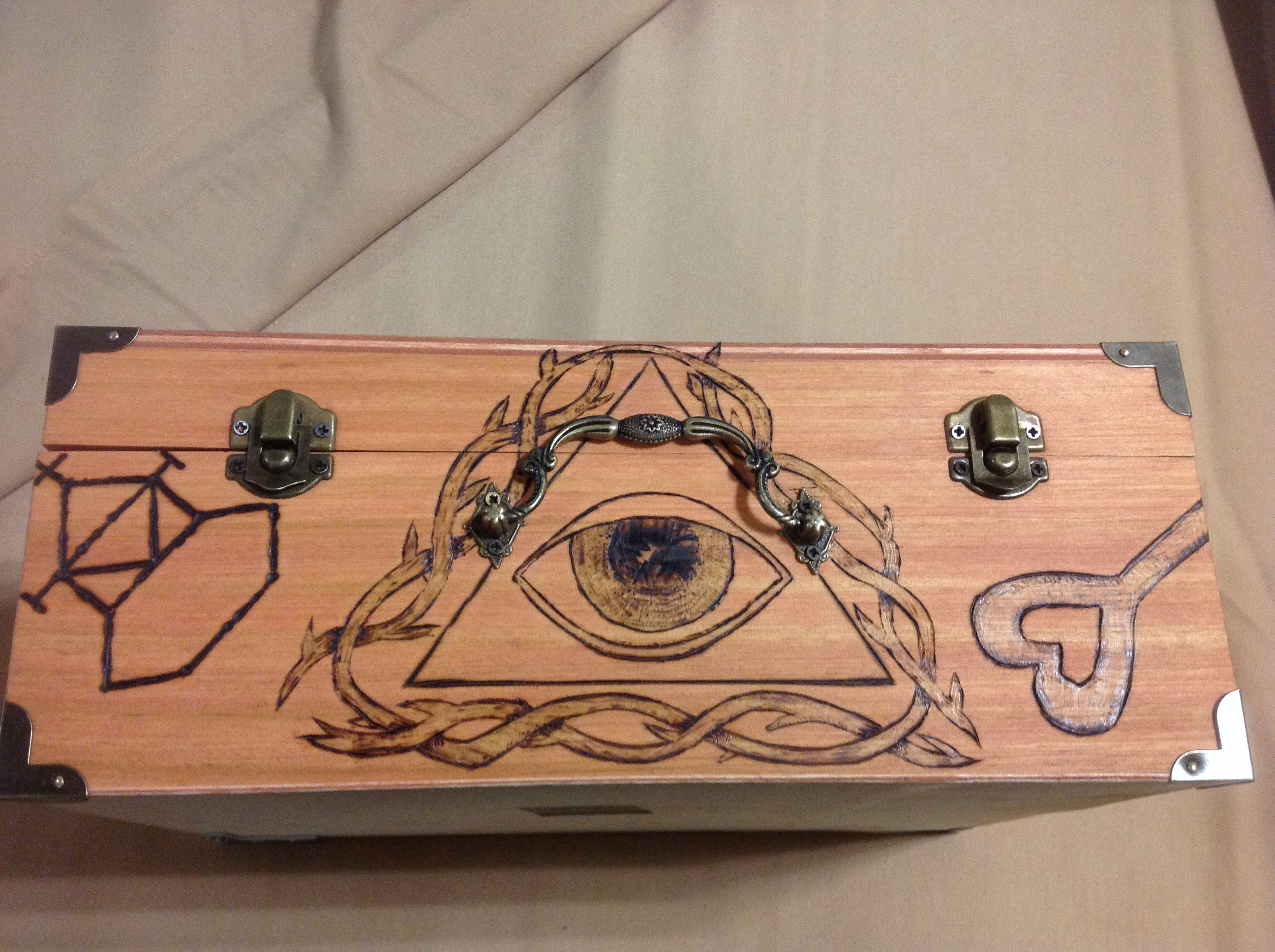
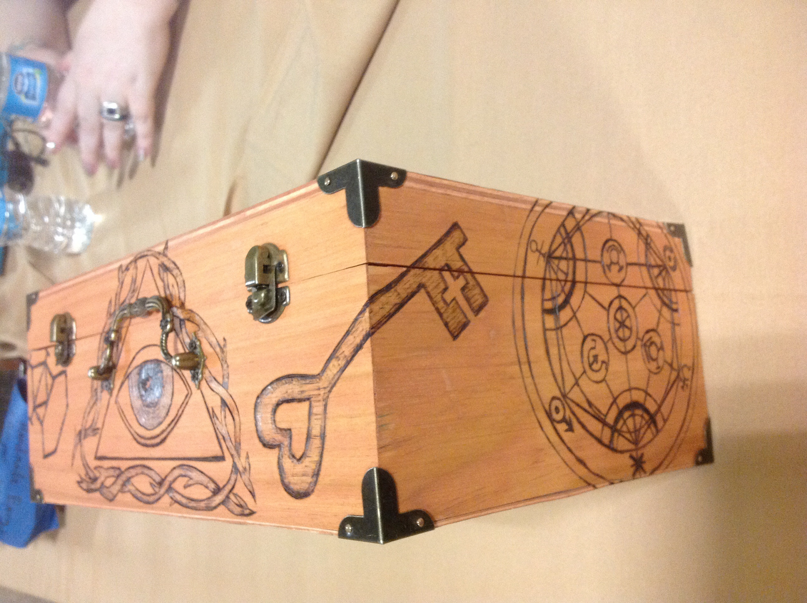
So I stopped them at the con, and took the following pictures of the final product for posterity. I have to admit, it’s a lovely piece of work.
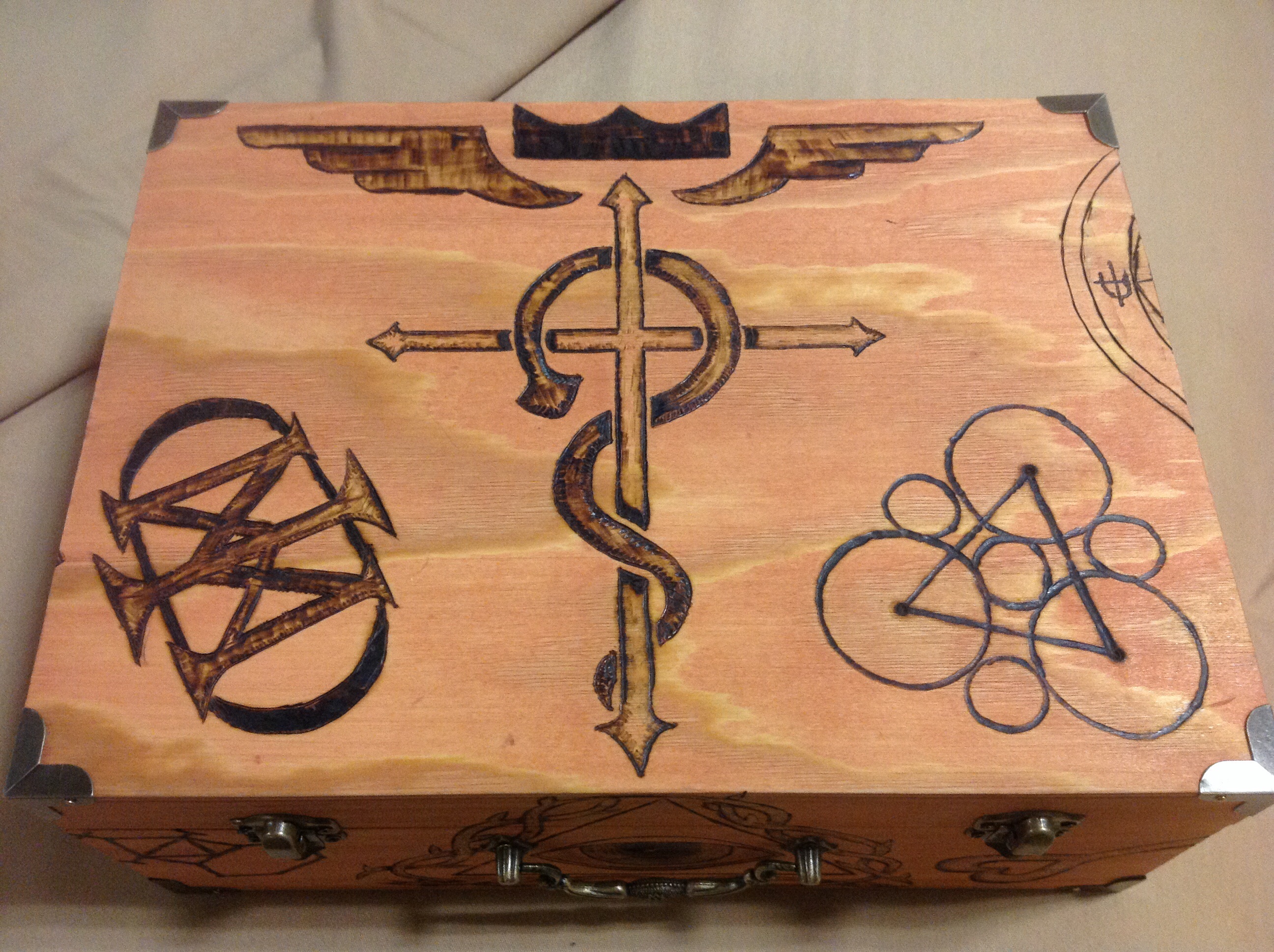
Top of box. The stain did a lovely yellow thing with some of the grain.